Count HTML State Changes Real-Time with CSS
Counting is a ubiquitous task in web applications. How many unread emails do you have? How many tasks are left unchecked on your to-do list? How many donut flavors are bagged in the shopping cart? All are crucial questions users deserve answers for.
So, this post will show you how to count bi-stated elements, which constitute the majority of user controls such as checkboxes and text inputs, using CSS counters.
You need to target those states with CSS first, which is possible by means of pseudo-classes and HTML attributes that allow us to do just that. Go ahead and experiment with the idea and explore the different pseudo-classes that can indicate the change in a state of an element, dynamically.
We’ll start with the simplest, checkboxes.
Read Also: The Definitive Guide to CSS Pseudo-Classes
1. Checkboxes
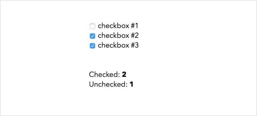
Checkboxes go into “checked” state when they’re ticked. The :checked pseudo-class indicates the checked state.
<input type=checkbox> checkbox #1<br>
<input type=checkbox> checkbox #2<br>
<input type=checkbox> checkbox #3<br>

<br>Checked: <b id=tickedBoxCount></b>
<br>Unchecked: <b id=unTickedBoxCount></b>
::root{
  counter-reset: tickedBoxCount, unTickedBoxCount;
}
input[type='checkbox']{
  counter-increment: unTickedBoxCount;
}
input[type='checkbox']:checked{
  counter-increment: tickedBoxCount;
}
#tickedBoxCount::before{
  content: counter(tickedBoxCount);
}
#unTickedBoxCount::before{
  content: counter(unTickedBoxCount);
}
Like I said before, this case is very simple. We set two counters at the root element and increment each for every checkbox for its two states, respectively. The counter values are then displayed in a designated place using content property.
If you want to understand better how CSS counters work, have a look at our previous post.
Below, you can see the final result. When you check and uncheck the checkboxes, the values of the “Checked” and “Unchecked” counters are modified real-time.
2. Text inputs
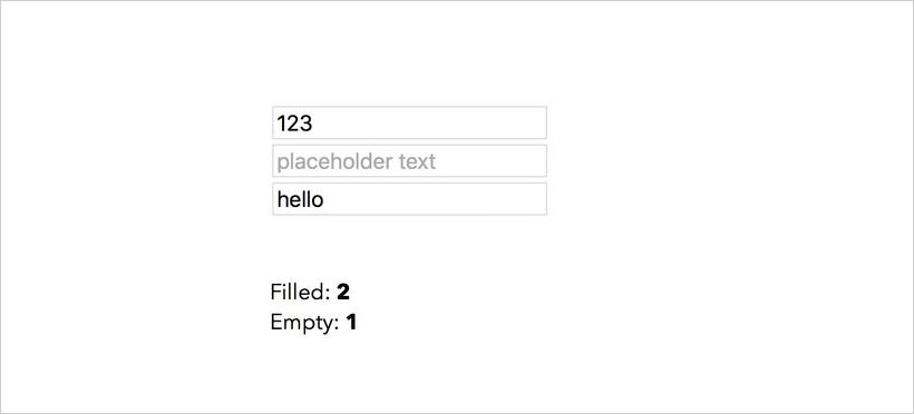
We can also count how many text inputs have been filled and how many have been left empty by the user. This solution won’t be as straightforward as the previous one, because, unlike checkboxes, text inputs don’t have pseudo-classes to flag when they’re filled.
So, we need to find an alternate route. There’s a pseudo-class that indicates when an element has placeholder text; it’s called :placeholder-shown.
If we use placeholders in our text input, we can know when the input field is empty. This happens when the user has not yet typed anything into it because the placeholder will disappear when that happens.
<input type=text placeholder='placeholder text'><br>
<input type=text placeholder='placeholder text'><br>
<input type=text placeholder='placeholder text'><br>

<br> Filled: <b id=filledInputCount></b>
<br> Empty: <b id=emptyInputCount></b>
::root{
  counter-reset: filledInputCount, emptyInputCount;
}
input[type='text']{
  counter-increment: filledInputCount;
}
input[type='text']:placeholder-shown{
  counter-increment: emptyInputCount;
}
#filledInputCount::before{
  content: counter(filledInputCount);
}
#emptyInputCount::before{
  content: counter(emptyInputCount);
}
The result is similar to the previous one—the two counters are automatically incremented and decremented as we add or remove text to or from the input fields.
3. Details
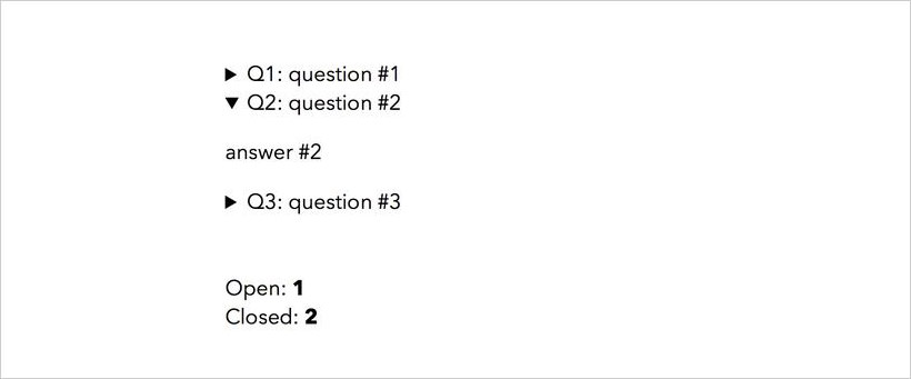
Alternate states of an element don’t always have to be indicated only by pseudo-classes. There might be HTML attributes doing that job, like in the case of the <details> element.
The <details> element displays the contents of its <summary> child element. When the user clicks that, other contents of the <details> element become visible. Note that <summary> element always needs to come first among the children of <details>.
So, <details> has two states: open and closed. The open state is indicated by the presence of the open HTML attribute in the element. This attribute can be targeted in CSS using its attribute selector.
<details>
  <summary>Q1: question #1</summary>
  <p>answer #1</p>
</details>
<details>
  <summary>Q2: question #2</summary>
  <p>answer #2</p>
</details>
<details>
  <summary>Q3: question #3</summary>
  <p>answer #3</p>
</details>
<br>
<br> Open: <b id=openDetailCount></b>
<br> Closed: <b id=closedDetailCount></b>
::root{
  counter-reset: openDetailCount, closedDetailCount;
}
details{
  counter-increment: closedDetailCount;
}
details[open]{
  counter-increment: openDetailCount;
}
#closedDetailCount::before{
  content: counter(closedDetailCount);
}
#openDetailCount::before{
  content: counter(openDetailCount);
}
The result is two real-time CSS-counters again: Open and Closed.
4. Radio buttons
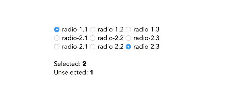
Counting radio buttons require a different technique. We could certainly use the :checked pseudo-class we used for checkboxes. However, radio buttons are used differently than checkboxes.
Radio buttons are meant to be in groups. The user can select only one inside a group. Each group acts as a single unit. The two states a radio button group can have is either one of the buttons is selected or none of them are selected.
Thus, we shouldn’t count radio buttons by individual buttons, but by button groups. To achieve that, we make use of the :nth-of-type selector. I’ll explain it later; let’s see the code first.
<input type=radio name='radio-1'>radio-1.1
<input type=radio name='radio-1'>radio-1.2
<input type=radio name='radio-1'>radio-1.3
<br>
<input type=radio name='radio-2'>radio-2.1
<input type=radio name='radio-2'>radio-2.2
<input type=radio name='radio-2'>radio-2.3
<br>
<input type=radio name='radio-3'>radio-2.1
<input type=radio name='radio-3'>radio-2.2
<input type=radio name='radio-3'>radio-2.3
<br>
<br> Selected: <b id=selectedRadioCount></b>
<br> Unselected: <b id=unSelectedRadioCount></b>
We need to assign the same name to the radio buttons in the same group. Each group in the code above has three radio buttons inside.
::root{
  counter-reset: selectedRadioCount, unSelectedRadioCount;
}
input[type='radio']:nth-of-type(3n){
  counter-increment: unSelectedRadioCount;
}
input[type='radio']:nth-of-type(3n):checked{
  counter-increment: selectedRadioCount;
}
input[type='radio']:not(:nth-of-type(3n)):checked{
  counter-increment: unSelectedRadioCount -1 selectedRadioCount;
}
#selectedRadioCount::before{
  content: counter(selectedRadioCount);
}
#unSelectedRadioCount::before{
  content: counter(unSelectedRadioCount);
}
The first three style rules in the above snippet are the same as the ones we applied to checkboxes, except, instead of targeting every radio button, we target the last radio button in each group, which is the third one in our case (:nth-of-type(3n)). So, we don’t count all the radio buttons but only one per group.
However, that won’t give us a correct real-time result, as we have not yet given any rule for counting the other two radio buttons in the group. If one of them is checked it should be counted & the unchecked result should decrease at the same time.
This is why we add a -1 value after unSelectedRadioCount in the last style rule that targets the other two radio buttons in a group. When one of them is checked, -1 will decrease the unchecked result.
The Placement of Counts
You can only see the correct result after the counting has been finished, i.e. after all the elements that are to be counted have been processed. This is why we need to place the element inside which we’ll display the counters only after the elements to be counted in the HTML source code.
You may not want to show the counters below the elements but somewhere else on the page. In this case, you need to reposition the counters using CSS properties such as translate, margin, or position.
But, my suggestion would be to use the CSS Grid so that you can create the layout of your page independent of the order of its elements in the HTML source code. For instance, you can easily create a grid that places the counters above or next to the input fields.
Read Also: Introduction to the CSS Grid Layout Module