Building Creative Websites Can Be Easy. Here’s How
Web designers, ready for some good news? We have some for you, and it involves designing creative websites.
The ever-expanding global market is creating an equally expanding number of opportunities. And with it increasing competition among businesses. Increased competition is having the effect of website designer clients insisting on more creativity to drive more sales.
That’s good news for Be Theme and its users because of its emphasis on creative designs and the vast number of options available.
The creative designs are just a start. Websites have to be both flexible and conversion-optimized. That’s where a web designer’s creativity comes into play, and that’s where customizable designs allow it to happen. Below, you’ll find five simple steps you can follow to create a website that’s not only awesomely attractive but fully equipped to convert visitors into users.
5 Steps to Building Creative Websites
Step 1: Choose a mesmerizing color palette
A typical color palette is a collection of colors. A creative color palette is one that’s on-brand, attracts instant attention, and does an excellent job of supporting the message.
Examples:
Artist is an excellent example of how BOLD color touches instantly attracts attention.

You’ll see the same in this Be Theme pre-built website. Notice how your eyes are instantly drawn to the center, and the headline.

Carbon8 cleverly aligns the color palette with its brand. Notice how effective using various shades of a primary color, in this case, green can be.

BeInsurance uses a color palette that is subtle yet crisp and does an excellent job of reinforcing their message.

If you need to appeal to a larger, perhaps more diverse audience, BeFestival offers a perfect example of how to proceed.

Step 2: Display crystal-clear images
This one’s obvious. If an image of your product or service is just a teeny-bit fuzzy on the edges, that’s the impression visitors are likely to get of your business. In any event, they’ll hope the images on the next page will be sharper.
When your clients can present their products and services with flair and clarity, it gives them an extra edge over the competition.
Examples:
BeStylist shows why this is so important. The image itself is a call to action.

You can do a similar website with RansomLTD. While different from the previous example, the importance of using sharp, high-density images is evident.

Zajno is in some respect, a mix of the two previous examples. It makes the web designer and the client both look good.

The Design Shop is another example of how to display your products with creativity and flair.

Step 3: Show visitors how your creativity benefits them
The objective in this step is not to show how creative you are, but to use your creativity to help visitors see themselves as customers.
Examples:
BeMarketing has a homepage video that does a great job of this. You can almost feel how practical and comfortable the shoe is.

Lane guides the visitor through flexible and functional workplace design.

BeSimple takes a minimalist approach using just the right graphics to convey the message.

BeTravelBlogger doesn’t rely on text to describe a travel blogger’s dream.

Step 4: Take advantage of white space to design creative websites
White space is the most important visual element you need to play around within your website design. You’re unlikely ever to use too much of it.
Examples:
Makespace has a clean design that carries a small but complete message.

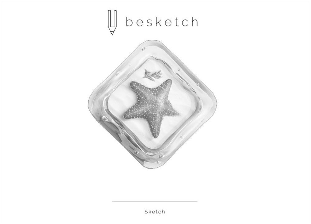
BeSketch and The Drive New York are a pair of creative websites that make the most of white space to enhance their critical elements and their message.

BeIcecream is perhaps THE most extreme use of white space to focus on the vital element. White space is an effective and compelling part of the brand.

Step 5: Make your CTAs impossible to ignore
To do that, they need to be big, bold, and bright. If your CTA doesn’t get immediate attention, it’s less likely to be clicked. If it grabs attention, however, the result is usually quite the opposite.
Examples:
BeDrawing has a CTA button that stands out with its a bold color, plus it’s big enough to draw attention immediately after the headline is read. It’s also positioned to serve as a "gate" that invites visitors to enter.

Stuart’s CTA buttons are clearly designed. The page itself could be described as creative or smart. It’s a pleasing mix of both.

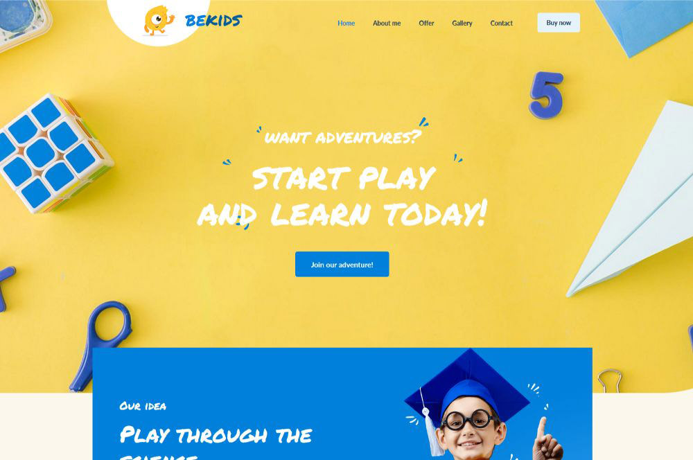
A great example is BeKids, where the CTA buttons color matches other design elements; a technique that helps them to stand out.
Wrapping it up on designing creative websites
You should find the above steps and ideas helpful as they give you a surefire way to build creative websites that feature eye-catching designs and are made with conversion in mind.
Bright, crisp, and stunning visuals and the clever use of white space is your secret to success. You also want to present product or services in a way that allows visitors to imagine themselves as users.
Unless you’re blessed with an extra dose of artistic brilliance, however, is at your creative best can and usually does take time. If you find yourself juggling multiple projects and tight deadlines, you might try using a pre-built website.
Once you do, you probably won’t go back to the "old way".
You’ll find the most comprehensive and useful gallery of creative websites imaginable on Be Theme. There are more than 450 pre-built websites to choose from and customize to your liking, and more are being added every month.