Create a Single Product Page with HTML5
In this tutorial, we’ll develop a single product page, using modern HTML5 techniques. We’ll incorporate methods previously discussed, including the <details> element and the CSS negation selector.
Let’s begin our project.
HTML5 Markup Overview
Let’s start by creating a basic HTML document with the following structure:
<div class="product">

  <header>
    <hgroup>
      <h1>Product Name - Specifications</h1>
      <h4>Catchy Tagline Here.</h4>
    </hgroup>
  </header>

  <figure>
    <img src="https://assets.hongkiat.com/uploads/html5-single-product-page/product-image.png" alt="Product Image">
  </figure>

  <section>
    <p>Description of the product with key features and benefits highlighted here.</p>
    <details>
      <summary>Product Features</summary>
      <ul>
        <li>Feature 1</li>
        <li>Feature 2</li>
        <li>Feature 3</li>
        <li>Feature 4</li>
        <li>Feature 5</li>
        <li>Feature 6</li>
      </ul>
    </details>
    <button>Buy Now</button>
  </section>

</div>
We utilize several HTML5 tags, such as header, hgroup, figure, section, and the previously discussed details and summary tags.
While we won’t delve deeply into these tags here, they are fundamental concepts readily available through various resources. If you’re new to HTML5, I recommend the following resources for a comprehensive understanding:
Let’s examine the initial layout of our page.

The layout starts with a header, followed by a section containing the image, description, and the ‘Buy Now’ button. Now, let’s enhance this basic page.
Styling the Page
We’ll begin by normalizing all default browser styles using a custom stylesheet. We will also add a gradient background to the html tag:
html {
  height: 100%;
  background: #f3f3f3;
  background: -moz-linear-gradient(top, #f3f3f3 0%, #ffffff 50%);
  background: -webkit-gradient(linear, left top, left bottom, color-stop(0%,#f3f3f3), color-stop(50%,#ffffff));
  background: -webkit-linear-gradient(top, #f3f3f3 0%, #ffffff 50%);
  background: -o-linear-gradient(top, #f3f3f3 0%, #ffffff 50%);
  background: -ms-linear-gradient(top, #f3f3f3 0%, #ffffff 50%);
  background: linear-gradient(to bottom, #f3f3f3 0%, #ffffff 50%);
  filter: progid:DXImageTransform.Microsoft.gradient(startColorstr='#f3f3f3', endColorstr='#ffffff', GradientType=0);
}
Our product elements are contained within a div with the class ‘product’. Here, we will center this wrapper and set its width to approximately 650px:
.wrapper {
  width: 650px;
  margin: auto;
  padding: 25px 0;
}
Styling the Header Section
In the header section, we style two headings, h1 and h4. Let’s apply some CSS to these elements:
h1, h4 {
  font-family: 'Helvetica Neue', Arial, sans-serif;
  font-weight: normal;
  margin: 0;
}
h1 {
  font-size: 24pt;
}
h4 {
  font-size: 16pt;
  color: #aaa;
}
Next, we’ll add a bit of spacing at the bottom of the header to separate it from the content below:
header {
  margin-bottom: 20px;
}
Noticing a lot of whitespace on the right side of the header, we can balance this by incorporating a logo:
Let’s place the Apple logo on the right side of the header:
header {
  margin-bottom: 20px;
  background: url('https://assets.hongkiat.com/uploads/html5-single-product-page/apple-logo.png') no-repeat right center;
}
Styling the Product Image
First, we’ll position the image to the left and limit its maximum width:
figure {
  float: left;
}
figure img {
  max-width: 350px;
}
With the image aligned to the left, we’ll float the description section to the right and set its width:
section {
  font-family: 'Tahoma', Arial, sans-serif;
  line-height: 150%;
  float: right;
  width: 300px;
  color: #333;
}
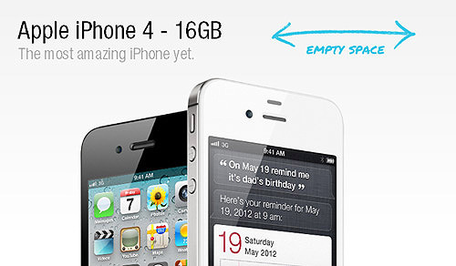
Here’s how our layout looks with these changes:

The layout is shaping up nicely, although the details tag may not function perfectly in all browsers yet. Next, we’ll focus on styling the ‘Buy Now’ button to enhance its appearance.
Styling the ‘Buy Now’ Button
For the button styles, we aim to replicate the aesthetic seen on the Apple.com Store. Below is the CSS needed to style the button accordingly:
button {
  background: #36a9ea;
  background: -moz-linear-gradient(top, #36a9ea 0%, #127fd2 100%);
  background: -webkit-gradient(linear, left top, left bottom, color-stop(0%, #36a9ea), color-stop(100%, #127fd2));
  background: -webkit-linear-gradient(top, #36a9ea 0%, #127fd2 100%);
  background: -o-linear-gradient(top, #36a9ea 0%, #127fd2 100%);
  background: -ms-linear-gradient(top, #36a9ea 0%, #127fd2 100%);
  background: linear-gradient(to bottom, #36a9ea 0%, #127fd2 100%);
  filter: progid:DXImageTransform.Microsoft.gradient(startColorstr='#36a9ea', endColorstr='#127fd2', GradientType=0);
  border: 1px solid #00599d;
  color: #fff;
  padding: 8px 20px;
  border-radius: 3px;
  box-shadow: 0px 1px 1px 0px rgba(0, 0, 0, 0.1), inset 0px 1px 0px 0px rgba(250, 250, 250, 0.3);
  text-shadow: 0px 1px 1px #156cc4;
  font-size: 10pt;
}

button:hover {
  background: #2f90d5;
  background: -moz-linear-gradient(top, #2f90d5 0%, #0351b7 100%);
  background: -webkit-gradient(linear, left top, left bottom, color-stop(0%, #2f90d5), color-stop(100%, #0351b7));
  background: -webkit-linear-gradient(top, #2f90d5 0%, #0351b7 100%);
  background: -o-linear-gradient(top, #2f90d5 0%, #0351b7 100%);
  background: -ms-linear-gradient(top, #2f90d5 0%, #0351b7 100%);
  background: linear-gradient(to bottom, #2f90d5 0%, #0351b7 100%);
}

button:active {
  background: #127fd2;
  box-shadow: inset 0px 2px 1px 0px rgba(0, 47, 117, 0.5), 0px 1px 1px 0px rgba(0, 0, 0, 0);
}
The button now sports a polished look, enhancing the page’s overall design.
Implementing Fallback for the ‘Details’ Element
In this section, we aim to provide similar functionality for the details element in browsers other than Chrome. Previously, we automated this process with a script, but now we’ll handle it manually.
Note: As a quick recap, the details element is primarily supported in the Chrome browser.
Let’s start with the CSS adjustments. We’ll make the summary tag appear clickable by changing the cursor style:
summary {
  cursor: pointer;
  font-size: 12pt;
  outline: none;
}
Next, we’ll add vertical margins to the details element to create more space around it:
details {
  margin: 20px 0;
}
By default, the summary tag displays an arrow. We’ll replace this with a plus-minus icon. Before we proceed, remember that I have previously downloaded icons from this Fugue collection and combined them into one sprite file.
We’ll add a pseudo-element before the summary to attach the plus icon as its background:
details > summary:before {
  width: 16px;
  height: 16px;
  display: inline-block;
  content: '' !important;
  background: url('../https://assets.hongkiat.com/uploads/html5-single-product-page/plus-min.png') no-repeat center top;
  margin-right: 5px;
  position: relative;
  top: 2px;
}
When the details element is open, the background position shifts to display the minus icon:
details[open] > summary:before,
details.open > summary:before {
  background: url('../https://assets.hongkiat.com/uploads/html5-single-product-page/plus-min.png') no-repeat center bottom;
}
The [open] selector targets the open attribute of the details element in supported browsers.
We will also hide the default arrow in Chrome:
details > summary::-webkit-details-marker {
  display: none;
}
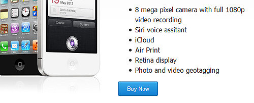
Here’s how it looks with our new icon:

The default arrow has been replaced, and in Chrome, clicking the summary toggles the icon. However, this effect isn’t replicated in other browsers yet. In the next step, we’ll explore how to achieve this with jQuery.
Implementing a Toggle Effect with jQuery
Before diving into the jQuery script, I’d like to acknowledge Ian Devlin for his inspirational work. The script below is a slight modification of his original concept.
First, we create a variable to store the summary element:
var summary = $('details summary');
Next, we’ll wrap all sibling elements of summary within a div:
summary.siblings().wrapAll('<div></div>');
We’ll then hide this div when the details element does not have the ‘open’ class:
$('details:not(.open) summary').siblings('div').hide();
Upon clicking summary, the hidden div will toggle visibility:
summary.click(function() {
    $(this).siblings('div').toggle();
    $('details').toggleClass('open');
});
This script will only run in browsers that do not support the details element:
if ($('html').hasClass('no-details')) {
    var summary = $('details summary');
    summary.siblings().wrapAll('<div class="slide"></div>');
    $('details:not(.open) summary').siblings('div').hide();
    summary.click(function() {
        $(this).siblings('div').toggle();
        $('details').toggleClass('open');
    });
}
Let’s test the toggle effect in various browsers. I have verified it works as far back as Internet Explorer 7.
Tips: For a smoother transition, replace .toggle() with .slideToggle() for a sliding effect. Additionally, if you want the details element to be open by default, simply add an ‘open’ class to it.
Conclusion
We’ve covered every step needed to create a single product page using HTML5, including solutions for unsupported browsers and replicating the toggle effect for the details element. I hope this tutorial has been informative and useful for your projects.
While I’ve tried to make everything clear, I realize some aspects may require further explanation. If you have any questions, please don’t hesitate to ask in the comments section below.