30 Catastrophic Design Fails
Designers do not get enough love from the people they work with. Sometimes they make it look so easy that you’d go, “Hey, I can do that too.” These 30 examples will show you that some people are born to design, and others will just give you a brain aneurysm.
Some of the featured designs are terrible even for the 90s, some were just made by randomingly picking and throwing Word Art elements into the mix. Others are just utterly hilarious and horrifying. All in all, this roundup is a good example of why businesses and institutions should probably hire professional graphic artists and web designers to do their design work for them.
Are you ready to cringe and facepalm super hard? You’ve been warned.
1. Mobile (“Computer Repair”) Doctor
A computer repair service’s website that does not inspire confidence because of their terrible copy. It should also be a crime to have that many (parentheses) and "double quotes" in the same confined space.

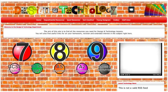
2. Fun Bad Poster
An actual poster for a local pizzeria in Boston.

3. Lazy Yet Subtle Karaoke Poster
Overuse of text art from the 90s.

4. Forced Acronym Award Nominee
Kids, this is not how acronyms work. This is how anti-acronyms work.

5. Rape Guts? Rape Huts?
This copy was doing so well and then the designer decided to get stylish with letters.

6. Designed to Give Eyestrains
Don’t you feel like hitting a brick wall?
7. That Tongue
Everything about the placement of that tongue is inappropriate.

8. DeSiGn LiKe A fOUrtEen YeArOLd
Whoever thought that alternating cases helps with text needs a good shaking.

9. Another Nominee For The Most Forced Acronym Award
That’s not how ANY of this works. And what is a flexible air interface?

10. Doing Things With Cans Are Illegal
We know littering is illegal but there seems to be something more happening with this can here. Just avoid cans, period.

11. Overusing Memes
Please do not abuse memes in an attempt to be “current”.

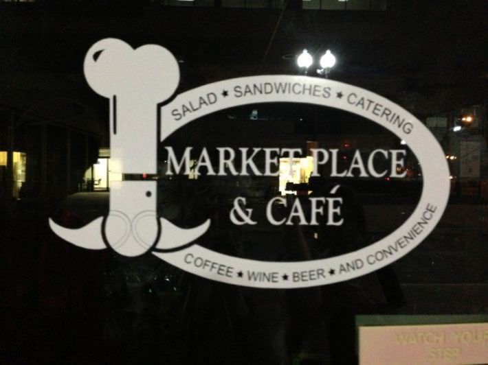
12. Chef’s Hat?
A fine example of a Freudian design slip.
13. School Logo
While there isn’t anything really wrong with the logo, it isn’t something that would inspire professionalism.

14. Registration Form Fail
A registration form that is obstructed by a rogue element. We are already living in a post-non-responsive website world, folks.

15. Bedsheet Background
Another fine relic of the past, only worse: a repeating background that takes too much attention, heavy borders and glaring colors.

16. WiFi Logo Fail
Can you spot it? This isn’t the logo for WiFi access.

17. Family Advocacy Program
A self-defeating acronym for an organization that promotes family values.

18. ChURrch
What’s missing here is a good proofreader.

19. Barff
Aside from the vomitous name, the opacity of the letters are terrible.

20. Catholic University Magazine
An unfortunate acronym from Catholic University Magazine, coupled with terrible layouting skills.

21. Inky Website Design Fail
Can you guess what the name of this website is? Go ahead, give it a shot. There’s at least a dozen clues.

22. Writer and Illustrator’s Website
That does not inspire confidence when it comes to their creativity.

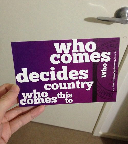
23. Who Comes Who What Now?
I can’t even place a good title for this one, the typography is simply terrible in many instances. It’s unreadable!
24. The Eat
Everyone loves to eat, but only the designer of this mug knows that that should be “cat”.

25. Website Stock Photo Fail
There isn’t much to say except for one note for designers: always double and triple check your stock photos.

26. Kickboxing Turned Racist
For a world that expects everyone to be politically correct, designers should also observe the custom. In this case, a wholesome logo just supported white supremacism.

27. It’s Not It’s Me You
Another prime example of a typography design fail.

28. News Website Design Fail
This is one good reason why people use Adblock. Remember, if your design looks great, but ads are on the way, or it’s just everywhere, people will leave your site immediately.

29. Unfortunate Reflection
Before playing with reflections, maybe make sure the end result doesn’t spell something new and entirely inapporpriate.

30. Is This Real?
…

How are you feeling so far? Should we call the cops or an ambulance? How did these designs make you feel? Any more design fails to share?