Accelerate Web Development with Foundation 5: A Comprehensive Guide
Adopting a frontend framework can revolutionize your web design process in several ways. It empowers you to adhere to modern design standards such as a mobile-first philosophy, semantic markup, and responsive design. By taking advantage of numerous pre-made CSS and JavaScript components, you can drastically enhance the speed of your development work, allowing you more time to concentrate on the aesthetics and user experience aspects.
Zurb Foundation 5 stands out as one of the leading frontend frameworks available today. It’s structured in a logical manner, user-friendly, and entirely free. The framework offers a versatile CSS grid system that aids in crafting neat, user-centric designs. Additionally, Foundation is thoroughly tested to ensure compatibility across different browsers and devices. See their compatibility guide for more details.
In this tutorial, I will guide you through how to quickly construct a website using Zurb Foundation 5. You can view the end result on the demo page. While I’ll be setting up the site’s layout, I’ll leave the addition of subtle design touches to you. The site we’re going to build together will fulfill every modern UX designer’s wish: it will be responsive, prioritize mobile, be user-friendly, and maintain semantic integrity.
This guide is quite detailed, so here are some shortcuts to help you navigate to specific sections more easily:
- Downloading Foundation 5
- Understanding the Grid
- Adding the Top Menu Bar
- Filling the Main Section
- Enhancing The Sidebar
- Wrapping Up
Downloading Foundation 5
You can download Foundation 5 in four distinct variations:
- the complete package
- a basic version containing only essential components
- a customizable version allowing you to select specific features
- a Sass version for those who prefer to customize variables and mixins in SCSS
For the purposes of this tutorial, I’ll be using the Complete package with vanilla CSS. However, you’re free to choose any version that suits your project’s needs, enabling you to keep your site lean by using only the components you actually need.
Once you’ve downloaded and extracted the ZIP file, opening the index.html file in your browser will present you with a page similar to this:
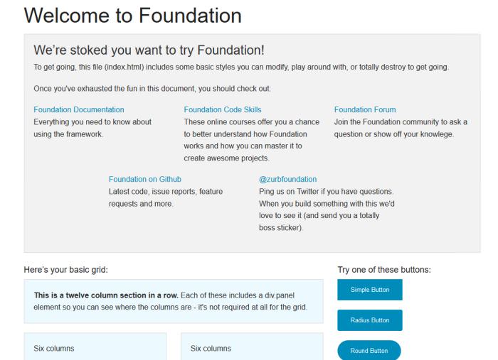
Indeed, the developers have included useful links right within the index file. While you can start building on this template by creating a new file (perhaps naming it home.html), accessing the Foundation Documentation is straightforward, rendering the preservation of this file unnecessary.
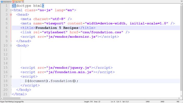
Launch your preferred code editor and erase all content within the <body> tag, stopping just before the closing <script> tags.
Modify the <title> tag within the <head> section to reflect your page’s title; for instance, “Foundation 5 Recipes” will be my choice.
The demonstration will be themed around food-related content, culminating in a final appearance akin to the following:

Understanding the Grid
By its design, Foundation 5 structures the screen using rows and columns. Rows are identified by the CSS class “row” and columns by the class “columns”.
The naming of CSS selectors in Foundation is intuitive. The framework incorporates three distinct grid systems:
- Small Grid for mobile screens
- Medium Grid for tablets
- Large Grid for desktops
The transitions between the Small, Medium, and Large Grids occur at screen widths of 641px and 1025px:
- Small Grid applies from 0 to 640px
- Medium Grid from 641 to 1024px
- Large Grid from 1025px onwards
Each grid system consists of 12 columns by default, a choice made because the number 12 is divisible by 2, 3, 4, and 6, offering numerous layout possibilities.
Should you opt for the “Custom Download” at the initial step, you have the flexibility to choose a different number of columns for more complex designs. However, we’ll stick to the standard 12 columns for this example.
Our planned layout will consist of a single large column on mobile and tablet views, and include a right sidebar on desktop views. Here’s a screenshot of the intended desktop layout filled with Cupcake Ipsum placeholder content:
A crucial practice is to maintain a clean grid structure.
Always start by adding a “row”. Within this row, you’ll insert columns, ensuring their total number equals 12. Deviating from this total disrupts the grid’s functionality.
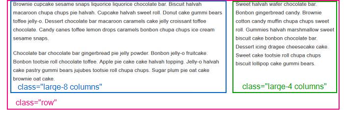
In our desktop example, I’ve allocated 8 columns for the main content on the left and 4 columns for the sidebar on the right.
Let’s examine the corresponding code. First, we define a <div> with the “row” class to encompass the entire page layout. It’s possible to nest additional rows within this primary one, as Foundation allows for unlimited nesting of rows and columns. Within every row, columns must be defined that collectively equal 12. These columns are designated with the “columns” class and an appropriate “large-n”, “medium-n”, or “small-n” class to specify their size.
 <div class="row">
	 <div class="large-8 columns">
	 <p>Content for the Main Section</p>
	 </div>

	 <aside class="large-4 columns">
	 <p>Content for the Sidebar</p>
 </aside>
 </div>
Choosing Between Large-n, Medium-n, and Small-n Classes
You may be wondering why I specified only the “large-8” and “large-4” classes without addressing the Small and Medium Grids. Recall that our layout plan includes a sidebar exclusively at desktop sizes, corresponding to the Large Grid, while mobile and tablet sizes feature a singular, expansive column.
Foundation’s logic is simple: you only need to specify the smallest grid size that your layout will adapt to. This approach ensures your layout is responsive and adaptable across devices.
To better understand, try resizing your browser window to see how the layout adjusts. With the current code, you’ll observe that the sidebar automatically repositions under the main content on mobile and tablet views.
Modify the “large-8” and “large-4” classes to “medium-8” and “medium-4” and notice the layout now includes a sidebar for both tablet and desktop views, but excludes mobile. This highlights the importance of setting the smallest grid size necessary for your desired layout.
For experimentation, switch the classes to “small-8” and “small-4”. This change will render the sidebar visible across all device sizes, including mobile.
Foundation 5 emphasizes a mobile-first approach to web development. This means you should prioritize mobile screen design since, within the Foundation framework, larger grids inherit the styling of their smaller counterparts, but not vice versa. Thus, the Medium and Large Grids build upon the Small Grid’s foundation, and the Large Grid extends the Medium Grid’s styling, ensuring a seamless transition across devices.
Adding the Top Menu Bar
For the third step, we’re going to enhance our site with a Top Menu Bar that includes a two-level dropdown submenu. This top bar isn’t part of the 2:1 desktop layout from Step 2. Thus, you should insert the code snippet we’ll craft in this step above the layout code added previously.
The top menu bar will feature the site’s name (“Foundation 5 Recipes”) on the left, accompanied by various menu items. On the right, we’ll place two utility menu items for added functionality.
By the end of this step, our site will present itself like this:
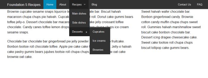
We’ll achieve this look by utilizing the Top Bar feature from Foundation 5, ensuring semantic correctness by nesting the top menu bar within a <header> tag.
The following code is a modified version from the official Foundation documentation. I’ve made slight adjustments by adding content and altering the order of list elements for a more customized feel. Class names like “has-dropdown” and “dropdown” clearly indicate their functionality. Additionally, I’ve applied Foundation’s “contain-to-grid” and “sticky” classes to the header for a fixed position effect.
<header class="contain-to-grid sticky">
  <nav class="top-bar" data-topbar role="navigation">
    <ul class="title-area">
      <li class="name"><h1><a href="#">Foundation 5 Recipes</a></h1></li>
      <li class="toggle-topbar menu-icon"><a href="#"><span>Menu</span></a></li>
    </ul>
    <section class="top-bar-section">
      <ul class="left">
        <li class="active"><a href="#">Home</a></li>
        <li><a href="#">About</a></li>
        <li class="has-dropdown"><a href="#">Recipes</a>
          <ul class="dropdown">
            <li><a href="#">Main dishes</a></li>
            <li><a href="#">Side dishes</a></li>
            <li class="has-dropdown"><a href="#">Desserts</a>
              <ul class="dropdown">
                <li><a href="#">Cupcakes</a></li>
                <li><a href="#">Ice creams</a></li>
                <li><a href="#">Brownies</a></li>
              </ul>
            </li>
          </ul>
        </li>
        <li><a href="#">Blog</a></li>
      </ul>
      <ul class="right">
        <li><a href="#">Contact Us</a></li>
        <li><a href="#">FAQ</a></li>
      </ul>
    </section>
  </nav>
</header>
If you copy-pasted this snippet into your index file, take a quick peek on it on mobile size and check out how cool it looks.
Filling the Main Content Area
In this step, we focus on enriching the main content area of our webpage. All code snippets introduced here should be placed within the <div class=”large-8 columns”> segment established in Step 2.
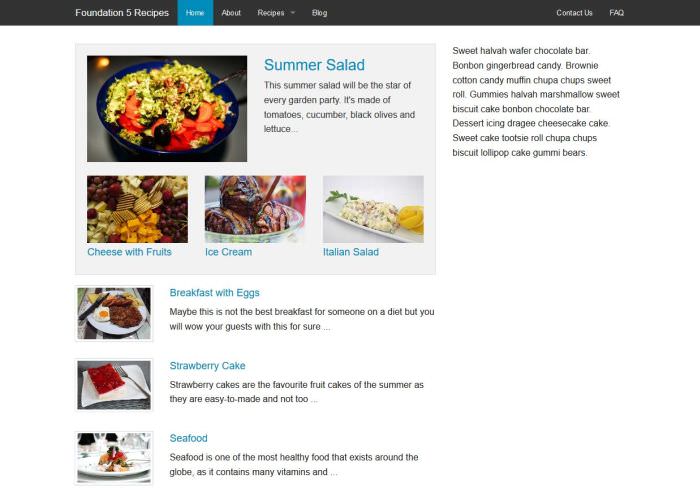
By completing this stage, our demo site’s appearance will significantly enhance, closely resembling the following:
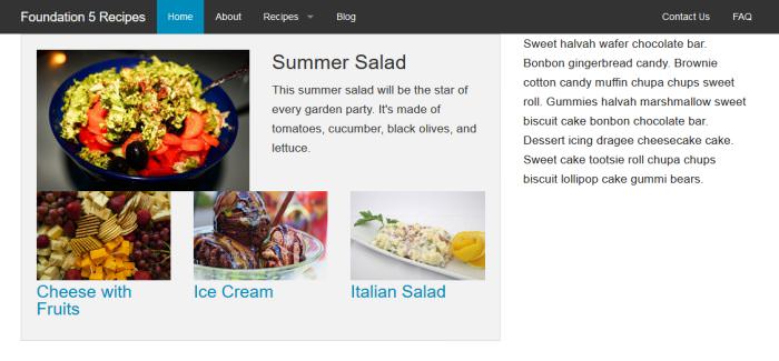
Adding a Popular Posts Panel
We begin by introducing a “Popular” section, showcased within a light gray box in the screenshot above, utilizing a Foundation Panel.
Step 4.1 involves crafting a prominent post, depicted in the demo as “Summer Salad”, accompanied by a large image and a succinct description. Following this, in Step 4.2, we will append three smaller, popular posts with lesser-sized images below it.
This entire section is encapsulated within the “panel” class, a preset CSS class by Foundation 5. Within this panel, we insert a new row, our initial nested row. On tablet and desktop views, this row is equally divided: one half for the image and the other for the subtitle and description.
Given the small screen’s limitations, where the image would appear minuscule, we opt for positioning the text beneath the image. Setting this 50-50 layout from the medium screen onwards, we employ the “medium-6 columns” CSS class for the columns.
Additionally, a custom CSS class named “popular-main” is applied to the nested row. This is not a Foundation 5 class but our own, added to facilitate the integration of personalized style rules. Feel free to incorporate as many custom CSS selectors into your Foundation project as desired.
<div class="panel">
  <div class="row popular-main">
    <div class="medium-6 columns">
      <img src="img/summer-salad.jpg" alt="Summer Salad">
    </div>
    <div class="medium-6 columns">
      <h3><a href="#">Summer Salad</a></h3>
      <p>This summer salad will be the star of every garden party. It's made of tomatoes, cucumber, black olives and lettuce...</p>
    </div>
  </div>
  <!-- Additional Popular Posts will come here in Step 4.2 -->
</div>
Adding 3 More Posts to the Popular Panel
We want to show the 3 additional posts only to tablet and desktop visitors, as 4 popular posts inside the Popular Panel would be too much distraction for people who will browse our site on small screens.
To achieve this goal we will make use of Foundation 5’s handy visibility classes. Foundation has many of them and their names such as “show-for-small-only” and “hide-for-large-up” clearly describe what they do.
Here we will choose the “show-for-medium-up” which will show the additional posts only on tablet and desktop size. Just like in Step 4.1, we will use the medium-n classes here too, as the smallest screen we want to show this layout is the tablet screen.
As this time we want to divide the row into 3 equal columns, we use the “medium-4 columns” CSS selector 3 times. We also add our own CSS class called “popular-additional” with the purpose of facilitating the custom styling later.
<div class="row popular-additional show-for-medium-up">
  <div class="medium-4 columns">
    <img src="img/cheese.jpg" alt="Cheese">
    <h4><a href="#">Cheese with Fruits</a></h4>
  </div>
  <div class="medium-4 columns">
    <img src="img/ice-cream.jpg" alt="Ice Cream">
    <h4><a href="#">Ice Cream</a></h4>
  </div>
  <div class="medium-4 columns">
    <img src="img/italian-salad.jpg" alt="Italian Salad">
    <h4><a href="#">Italian Salad</a></h4>
  </div>
</div>
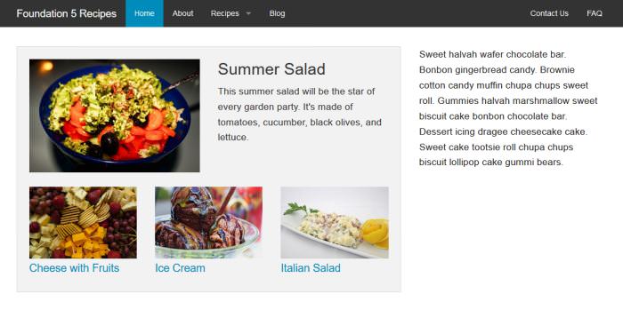
Prettying Up the CSS
If you followed this tutorial by creating your own demo code you will see that our demo site has some layout flaws (see below), so it’s time to add some layout adjustments to our CSS.
To add our own style we will create a custom CSS file called app.css (like how the Foundation Docs recommend it in the CSS Best Practices section).
Let’s open up the /css folder in our demo folder, create an empty text file and name it app.css. Finally open it up in a text editor.
Of course we also need to add the new custom CSS file to the <head> section of the index.html file below the foundation.css stylesheet. Now the <head> section of the index file looks like this:
<head>
  <meta charset="utf-8" />
  <meta name="viewport" content="width=device-width, initial-scale=1.0" />
  <title>Foundation 5 Recipes</title>
  <link rel="stylesheet" href="css/foundation.css" />
  <link rel="stylesheet" href="css/app.css" />
  <script src="js/vendor/modernizr.js"></script>
</head>
The style rules that we add to the app.css file to pretty up our prototype are these:
header {
  margin-bottom: 2em;
}
.popular-additional h4 {
  font-size: 1.125em;
  margin-top: 0.4em;
}
.row .row.popular-main {
  margin-bottom: 1.5em;
}
As Foundation 5 uses relative units, we need to use “em”-s or “rem”-s instead of pixels to keep up with the rules. (You can read about CSS units: Pixels vs ems vs % here.) I used Firefox’s Firebug extension to determine where I have to override Foundation 5’s CSS rules, you can use any other web development browser extensions if you want.
Here in this short CSS snippet we only had to override Foundation’s default CSS only once, at the last rule (.row .row.popular-main). Here’s what the demo site looks like now:
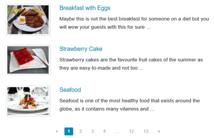
Adding Some More Content
Using the same rules as before we will add some more content to the main section of the page. The content that we will add now will be the Latest Posts with small thumbnails.
Foundation 5 has really cool pre-prepared thumbnail styles that we will make use of in this Step. Foundation Thumbnails use a pre-built CSS class called “th” that we need to add to the images we want to display as thumbnails in the way you can see it in the code snippet below.
For each Latest Post we add a new row below the Popular Panel with our custom CSS class called “latest-post”.
On tablet and desktop size we will show a small thumbnail using Foundation’s thumbnail class on the left, and the title and a short description on the right. On mobile, the headline and the description will go below the thumbnail.
Now I used the “medium-3 columns” and “medium-9 columns” classes to make them divide the screen into 1:3, 25% for the image and75% for the text up from medium size.
Insert the following code snippet below the Popular Panel three times (for the three Latest Posts). Here I just include the code of one Latest Post row, as all of them use the same HTML markup, only the content differs.
<div class="row latest-post">
  <div class="medium-3 columns">
    <a class="th" href="img/full-size-image.jpg">
      <img src="img/thumbnail-size-image.jpg" alt>
    </a>
  </div>
  <div class="medium-9 columns">
    <h4><a href="#">Title of Latest Post</a></h4>
    <p>Content of Latest Post... </p>
  </div>
</div>
Our custom CSS file created in Step 4.3, app.css also gets some new style rules to keep the looks of the demo tidy. Note: If you want to add your own custom CSS to Foundation, never forget to check, with a web dev tool, where you have to override the default rules.
In the CSS snippet below we need to override them in the first rule (.row .row.latest-post). In the second rule it’s enough to just use our own custom selector (.latest-post h4).
.row .row.latest-post {
  margin-bottom: 1.5em;
}
.latest-post h4 {
  margin-top: 0;
  font-size: 1.125em;
}
Our prototype now looks like this:
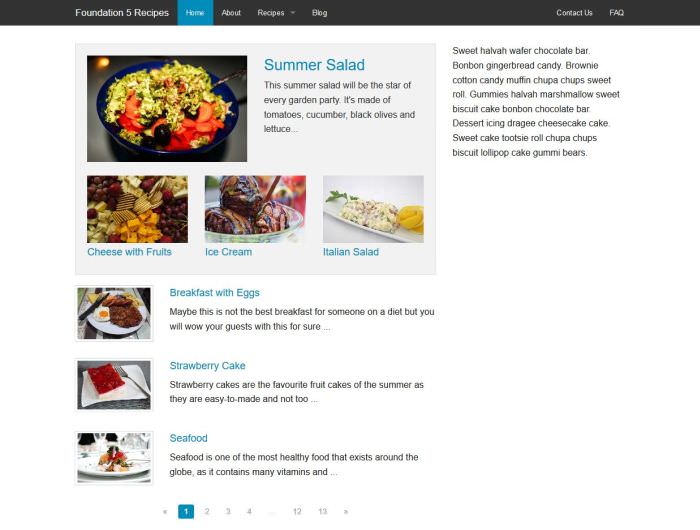
Adding Pagination
In this step we will add a cool pagination below the Latest Posts. Foundation 5 gives us a helping hand by its convenient, ready-to-use pagination classes. We use the same code in this step that you can find in the “Advanced” section inside the Pagination Docs.
<div class="pagination-centered">
  <ul class="pagination">
    <li class="arrow unavailable"><a href>«</a></li>
    <li class="current"><a href>1</a></li>
    <li><a href>2</a></li>
    <li><a href>3</a></li>
    <li><a href>4</a></li>
    <li class="unavailable"><a href>…</a></li>
    <li><a href>12</a></li>
    <li><a href>13</a></li>
    <li class="arrow"><a href>»</a></li>
  </ul>
</div>
Here are the Latest Posts with the newly added Pagination section:
Populating the Sidebar
Now that we are ready with the main content of our demo site, it’s time to populate the right sidebar. The right sidebar will slip below the main content on mobile and tablet sizes.
You need to insert all the code snippets in this section inside the <aside class=”large-4 columns”> HTML tag that we set for the sidebar in Step 2.
The left sidebar will contain a Newsletter Sign Up Form (1), a Latest Video (2) and an accordion-style Sidebar Menu under the nickname “Our Cookbook” (3).
At the end of this step we will be ready with our demo that will look like this:
The Newsletter Form
To build a form in Foundation 5, you don’t have to do anything else, just place the grid inside a <form> HTML tag.
If you take a look at the code snippet below, you will see that we put the form in a row in which we set different CSS selectors for all the 3 grids: “small-12”, “medium-9”, and “large-12”.
We chose this solution because a 100% wide Newsletter Form looks cool on mobile size, but it’s really really awkward on tablet size as it becomes very wide. Luckily Foundation 5 lets us use “Incomplete Rows”: we just have to add the “end” class to the CSS class definition of the incomplete column.
So this is what’s going to happen here: on mobile size the sidebar will be displayed below the main content with a Newsletter Sign Up Form that covers the whole screen.
On medium size the sidebar will remain under the main content, but the Newsletter Form will just cover the 75% of the screen, and the remaining 25% will stay empty.
On desktop size the sidebar will be right next to the main content, and the Newsletter Form will cover the whole width of the sidebar again.
See the Grid Docs to read more about Incomplete Rows.
<div class="row">
  <div class="small-12 medium-9 large-12 columns end">
    <h5>Sign Up To Our Newsletter</h5>
    <form>
      <div class="row collapse">
        <div class="small-8 columns">
          <input type="text" placeholder="your@ema.il">
        </div>
        <div class="small-4 columns">
          <a href="#" class="button postfix">Send</a>
        </div>
      </div>
    </form>
  </div>
</div>
Now take a look inside the <form> tag in the code snippet above. We use Foundation’s built-in form system with the Postfix Button option (class=”button postfix”).
Foundation Forms have many other layout options such as Prefix Label, Prefix Radius Label, Postfix Button, and Postfix Label. We chose the Postfix Button option here as it’s more user-friendly: users can click on it and send the form at once.
Inside the form we will add a new nested row that divides the screen to 2:1. The text input will get 8 columns and the postfix button will get 4. As we want to have this layout even on mobile screen, we will set the “small-8 columns” and “small-4 columns” CSS-selectors here, the Small Grid being the smallest size where we want to implement this markup.
You can see another new thing in the HTML code above which is the “row collapse” class. This is Foundation 5’s built-in style. By default there is a gutter between two adjacent columns, but if we add the “collapse” class to our row, the gutter will disappear. We do this because we want the button to be right next to the text input without any space between them.
Now it’s time to insert this code snippet into the <aside> section of your HTML file.
Flex Video
Below the Newsletter Section we will add a Daily Video Recipe to our sidebar. Foundation 5 helps us make embedded videos responsive and force them to scale automatically with its Flex Video feature.
Flex Videos use the built-in “flex-video” CSS class. We create a new row for the Daily Video Recipe sidebar section and place one wide column in it with the “small-12 medium-9 large-12 columns end” CSS selectors for the same reason we used an incomplete row in the Medium Grid in the previous step.
Here is the code you need to paste below the Newsletter Section. You can use any video from Youtube, Vimeo etc.
<div class="row">
  <div class="small-12 medium-9 large-12 columns end">
    <h5>Daily Video Recipe</h5>
    <div class="flex-video">
      <iframe width="560" height="315" src="https://www.youtube.com/embed/PAtt_K3Tjjk" frameborder="0" allowfullscreen></iframe>
    </div>
  </div>
</div>
The Sidebar Menu
For the Sidebar Menu we will use the Accordion feature of Foundation 5. Accordions are web elements that expand and collapse the content into logical sections.
On our demo site these logical sections are the 3 different food groups (Main Dishes, Side Dishes, Desserts), and each group contains more smaller groups such as “Poultry”, “Pork”, “Beef”, “Vegetarian”.
We place the whole sidebar Accordion into one wide column with the same logic as in the 5.1 and 5.2 Steps before. We put the accordion inside it as an unordered list with the appropriate built-in CSS classes such as “accordion” and “accordion-navigation”.
As Foundation Accordions work with JavaScript, you can customize its behavior with the help of pre-built JavaScript variables if you want. To do so, look at the “Optional JavaScript Configuration” section in the Accordion Docs. The following code snippet comes below the Flex Video section inside the index.html file.
<div class="row">
  <div class="small-12 medium-9 large-12 columns end">
    <h5>Our Cookbook</h5>
    <ul class="accordion" data-accordion>
      <li class="accordion-navigation">
        <a href="#panel1a">Main dishes</a>
        <div id="panel1a" class="content active">
          <ul>
            <li><a href="#">Poultry</a></li>
            <li><a href="#">Pork</a></li>
            <li><a href="#">Beef</a></li>
            <li><a href="#">Vegetarian</a></li>
          </ul>
        </div>
      </li>
      <li class="accordion-navigation">
        <a href="#panel2a">Side dishes</a>
        <div id="panel2a" class="content">
          <ul>
            <li><a href="#">Potato dishes</a></li>
            <li><a href="#">Vegetables</a></li>
            <li><a href="#">Salads</a></li>
            <li><a href="#">Rice recipes</a></li>
          </ul>
        </div>
      </li>
      <li class="accordion-navigation">
        <a href="#panel3a">Desserts</a>
        <div id="panel3a" class="content">
          <ul>
            <li><a href="#">Fruit cakes</a></li>
            <li><a href="#">Brownies</a></li>
            <li><a href="#">Ice creams</a></li>
            <li><a href="#">Pies</a></li>
          </ul>
        </div>
      </li>
    </ul>
  </div>
</div>
Conclusion
Now that we are ready with our demo site, let’s see what else you can accomplish with Foundation 5. The elements we used in this demo are just a small set of the features of the Foundation framework. There are many other things you can make use of in your design, such as customizable Icon Bars, Breadcrumbs, Lightboxes, Range Sliders, Form Validation, and many others. The Docs are pretty well-written and they help developers with many code examples.
If you are familiar with Sass you have even more options as each section in the Docs explains how you can build your own mixins, and which Sass-variables you can use to customize your site. Before you start to design your webpage don’t forget to check the compatibility of the Foundation framework to make sure it works on all browsers you need to build for.