Advanced Checkbox Styling with CSS Grid
The CSS Grid Layout Module can not only solve a mammoth of a layout problem but also some good old mulish issues we’ve been dealing with for a long time, such as styling a checkbox label.
While there’s a relatively straightforward method to style the label when it appears after the checkbox, it’s not that easy when the label appears before it.
Read Also: Guide to CSS Grid Layout Fr Unit
Checkbox styling without CSS Grid
Styling a label after a checkbox is something us developers have been doing ever since we read about it somewhere. This technique is one of the prime and old examples of the powerful dynamics that CSS can possess.
Here’s the code you already might be familiar with, that styles a label after a checked checkbox:
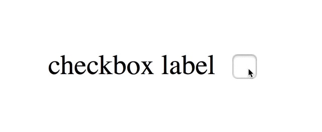
<input type="checkbox">
<label>label for the checkbox</label>
input:checked + label {
  /* style me */
}
A styled label after a checkbox might look like this (however, you can use other style rules as well):

The above CSS code uses the adjacent sibling combinator marked by the + key. When a checkbox is in the :checked state, an element after it (usually a label) can be styled using this method.
Such a simple and effective technique! What could possibly go wrong with it? Nothing—until you want to display the label before the checkbox.
The adjacent sibling combinator selects the next element; this means the label has to come after the checkbox in the HTML source code.
So, to make a label appear before the belonging checkbox on the screen, we can’t just move it before the checkbox in the source code, as a previous sibling selector doesn’t exist in CSS.
Which leaves only one option: repositioning the checkbox and the label using transform or position or margin or another CSS property with some kind of telekinetic power, so that the label appears to the left of the checkbox on the screen.
Problems with the traditional method
There’s nothing majorly wrong with the aforementioned technique but it can be inefficient in certain cases. I mean cases in which the rearranged positions of the checkbox and the label don’t work anymore.
Think responsive, for instance. You might have to resize or reposition the checkbox according to the device it’s displayed on. When that happens, you will need to reposition the label as well, as there’ll be no automatic realignment done to the label in response to the repositioning/resizing of the checkbox.
We can eliminate this disadvantage if we could just provide some solid layout for the checkbox and the label, instead of roughly positioning them on the page.
But, almost all layout systems, such as tables or columns, require you to add the label before the checkbox in the source code to make it appear the same way on screen. That’s something we don’t want to do because the next element selector on the label will stop working.
CSS Grid, on the other hand, is a layout system that is not dependent on the placement/order of elements in the source code.
The reordering capabilities of grid layout intentionally affect only the visual rendering, leaving speech order and navigation based on the source order. This allows authors to manipulate the visual presentation while leaving the source order intact… – CSS Grid Layout Module Level 1, W3C
Thus, CSS grid is an ideal solution to style the label that appears before the checkbox.
Checkbox styling with CSS Grid
Let’s start with the HTML code. The order of the checkbox and label will remain the same as before. We just add both of them to a grid.
<div id="cbgrid">
  <input type="checkbox">
  <label>label for the checkbox</label>
</div>
The accompanying CSS is as follows:
#cbgrid {
  display: grid;
  grid-template-areas: "left right";
  width: 150px;
}
input[type=checkbox] {
  grid-area: right;
}
label {
  grid-area: left;
}
I’ll not go in depth on how the CSS grid works, as I already wrote a detailed article on the subject, that you can read here. Some basics, however: the display: grid property turns an element into a grid container, grid-area identifies the grid area an element belongs to, and grid-template-areas forms a grid layout, comprised of different grid areas.
In the above code, there are two grid areas: "left" and "right". They make up two columns of a grid row. The checkbox belongs to the "right" area and the label to the "left". Here’s how they look on screen:
Since we didn’t change the relative placement of the checkbox and the label in the source code, we can still use the adjacent sibling combinator:
input:checked + label {
  /* style me */
}
Note that a grid item is always blockified; it appears with a surrounding box known as the grid-level box. If you don’t want that, for instance for a label, put a wrapper on that item (wrap it in another element) and turn that wrapper into the grid area.
That’s it, folks. CSS grid hopefully helps you nail down the layouts of those cheeky checkboxes.
Read Also: CSS Grid Layout: How to Use minmax()