How to Create a CSS Ribbon
We talk about CSS ribbons in web design when a strip of box (called ribbon) wraps another box. It’s a fairly used design technique to decorate text, especially headings. On W3C‘s website you can check out how properly used CSS ribbons can help structure content in a subtle way.
So, in this post we’re going to see how to create a simple CSS ribbon that you can use to enhance the headings on your website. Thanks to CSS transformations, we can create this design with a much simpler code base than before.
You can take a peek at the final demo below.
Read Also: How to Create Skewed Edges With CSS
HTML & basic styles
First, we create a <header> HTML element to which we’ll later add the ribbon design. We place it inside a <section> tag we mark with the .card selector that represents a rectangle box the ribbon will wrap around.
<section class=card>
	<header class=ribbon> </header>
</section>
We also set the basic dimensions and the background color with CSS.
.card {
  background-color: beige;
  height: 300px;
  margin: 40px;
  width: 500px;
}
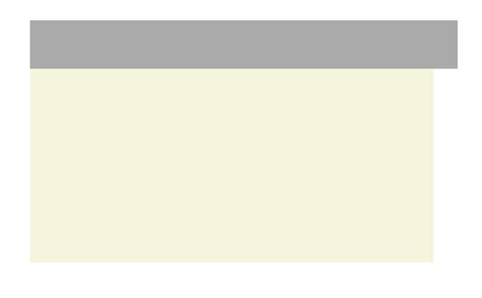
The mid-portion of the ribbon
We’ll use a CSS variable (allows us to store and reuse a CSS value) called --p to store the padding value. The value of the padding property uses the var(--p) syntax for the left and right paddings of the ribbon so that it can be easily widened. The --p variable later will be reused multiple times; that makes our code flexible.
.ribbon {
  --p: 15px;
  background-color: rgb(170,170,170);
  height: 60px;
  padding: 0 var(--p);
  width: 100%;
}
On the screenshot below you can see how your demo is supposed to look like at this point:
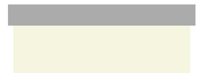
Centering the ribbon
We also need to center the ribbon. We push it to left by the padding size (marked by the --p variable) using relative positioning.
.ribbon {
  --p: 15px;
  background-color: rgb(170,170,170);
  height: 60px;
  padding: 0 var(--p);
  position: relative;
  right: var(--p);
  width: 100%;
}
The updated demo:
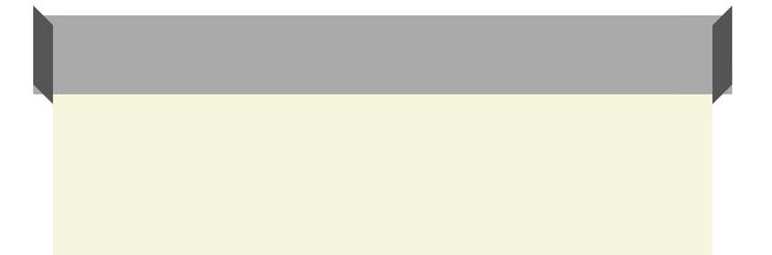
The sides of the ribbon
Now we create the left and right sides of the ribbon that ought to seemingly bend around the card edge. To do so, we use both the :before and :after pseudo-elements of .ribbon.
Read Also: Understanding Pseudo-Element :before and :after
Both pseudo-elements inherit the background color of .ribbon, and we use the filter: brightness(.5) rule to darken their color a bit. They are also absolutely positioned within their (relatively positioned) parent.
Their width needs to be the same as the padding size, and we place them to the left and right ends of the ribbon using the left: 0 and right: 0 style rules.
.ribbon:before,
.ribbon:after {
  background-color: inherit;
  content:'';
  display: block;
  filter: brightness(.5);
  height: 100%;
  position: absolute;
  width: var(--p);
}
.ribbon:before {
  left: 0;
}
.ribbon:after {
  right: 0;
}
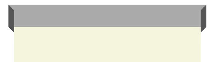
Now the ribbon with the sides we’ve just added looks as below:

Skew the sides
To make the sides of the ribbon look bent, we need to skew the sides by 45°. The transform: skewy() CSS rule skews elements vertically.
.ribbon:before {
  left: 0;
  transform:skewy(45deg);
}
.ribbon:after {
  right: 0;
  transform:skewy(-45deg);
}
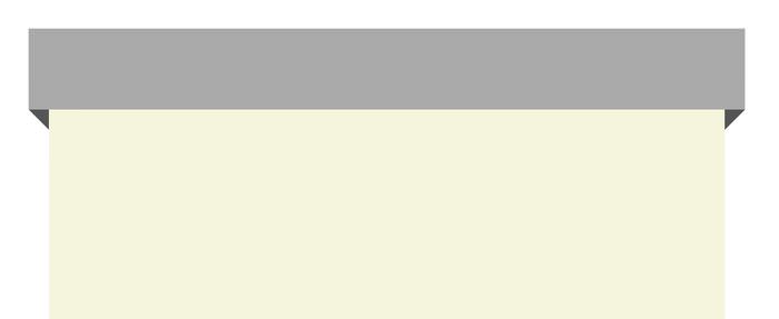
As you can see the edges of the sides don’t align after the transformation, so we need to pull them down.
Align the sides
To determine the proper length by which we need to move the sides down, we turn to trigonometry. What we need to find is x, as y is the width of the sides (equals to the padding size of .ribbon), and the angle θ is 45° (the angle of the skew).
The resulting x then needs to be halved, as there are a left and a right side as well.
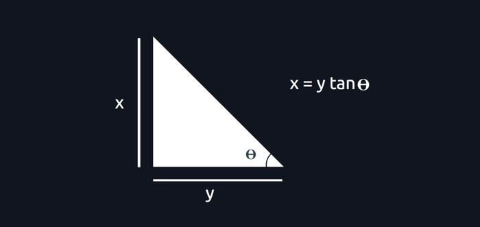
If you’re using any CSS preprocessor check if it has a tan function, otherwise refer to a tangent chart or a calculator to find out the tangent value of the angle. We’re lucky as tan 45° is 1, which means that the value of x equals to y in our case.
.ribbon:before,
.ribbon:after {
  background-color: inherit;
  content:'';
  display: block;
  filter: brightness(.5);
  height: 100%;
  position: absolute;
  top: calc(var(--p)/2);
  width: var(--p);
}
Since x had to be halved, we use the calc() CSS function to perform the division of the --p variable.
Finally we need to align the sides along the z-axis as well, so let’s add the z-index: -1 rule to the sides in order to place them behind the mid-portion of the ribbon.
.ribbon:before,
.ribbon:after {
  background-color: inherit;
  content:'';
  display: block;
  filter: brightness(.5);
  height: 100%;
  position: absolute;
  top: calc(var(--p)/2);
  width: var(--p);
  z-index: -1;
}
Now that we aligned the sides, our CSS ribbon is done.
Below you can check out the live demo again, please note that it uses some additional stylings as well.