Web Design: Hide / Show Notification Bar With CSS3
Inspired by a comment from one of our readers on our previous post (CSS3 Bounce Effect), we are going to show you how to create a notification bar with a control button in this tutorial. The idea is that we will be able to hide or show the notification bar by clicking on a button – similar to the HelloBar.
As the title says, we will be doing this using only some CSS3 features. Well, let’s just get started.
HTML Markup
We start by creating the document and structuring the HTML markup. It is worth noting that the HTML markup plays an important role for the “hide-n-show” function to work properly, as the function will be built purely using CSS3, which is sensitive to element structure and position.
Add the HTML elements in the following order.
<div class="notification-bar">
  <input id="hide" type="radio" name="bar" value="hide">
  <input id="show" type="radio" name="bar" value="show" checked="checked">

  <label for="hide">hide</label>
  <label for="show">show</label>

  <div class="notification-text">Hello World, you can hide this notification by clicking the close button.</div>
</div>
As you can see from the above code, we added two radio inputs with their labels to control the notification bar visibility – and, by default, the radio input with an id of show is checked.
At this point, some of you might already get the picture of how this works. When the radio input with an id of hide is checked, the notification bar will be hidden, and it will be displayed when the radio input with an id of show is checked.
Styles
Let’s add some decorative styles to make the notification bar look nicer. This includes specifying the notification’s background color, the font color, hiding the radio inputs, and adding representative icons to their labels.
.notification-bar {
  position: absolute;
  width: 100%;
}
.notification-text {
  background-color: #2980B9;
  padding: 15px;
  color: #fff;
  font-size: 14px;
  text-align: center;
  position: absolute;
  width: 100%;
}
.notification-bar input {
  display: none;
}
.notification-bar label {
  cursor: pointer;
  color: #fff;
  position: absolute;
  z-index: 5;
  display: inline-block;
  text-indent: 100%;
  white-space: nowrap;
  overflow: hidden;
}
.notification-bar label[for=hide] {
  right: 15px;
  top: 11px;
  width: 24px;
  height: 24px;
  background: url('../img/close.png') no-repeat center center;
}
.notification-bar label[for=show] {
  width: 45px;
  height: 50px;
  border-radius: 0px 0px 3px 3px;
  right: 10px;
  background: url('../img/show.png') no-repeat center center #2980B9;
}
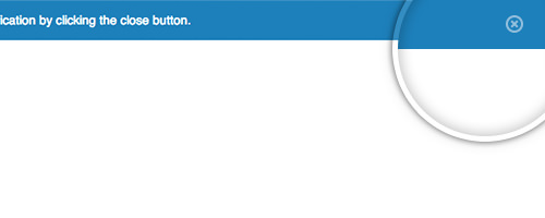
Then, our notification bar will look like the following screenshot.
It’s really simple. You can always add more styles if you want to.
Build the Function
As we are using the input radio button, we are able to apply the CSS3 :checked pseudo-class and then target the elements that follow using the sibling selector.
.notification-bar input[value=show]:checked ~ label[for=show] {
  -webkit-transition: ease 350ms;
  -moz-transition: ease 350ms;
  -o-transition: ease 350ms;
  transition: ease 350ms;

  -webkit-transform: translateY(-100%);
  -moz-transform: translateY(-100%);
  -o-transform: translateY(-100%);
  transform: translateY(-100%);
}
Given the above code, when the radio input with an id of show is checked, its associated label with the for="show" attribute is moved to the top by 100% from its original position, while the additional transition property will make it move smoothly.
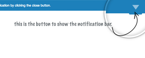
The button that is used to hide the notification bar should be visible, as you can see below.
Next, when users click on the close button, the notification bar, as well as the close button, should move to the top and disappear. Meanwhile, the button used to pull it down should return to its original position.
To do so, we can write the rule in this way.
.notification-bar input[value=show]:checked ~ label[for=show],
.notification-bar input[value=hide]:checked ~ label[for=hide],
.notification-bar input[value=hide]:checked ~ .notification-text {
  -webkit-transition: ease 350ms;
  -moz-transition: ease 350ms;
  -o-transition: ease 350ms;
  transition: ease 350ms;

  -webkit-transform: translateY(-100%);
  -moz-transform: translateY(-100%);
  -o-transform: translateY(-100%);
  transform: translateY(-100%);
}
.notification-bar input[value=hide]:checked ~ label[for=show] {
  -webkit-transition: ease 350ms;
  -moz-transition: ease 350ms;
  -o-transition: ease 350ms;
  transition: ease 350ms;

  -webkit-transform: translateY(0%);
  -moz-transform: translateY(0%);
  -o-transform: translateY(0%);
  transform: translateY(0%);
}
Then, to show the notification bar, we can write the rule, as follows.
.notification-bar input[value=show]:checked ~ label[for=hide],
.notification-bar input[value=show]:checked ~ .notification-text {
  -webkit-transition: ease 350ms;
  -moz-transition: ease 350ms;
  -o-transition: ease 350ms;
  transition: ease 350ms;

  -webkit-transform: translateY(0%);
  -moz-transform: translateY(0%);
  -o-transform: translateY(0%);
  transform: translateY(0%);
}
Final Touch
Lastly, I would like to add a small animation effect when the notification bar first loads. To do so, I create a @kyeframe rule, like so.
@keyframes initiate {
  0% {
    transform:translateY(-100%);
  }
  50% {
    transform:translateY(-50%);
  }
  100% {
    transform:translateY(0%);
  }
}
And assign the animation to the notification text container.
.notification-text {
  background-color: #2980B9;
  padding: 15px;
  color: #fff;
  font-size: 14px;
  text-align: center;
  position: absolute;
  width: 100%;

  -webkit-animation: initiate 350ms ease;
  -moz-animation: initiate 350ms ease;
  -o-animation: initiate 350ms ease;
  animation: initiate 350ms ease;
}
Check out: Creating Advanced “Marquee” With CSS3 Animation
That’s all the code we need. You can now see it in action in the demo page or download the source from the following links.