How to Create Bounce Effect with CSS3 Animation
Today, we are experimenting with CSS3 Animation. Previously, we explored how to create a “marquee” effect using CSS3 Animation. Now, we’re going to craft a “notification bar” that includes a bounce effect.
Let’s dive in.
Getting Started
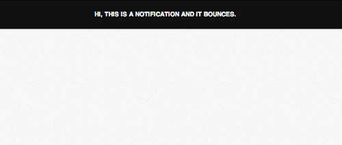
Let’s create a new HTML document and add the following markup to structure the notification bar.
<div class="css3-notification">
    <p>Hi, this is a notification and it bounces.</p>
</div>
Next, let’s add some stylish decorations to enhance the look of the notification bar.
.css3-notification {
    font-size: .8em;
    text-align: center;
    padding: 10px;
    background-color: #111;
    color: #fff;
    box-shadow: 0px 1px 3px 0px rgba(0, 0, 0, .3);
    text-transform: uppercase;
    position: relative;
    font-weight: bold;
}
This is how it will appear in browsers at this point.
Writing CSS3 Animation Keyframes
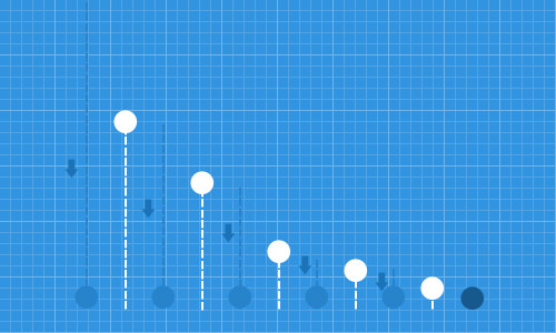
The basic concept is that when an object initially drops and hits a surface, it bounces back to its highest point and then gradually reaches a lower height with each subsequent bounce until it comes to a stop. This motion is depicted in the image below.
Step 1: Creating Animation Keyframe
First, let’s define our CSS3 Animation Keyframe in the stylesheet. We’ll simply name this keyframe bounce.
@keyframes bounce {

}
Remember, this tutorial uses the standard @keyframe syntax from W3C for simplicity. However, for compatibility across browsers, vendor-specific prefixes like -webkit-, -moz-, and -o- are essential and will be provided later in the source codes.
Step 2: Specifying Initial Position
Initially, we set the object’s position at the top. Using CSS3 Transforms, we apply a negative value for the Y-axis. Here, we specify the position from 0% to 5% of the animation duration, allowing the notification bar to remain briefly in that position.
0% {
    transform: translateY(-100%);
    opacity: 0;
}
5% {
    transform: translateY(-100%);
    opacity: 0;
}
Step 3: Specifying the First Bounce
Next, between 5% and 15% of the animation timeframe, the object moves towards its original position. We reset the translateY property to 0%. Notably, when an object bounces, it displays elasticity.
Upon impacting a solid surface, the impacted side often compresses or deforms slightly. Accordingly, we reduce the padding-bottom from 10px to 5px to simulate this effect.
15% {
    transform: translateY(0);
    padding-bottom: 5px;
}
After the impact, the object bounces upwards, reaching its peak height at 30% of the timeframe, set at -50% on the Y-axis.
30% {
    transform: translateY(-50%);
}
Step 4: Specifying the Second Bounce
After reaching its highest point, the object returns to the 0 position, effectively hitting the ground again. This time, the object will be less deformed than during its first impact. We adjust the padding-bottom to 6px.
40% {
    transform: translateY(0%);
    padding-bottom: 6px;
}
The object then makes a second bounce, reaching a height lower than the first one; it moves up 30% from its current position.
50% {
    transform: translateY(-30%);
}
Step 5: Continuously Bouncing Until It Stops
The bouncing continues, diminishing slightly with each bounce until the end of the animation timeframe. Below are the settings for the remainder of the animation, from 70% to 100% of the duration.
70% {
    transform: translateY(0%);
    padding-bottom: 7px;
}
80% {
    transform: translateY(-15%);
}
90% {
    transform: translateY(0%);
    padding-bottom: 8px;
}
95% {
    transform: translateY(-7%);
}
97% {
    transform: translateY(0%);
    padding-bottom: 9px;
}
99% {
    transform: translateY(-3%);
}
100% {
    transform: translateY(0);
    padding-bottom: 9px;
    opacity: 1;
}
Now, you can view the bounce effect in action via the link below.
Further Resources
Below are more resources for delving deeper into CSS3 Animation, Transformations, and Bounce Effects.
- Creating Advanced “Marquee” With CSS3 Animation — Hongkiat.com
- CSS3 2D Transforms — Hongkiat.com
- What are all the equations we use to calculate how bounces work? — StackExchange
- Bounce Effect with jQuery — jQuery.com
- 3D Bouncing Ball with CSS3 — Codrops