30 Useful Responsive Web Design Tutorials
As we conclude our "Responsive Web Design week", this final post of the series is dedicated to enhancing your skills in creating web designs that adapt seamlessly across various devices. We’re excited to showcase 30 Responsive Web Design Tutorials from around the web.
While this isn’t an all-encompassing list, it’s a great starting point for understanding the fundamentals of crafting websites that accommodate all screen sizes.
Creating a User-Friendly Responsive Website Menu
By: Thoriq Firdaus
Discover how to build your own responsive website navigation in this guide. A crucial element of any website is its navigational ease, allowing visitors to smoothly transition between different sections. This tutorial will guide you through using CSS3 to create a navigation that’s both efficient and responsive.

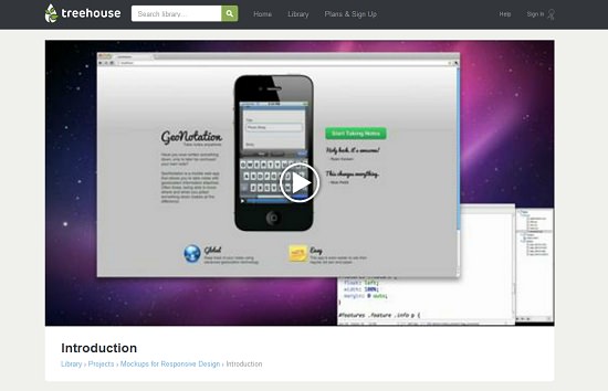
Designing a Responsive Online Resume
By: Jake Rocheleau
For web professionals, an online resume is a vital tool. Why not elevate it by making it responsive? This not only makes it more accessible to employers and clients on any device but also serves as a practical showcase of your development skills. Learn how to transform your resume into a dynamic, responsive portfolio.

Mastering Responsive Design: A Guide for Web Developers
By: freeCodeCamp.org
This guide dives deep into the core aspects of responsive web design, underscoring the significance of a mobile-first approach. It unpacks vital concepts such as CSS units, the basics of Flexbox, and the essentials of media queries. Featured as a segment in the comprehensive Scrimba course ‘The Responsive Web Design Bootcamp’, it includes hands-on exercises for crafting a fully responsive 3-page website.
The guide offers in-depth insights into the utilization of various CSS units, applying Flexbox for layout structuring, and employing media queries for diverse screen sizes, culminating in a solid grasp of responsive web design techniques.

Auto-Layout: Unveiling Stacks – Bringing Flexbox to Sketch
By: Anima App’s medium blog
Auto-Layout introduces Stacks, a transformative feature in Sketch that mimics Flexbox, revolutionizing responsive layout design. This innovative tool enables designers to effortlessly work with Columns, Rows, and Grids, significantly boosting layout consistency and clarity. Stacks, akin to a simplified Flexbox, dismisses the need for CSS in browser-based designs, enhancing accessibility.
This article details the Stacks feature, its functionalities, and its impact on the design workflow. It provides insights into creating interactive, high-fidelity prototypes in Sketch, representing a major stride in enabling designers to take complete control of their design process and fostering collaboration between design and engineering teams.

Creating Responsive Design Guides in Adobe XD
By: Web Design Ledger
This tutorial from Web Design Ledger is a comprehensive guide on crafting responsive design guides in Adobe Experience Design CC (Adobe XD). Starting from the basics of document creation, it walks you through the entire design process.
Key steps include forming shapes to denote site width and margins, utilizing the Repeat Grid tool, and fine-tuning the opacity of design components. An indispensable resource for designers aiming to create adaptable websites, this tutorial offers actionable tips and strategies to ensure that designs fluidly adjust to different devices. It’s an excellent resource for those keen to refine their Adobe XD and responsive web design skills.

Exploring Sticky Footer Solutions: Five Effective Techniques
By: CSS-Tricks
This article from CSS-Tricks offers an insightful exploration of five distinct methods for crafting a sticky footer – a footer that remains attached to the bottom of the browser window. It delves into various approaches including utilizing negative bottom margins on wrappers, negative top margins on footers, leveraging `calc()` for adjusting height in wrappers, and employing flexbox and grid layout strategies.
Each technique is thoroughly discussed with practical code examples and their implications, providing a detailed guide for web developers. This piece is especially beneficial for those looking to incorporate a sticky footer in their web designs, offering a range of solutions to fit different web development scenarios and preferences.

Navigating the Changing Landscape of Web Input Methods
By: A List Apart
“Adapting to Input,” featured on A List Apart, tackles the evolving realm of web input modes. The article shines a light on moving beyond traditional input device assumptions (keyboard and mouse for desktop, touch for mobile) to embrace a broader perspective on user interaction. It discusses the rise of various input methods like accelerometers, GPS, and 3D touch, underscoring the necessity for web designs to be versatile and responsive to an array of input types.
Advocating for designs that cater to multiple inputs concurrently, it emphasizes the importance of accessibility and defaulting to the largest target size. The article also recommends abstracting basic input in code and enhancing input progressively, making it an essential read for contemporary web developers navigating the complexities of varied user input modes.

Rethinking Best Practices for Mobile Web Performance
By: molily
The article on molily.de offers a critical perspective on prevailing best practices in mobile web performance, asserting that they may not effectively meet the requirements of mobile users. It highlights how conventional web performance standards, originally devised for desktop browsing, are inadequate in the mobile context, often resulting in sluggish, unresponsive, and frustrating user experiences.
The piece stresses the need to revisit these practices to better suit mobile internet characteristics, typically characterized by lower bandwidth and higher latency. It advocates for a paradigm shift focusing not just on content rendering but on fostering meaningful user interaction and stable interfaces during the loading phase. This article serves as a wake-up call for web developers to align their approaches with the practicalities of mobile web usage.

Mastering Responsive Web Design: Advanced HTML & CSS Techniques
By: Shay Howe
Shay Howe’s detailed guide provides an in-depth look into the world of responsive web design (RWD), a vital skill in today’s web development. The tutorial encompasses the implementation of adaptable layouts, media queries, and flexible media, ensuring compatibility across a range of devices and screen sizes. It highlights the importance of crafting web layouts using a fluid grid system and relative length units like percentages or em units, adapting the layout to various browser and device viewports.
The guide further explores CSS3 viewport-relative length units, including vw, vh, vmin, and vmax, and underscores the critical role of media queries in responsive design. An invaluable resource, this guide is essential for developers aiming to create seamless and engaging user experiences across all devices.

Getting Started with Responsive Web Design: A Video Introduction
By: Nick Petit
This brief, 9-minute video provides an overview of responsive web design, covering its origins, its influence on website design, and the key components involved. Perfect for beginners, this tutorial offers a non-coding path to understanding the basics of responsive design.
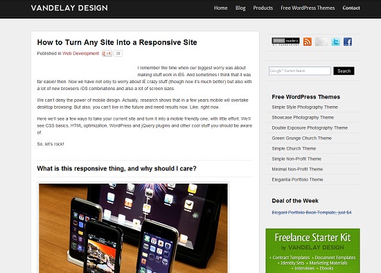
Transforming Any Website into a Responsive Design
By: Rochester Oliveira
Dive into the essentials of making your website responsive with this detailed tutorial. It breaks down the process, focusing on different operating systems, browsers, and the elements that vary when viewed on different devices. The guide also includes handy WordPress and jQuery plugins to streamline your development.
Responsive Design Simplified in 3 Steps
By: Nick La
Discover how to craft a responsive web design using meta tags, an efficient HTML structure, and essential media queries. This tutorial is geared towards those with a basic understanding of CSS, providing a straightforward approach to responsive design.

Guidelines for Responsive Web Design
By: Max Luzuriaga
This article serves more as an insightful guide than a step-by-step tutorial on creating responsive web designs. The author offers valuable dos and don’ts, sheds light on why certain elements aren’t sufficiently responsive, and discusses how to handle proportions and modules. Plus, it’s concise and straightforward, making it easy to digest.

A Visual Guide to Responsive Web Design
By: Andrew Gormley
Prefer visual learning? This video tutorial, spanning about 25 minutes, is less about reading and more about watching. It’s technical, but the creator has fast-forwarded through coding segments and then revisits them to explain the functionality. This format makes it an engaging way to learn about responsive design without being overwhelmed by text.

Mastering Fluid Images in Responsive Design
By: Ethan Marcotte
Ethan Marcotte is a name synonymous with responsive web design, being the pioneer behind the concept. In this article, he shares his expertise on creating fluid images, an essential component of responsive design. His insights are invaluable, especially considering his influence in the field.

Responsive Web Design Using CSS3 Media Queries
By: Nick La
This excellent tutorial guides you through designing a cross-browser responsive website using HTML5 and CSS3. The step-by-step approach is complemented by demos showing the web design before and after implementing media queries, providing a clear understanding of their powerful impact.

Aligning Images with Text in Responsive Design
By: Zoe Mickley Gillenwater
Learn how to adjust fixed-width images to change their size and spacing, aligning perfectly with accompanying text regardless of browser window size. This tutorial offers an ingenious CSS technique for seamless visual harmony between text and images.

Context-aware Responsive Images
By: Scott Jehl
Embrace the mobile-first approach with this tutorial. It teaches how to assign larger image sizes for higher screen resolutions while minimizing unnecessary image requests and avoiding user agent (UA) sniffing. A smart strategy for responsive and efficient image sizing.

Making Videos Responsive
By: Nick La
Discover how to make videos respond and scale with your browser window. This tutorial offers a CSS-based method to ensure your videos adapt fluidly across different screen sizes, complete with a live demonstration of the technique in action.

Responsive Image Cropping Techniques
By: Zoe Mickley Gillenwater
Extracted from the author’s book, this tutorial focuses on dynamically cropping images to suit different screen resolutions. It teaches how to reveal or conceal parts of images depending on the available screen space, ensuring a visually appealing and adaptive presentation of images.

CSS3 for Responsive Content Navigation
By: Mary Lou
Looking for a more dynamic user navigation experience? This tutorial teaches you to code sophisticated transitions such as fading, sliding, rotating, and scaling. It focuses on using CSS3 to manage content layers’ visibility, providing users with a seamless and interactive navigation experience.

Creating a Responsive Web Design Template
By: Harry Atkins
Engage in this concise tutorial to develop a responsive web template that is optimized for both desktop and iPhone usage. It’s a practical guide for those aiming to create versatile web designs that adapt to different device screens.

Designing a Responsive Horizontal Layout
By: Mary Lou
This tutorial guides you through crafting a horizontal layout with scrollable content panels. Using The Origin of Species as an example, it demonstrates how to separate each chapter into columns in a full-browser mode and transition to a vertical scrolling format for smaller screens.

Adapting a Menu into a Dropdown for Small Screens
By: Chris Coyier
Discover how to transform a menu into a dropdown list on narrow browser windows or mobile devices. This tutorial shows the process of converting a row of links into a space-efficient dropdown menu, ensuring that navigation remains intuitive and accessible on smaller screens.

Building a Flexible Slide-to-Top Accordion
By: Mary Lou
Learn to create a flexible and simple accordion layout with this tutorial. It focuses on implementing fade-in transitions and adapting widths to suit various screen sizes and resolutions, offering a responsive and engaging user experience.

Adapting Tables for Mobile Screens
By: Chris Coyier
Dealing with tables on small screens can be challenging, but it’s not a reason to avoid them. Discover how to utilize media queries to transform your table’s layout for mobile devices. Check out the demo to see the transformative effects you can achieve following this guide.

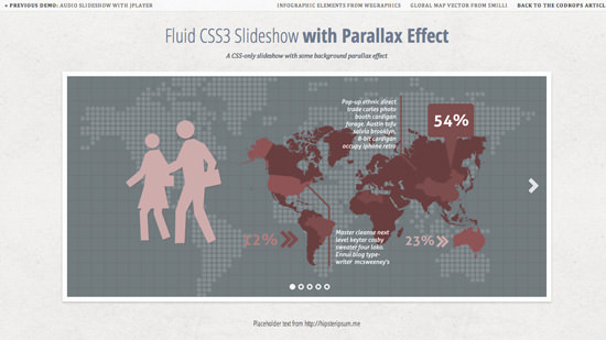
Fluid Slideshows with CSS3 and Parallax
By: Ring Wing
Learn to create a CSS3-based slideshow that employs two background images. When you alter the backgrounds’ positions, a striking parallax effect emerges. Additionally, the slideshow dynamically adjusts its size with browser window changes.
Crafting a Responsive Thumbnail Gallery
By: Joshua Johnson
Perfect for websites showcasing thumbnail galleries. This guide explains how the layout adapts from two columns on smaller screens to up to five columns on larger ones. Explore more in our Top 10 Free Responsive Image Galleries/Slideshows compilation.

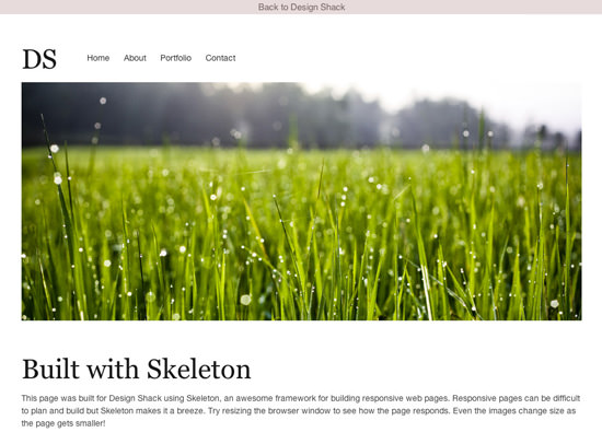
Responsive Design with the Skeleton Framework
By: Joshua Johnson
Explore the Skeleton framework, an excellent tool for crafting responsive websites. This step-by-step tutorial demonstrates the ease of creating modern, responsive designs using Skeleton. You’ll be amazed at the simplicity of its implementation.
Mastering Responsive Web Design with HTML5 and Less Framework 3
By: Louis Simoneau
If you’re new to Less, start with our Less CSS tutorial to get acquainted. This tutorial showcases the Less framework in action, highlighting the impactful use of media queries in responsive design.

Wrapping Up the Responsive Web Design Series
With this, we wrap up our Responsive Web Design series. Our goal was to unveil the nuances of responsive design through various themes, tools, and resources. We’re eager to hear your thoughts!