LESS CSS Tutorial: Designing A Slick Menu Navigation bar
Web design and development world is really evolving rapidly. We can see this in the great number of new stuff launched in the community (almost) everyday, be it Apps or new Frameworks that help make our day-to-day job as web designers or developers more effective and efficient.
One that caught my attention from web design evolvement today is LESS, a programmable stylesheet language that extends the way we write CSS syntax by combining some programming concepts like Variables, Mixins, Functions and Operations.
It opens new capabilities in writing CSS syntax. For instance, by applying Mixins in CSS like the way we do in a program, we can now store default styles and values that can be applied in the entire file whenever possible. With this, we won’t need to write the same styles over and over again.
Well, let’s do some exercises with LESS to get better insight into what it has to offer.
Designing with LESS
In this tutorial we will try to design a slick menu navigation bar that is inspired from the one in Apple.com. As it is only ‘inspired’ by the original product, take note that our final tutorial product will not be precisely the same as the original.
To get started, you might want to read the following helpful resources first. They explain some basic implementations of LESS language, which will be helpful to you before you dig further into this tutorial.
- LESS Is More: Make Your CSS Coding Easier with LESS
- Write Better CSS with Less
- An Introduction To LESS, And Comparison To Sass
Preparation
First of all, there are some essential things we need for this small project, that is:
1. LESS Text Editor
We will need a text editor to code the navigation menu. However, most of the text editors available in the market today (such as Dreamweaver, Notepad++, InType, Sublime Text 2) have yet to support .less file extensions by default, so the syntax may not be highlighted well.
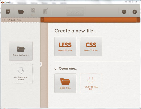
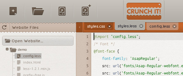
So, for the purpose of this tutorial, we will use a special text editor for LESS named ChrunchApp. We can open and edit .less extension files and compile it into static CSS using this application. Since it is an Adobe Air application, it can be installed in every major desktop OS (Win, OSX and Linux).
For the HTML editor you can use any editor you are already comfortable using now. I personally like Sublime Text 2.
2. Less.js
Next, download the LESS JavaScript Library from their official website, the current version is 1.2.1. Place it inside your practice folder for this.
Then link the file to the HTML document.
<script src="less-1.2.1.min.js" type="text/javascript"></script>
3. Prefix-free
We will also utilize a few CSS3 features to accomplish some effects in the navigation menu which will include vendor prefixes (-moz-, -o-, -webkit-) for it to render correctly across different browsers. However, I personally do not favor using prefixes as it will bloat the CSS file.
For this reason, I decided to use prefix-free, a JavaScript library created by Lea Verou that will handle the vendor prefixes automatically in the background. So we will only need to write the official syntax from W3C.
Download the file and link it to the HTML file.
<script src="prefix-free.js" type="text/javascript"></script>
All right, we are all set up; now let’s start structuring the HTML markup.
HTML Markup
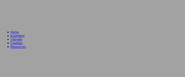
The navigation is quite simple. It will have five menus wrapped inside an unordered list tag. Open up your favorite HTML editor and put the following markup:
<nav>
	<ul>
		<li><a rel="nofollow" target="_blank" href="#">Home</a></li>
		<li><a rel="nofollow" target="_blank" href="#">Inspiration</a></li>
		<li><a rel="nofollow" target="_blank" href="#">Tutorials</a></li>
		<li><a rel="nofollow" target="_blank" href="#">Freebies</a></li>
		<li><a rel="nofollow" target="_blank" href="#">Resources</a></li>
	</ul>
</nav>
LESS Styling
In this section we will start styling the navigation with LESS language. For those who are new to programming-like language, writing CSS syntax with LESS would feel a little weird and awkward. But don’t worry, once you have some practice, it will surely more enjoyable than the way we write pure CSS (it my experience, it is also a bit addictive).
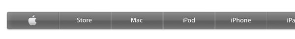
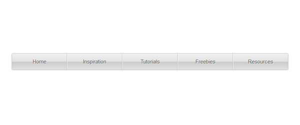
Let’s examine the navigation style from our source of inspiration.
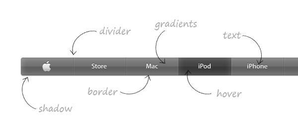
As we can see in the screenshot above, the Apple.com navigation has the following 6 main common styles:
- shadow
- border
- divider
- gradients
- hover effect
- text
We will store these styles and save them inside config.less as the default style Configuration; some designers might also name it lib.css that stands for Library. Link this file to our document.
<link rel="stylesheet/less" type="text/css" href="styles.less">
Make sure you place it before the LESS JavaScript library.
Define Color Base with Variables
In this step we will define the navigation color base using Variables. The variable in LESS is declared using the @ symbol.
@theme: #555;
This @theme variable is our standard color; we will use it in every way possible to tail perfect color scheme and so that the color composition would be expected to become more consistent.
Define Default Shadow Style with Mixins
One of the features I love from LESS is Mixins. It is a programming concept that stores several predefined styles that in LESS can be inherited in classes or ids later on in the stylesheet.
.shadow {
	box-shadow: 0 1px 2px 0 @theme;
}
In the code above I did not include the prefixed version of the box-shadow property, since the prefix-free library will handle them automatically. Also, the shadow color is inherited from the theme variable color.
Define Border Style with Parametric Mixins
The navigation bar will need a distinct border color with a slightly rounded corner. We can compile the border style using Parametric Mixins. It actually has the same functionality as Mixins, only difference is that it also has changeable parameters so the values are more adjustable.
.border(@radius:3px) {
	border-radius: @radius;
	border: 1px solid @theme - #050505;
}
In the code above, we set up the default border @radius for 3px and as we mentioned before, this value can be changed later.
Define Gradient, Divider, and Hover Style with Operation
Operation is simply a programming language where we can apply mathematic formula like Addition, Division, Subtraction and Multiplication to get a desired result. Let’s take a look at the following code:
.divider {
	border-style: solid;
	border-width: 0 1px 0 1px;
	border-color: transparent @theme - #111 transparent @theme + #333;
}
In the code above we subtract @theme variable by #111, this way the left border color output would be a bit darker. While the right border color is derived from the addition of @theme variable with hex color #333, the output would be lighter.
Color Scheme Level
Well, for some of you that might be confused with formulas, let’s examine the color scheme diagram below to get a better understanding:
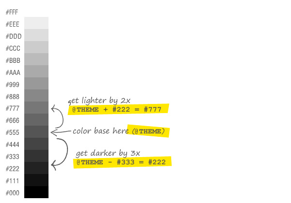
The maximum dark tone is #000 (black), while the maximum light tone is #fff (white) and our current color base is #555. So, if we want the color base to be 3 levels darker from the current, we can simply subtract it by #333. The same way can also be applied to lighten the color.
Next, we will operate the gradient color.
.gradient {
	background: linear-gradient(top, @theme + #252525 0%, @theme + #171717 50%, @theme - #010101 51%, @theme + #151515 100%);
}
.hovereffect {
	background: linear-gradient(top, @theme - #010101 0%, @theme - #121212 50%, @theme - #222222 51%, @theme - #050505 100%);
}
Define Text Style with Guard Mixins
We plan to have 2 colors on the navigation bar, ne dark color and one light. We apply two conditional statements for the text using Guard Mixins.
First, when the text is given a color that has lightness equal to or greater than 50%, the text-shadow should turn dark, in this case color #000000.
.textcolor(@txtcolor) when (lightness(@txtcolor) >= 50%) {
	color: @txtcolor;
	text-shadow: 1px 1px 0px #000000;
}
Then, when the text is given a color that the lightness is less than 50% the text-shadow will turn white.
.textcolor(@txtcolor) when (lightness(@txtcolor) < 50%) {
	color: @txtcolor;
	text-shadow: 1px 1px 0px #ffffff;
}
Importing LESS
Let’s now create another .less file named styles.less and import config.less into it:
@import "config.less";
Add Font Family
In order for the navigation bar to look more appealing, we will include a new font family using @font-face rule. Surprisingly, @font-face rule is actually already supported since IE6!
This time we will use the Asap font. Download it from Font Squirrel’s font face collection. Then insert the following styles to our recently created styles.less file.
@font-face {
	font-family: 'AsapRegular';
	src:url('fonts/Asap-Regular-webfont.eot');
	src:url('fonts/Asap-Regular-webfont.eot?#iefix') format('embedded-opentype'),
	url('fonts/Asap-Regular-webfont.woff') format('woff'),
	url('fonts/Asap-Regular-webfont.ttf') format('truetype'),
	url('fonts/Asap-Regular-webfont.svg#AsapRegular') format('svg');
	font-weight: normal;
	font-style: normal;
}
Styling the Body with Color functions
Now, we will give a background color to the body (that should be lighter than the color base) as well as specifying the font family and font size. We can approach the effect using Color functions:
The following code will lighten the background at 30%.
body {
	background: lighten(@theme, 30%);
	font-family: AsapRegular, sans-serif;
	font-size: 11pt;
}
Styling the Navigation with Nested Rule
In LESS we are able to nest styles directly under its parent. Let’s take a look at the code below.
The nav tag that contains all the necessary elements for the navigation will be given the following styles.
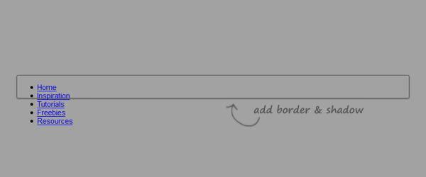
nav {
	margin: 50px auto 0;
	width: 788px;
	height: 45px;
	.border;
	.shadow;
}
Notice that, instead of giving a bunch of CSS rules again, I only inserted .border to give the border style and .shadow to add shadow. In real cases, these set of classes can be reused in another element as well, wherever it’s needed.
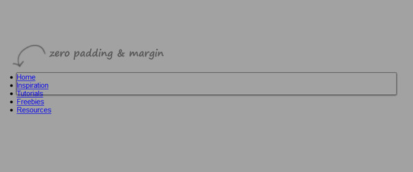
Next, we give styles for the ul inside the nav to have zero padding and margin. Not so long ago we will approach the style by writing something like this:
nav {
	...
}
nav ul {
	...
}
There is nothing wrong with this approach, in fact, I used to do it every time and am pretty comfortable with it. However, this method, many a CSS designer has said, is verbosed and in some cases, not easily manageable.
Now, we can do something like this:
nav {
	margin: 50px auto 0;
	width: 788px;
	height: 45px;
	.border;
	.shadow;
	ul {
		padding: 0;
		margin: 0;
	}
}
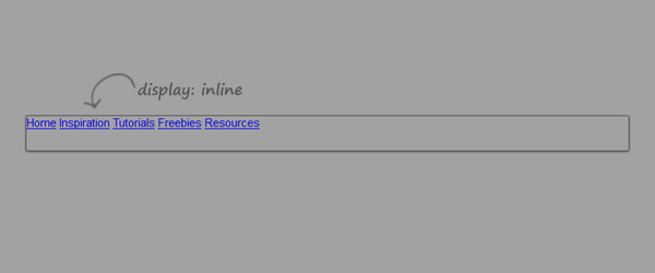
And then the menu will be displayed in a row using display: inline property.
nav {
	margin: 50px auto 0;
	width: 788px;
	height: 45px;
	.border;
	.shadow;
	ul {
		padding: 0;
		margin: 0;
		li {
			display: inline;
		}
	}
}
In the syntax below we specify the menu anchor tag style and add our predefined styles, those are: .textcolor, .divider, .gradient.
nav {
	margin: 50px auto 0;
	width: 788px;
	height: 45px;
	.border;
	.shadow;
	ul {
		padding: 0;
		margin: 0;
		li {
			display: inline;
			a {
				text-decoration: none;
				display: inline-block;
				float: left;
				width: 156px;
				height: 45px;
				text-align: center;
				line-height: 300%;
				.textcolor(#f2f2f2); // You can change this line
				.divider;
				.gradient;
			}
		}
	}
}
In the code above we apply hex color #f2f2f2 in which the lightness is considered above 50%, so we would expect to see the shadow to become dark (automatically). The rest of the code I am sure is quite self-explanatory.
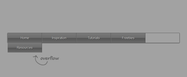
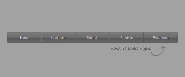
However, if we look at the current result above, each of the menu are having dividers thus resulting in the last section overflowing to the bottom. So we need to to omit the border style for the first and last child of the navigation bar.
nav {
	margin: 50px auto 0;
	width: 788px;
	height: 45px;
	.border;
	.shadow;
	ul {
		padding: 0;
		margin: 0;
		li {
			display: inline;
			a {
				text-decoration: none;
				display: inline-block;
				float: left;
				width: 156px;
				height: 45px;
				text-align: center;
				line-height: 300%;
				.textcolor(#f2f2f2); // You can change this line
				.divider;
				.gradient;
			}
		}
		li:first-child a {
			border-left: none;
		}
		li:last-child a {
			border-right: none;
		}
	}
}
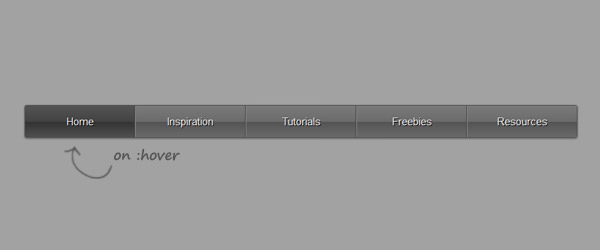
Hover State
For the last step we will add the hover effect. In LESS we can add pseudo-element such as :hover using & symbol.
nav {
	margin: 50px auto 0;
	width: 788px;
	height: 45px;
	.border;
	.shadow;
		ul {
			padding: 0;
			margin: 0;
			li {
				display: inline;
				a {
					text-decoration: none;
					display: inline-block;
					float: left;
					width: 156px;
					height: 45px;
					text-align: center;
					line-height: 300%;
					.textcolor(#f2f2f2); // You can change this line
					.divider;
					.gradient;
					&:hover {
						.hovereffect;
					}
				}
			}
			li:first-child a {
				border-left: none;
			}
			li:last-child a {
				border-right: none;
			}
		}
	}
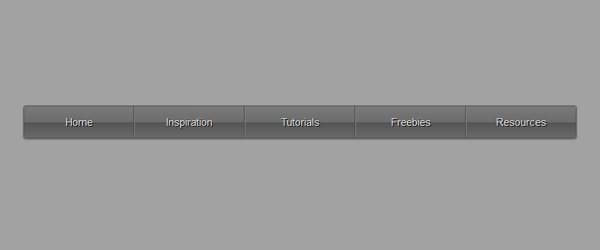
Change the color theme
Here is the cool part of LESS. If we want to change the overall color theme, we can do it in fewer line changes than what we need in pure CSS.
In this case, I will change the navigation color to be a bit lighter. Simply change the following two lines.
@theme: #ccc; //Change this
.textcolor(#555); //And this
And here is the result.
Compile LESS into CSS
When we are still using the LESS JavaScript, it will grab the .less file and translate it into static CSS so that the standard browser can interpret it. This is a double job in the client side, not to mention redundant and wastes bandwidth. The main point of LESS is in the workflow to simplify our practice in compiling static CSS to be more dynamic and programmable.
So, when we are about to put the navigation bar live on a website, it is important to compile the LESS file into static CSS.
Click the Crunch It! big button.
Save the .less in our exercise file, link it to the HTML document and unlink the .less & less.js file from the document.
.shadow { box-shadow: 0 1px 2px 0 #555555; }

.divider {
	border-style: solid;
	border-width: 0 1px 0 1px;
	border-color: transparent #444444 transparent #888888; }

.gradient { background: linear-gradient(top, #7a7a7a 0%, #6c6c6c 50%, #545454 51%, #6a6a6a 100%); }

.hovereffect { background: linear-gradient(top, #545454 0%, #434343 50%, #333333 51%, #505050 100%); }

@font-face {
	font-family: 'AsapRegular';
	src: url('fonts/Asap-Regular-webfont.eot');
	src: url('fonts/Asap-Regular-webfont.eot?#iefix') format('embedded-opentype'),url('fonts/Asap-Regular-webfont.woff') format('woff'),url('fonts/Asap-Regular-webfont.ttf') format('truetype'),url('fonts/Asap-Regular-webfont.svg#AsapRegular') format('svg');
	font-weight: normal;
	font-style: normal; }

body {
	background: #a2a2a2;
	font-family: AsapRegular,sans-serif;
	font-size: 11pt; }

nav {
	margin: 50px auto 0;
	width: 788px;
	height: 45px;
	border-radius: 3px;
	border: 1px solid #505050;
	box-shadow: 0 1px 2px 0 #555555; }

nav ul {
	padding: 0;
	margin: 0; }

nav ul li { display: inline; }

nav ul li a {
	text-decoration: none;
	display: inline-block;
	float: left;
	width: 156px;
	height: 45px;
	text-align: center;
	line-height: 300%;
	color: #f2f2f2;
	text-shadow: 1px 1px 0px #000000;
	border-style: solid;
	border-width: 0 1px 0 1px;
	border-color: transparent #444444 transparent #888888;
	background: linear-gradient(top, #7a7a7a 0%, #6c6c6c 50%, #545454 51%, #6a6a6a 100%); }
	nav ul li a:hover { background: linear-gradient(top, #545454 0%, #434343 50%, #333333 51%, #505050 100%); }
	nav ul li:first-child a { border-left: none; }
	nav ul li:last-child a { border-right: none; }
Let’s take a look at the result once again.
And we are done, please feel free to experiment with it.
Conclusion
We have learned many things about LESS language today, such as:
- Variables.
- Mixins
- Parametric Mixins
- Operations
- Guarded Mixins
- And Nested Rules
Although there are many things that can be covered further and many possibilities to be shown and explained, we hope you enjoyed this basic tutorial.