Understanding Microinteractions in Mobile App Design
Usability is one of the key components of mobile UI design. Great usability often involves microinteractions which are small responses and behaviors from an interface dictating how the UI should be used. These microinteractions define behaviors, encourage engagement, and help users visualize how an interface should work.
Digital interfaces are the middlemen between users and their desired goals. Interface designers create experiences that help users perform certain tasks. For example, a todo list app has an interface that helps users organize their tasks. Just like a Facebook app gives users an interface to interact with their Facebook account.
In this guide, I will delve further into microinteractions for mobile apps. Small interactions may seem trivial but they can have an immense impact on the quality of a user’s experience. When done properly, microinteractions feel like a genuine part of the overarching mobile user experience.
The Power of Microinteractions
In most cases the goal of a microinteraction is to provide feedback based on the user’s action. This can help users visualize how the interface moves or behaves, even though it’s purely digital on a flat screen.
Microinteractions have power because they create an illusory experience. On/off sliders don’t really move like physical switches, but they can appear to move this way through animations.

I found an incredible quote in this post discussing the immense value of microinteractions for mobile apps:
“The best products do two things well: features and details. Features are what draw people to your product. Details are what keep them there. And details are what actually make our app stand out from our competition.”
The small details may seem insignificant from a development standpoint, but from a user experience standpoint they genuinely make the difference between an OK app UI and an extraordinary app UI.
Great microinteractions make the user feel rewarded for taking an action. These actions can be repeated and ingrained into the user’s behavior. They can learn how to use an application based on these smaller microinteractions. When the user performs a behavior, these small interactions signal "yes, you can interact with me!"
Take a look at the examples found in Google’s material design specs. The documentation actually has an entire section dedicated to material motion. Spatial relationships are a big part of this equation, but motion can dictate more than just spatial relationships.
Here are the most common uses of animation and motion in mobile UI/UX design:
- Guiding users between different pages
- Guiding users through the interface to teach certain behaviors
- Suggesting actions/behaviors which can be taken on any given page
Mobile apps have much less screen space than websites. This can lead to some difficulties teaching users how to use an app. But it can be surprisingly simple if you know how to implement microinteractions properly.
How Microinteractions Work
A single microinteraction fires whenever the user engages with one part of an interface. Most microinteractions are animated responses to the user’s gesture. So a swiping motion will respond differently than a tap or a flick.
Blink UX did a great post discussing the minor details of microinteractions. These small animations should follow a predictable process that the user can learn for every interaction in the application.
Microinteractions guide users through an interface by offering responses to behaviors. Once the user knows that an on/off slider can move, they know it’s interactive. Based on the response, they’ll also know if a setting was turn on or off. When a button looks like it can be clicked the user instinctively knows they can interact with it.
According to UXPin, every basic microinteraction can break down into four steps, but I’ve summarized the process into three steps.
- Action – the user does something like flick, swipe, tap & hold, or some other interaction.
- Reaction – the interface responds based on what needs to happen. Swiping a screen might move back in the browser history, or tapping an ON/OFF slider might switch off a setting.
- Feedback – this is what the user actually sees as the result of the interaction. When the user swipes back in a mobile browser it might float the previous page up to appear "on top" of the screen. The on/off slider might glide smoothly or grow larger when pressure is applied to the screen.
These very small actions can be accomplished without animation, but great microinteractions offer a realistic feeling to the flat digital interface, which mostly comes in the form of realistic animation effects. These breathe life into the interface and encourage more user interaction.
Recommended Reading: Flat 2.0 & How It Solves Flat Design’s Usability Problems
Look For The Details
By looking at the smaller pieces of a design, you’ll understand how an app should respond to a particular behavior.
Pull to refresh is a good example of a now-popular microinteraction. It wasn’t an integral part of iOS when it first launched, but many apps took this idea and started moving with it. Now pull to refresh is a well known behavior that most users just know to use when browsing a feed UI. The same can be said about mobile hamburger menus which have grown wildly in popularity.
Make every microinteraction realistic and simple. Don’t overdo animations because they can become tedious if they’re too detailed and get used frequently. The user doesn’t want sparkles to appear every time they tap a menu icon. Strike a balance with genuine value that communicates how the interface should work without going overboard.
Looking At Some Examples
I think the best way to learn something is by doing it, and the second best way is to study the work of others. I’ve collected a small handful of UI/UX microinteraction animations from talented Dribbble users to show you how these look in a real mockup.
Every application will be different and have different needs based on what the app does. In the end most users want the same thing: an app that’s intuitive and delivers a quality user experience with microinteractions relative to user behaviors.
1. Animated Event App UI
The first example is a nifty card animation feature created by Ivan Martynenko. You’ll notice a handful of microinteractions in this design, notably card swiping and moving through details.
When tapping on the card it grows in size. And when tapping the Subscribe button the user’s profile photo slides into the list of subscribers. Everything feels very intuitive and quite natural to the interface.

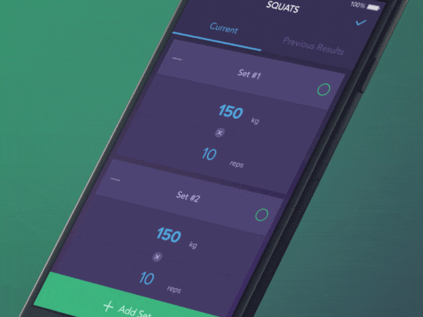
2. Interactive Exercise Screen
This creative mobile exercise animation comes from designer Vitaly Rubtsov. It demos a user saving their workout for one set of squats.
Notice each animation has the same elastic bounce effect when the menus open and snap closed. This is also true when the activity is checked as "Done". Consistency is key with microinteractions because they should all feel connected to the same interface.
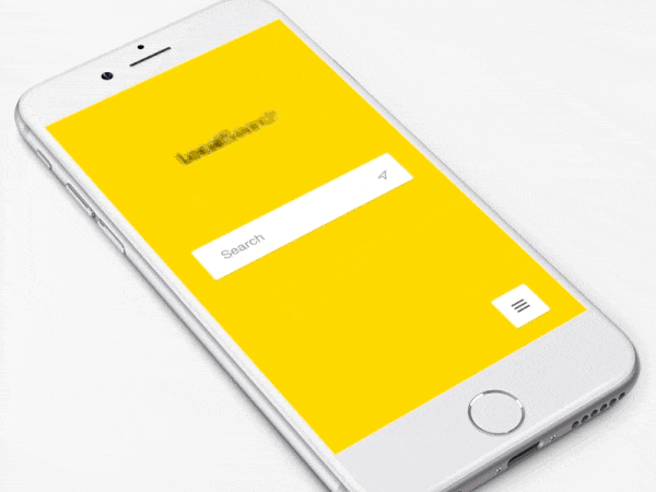
3. Search App Microinteractions
Short, sweet, and to the point. I think this best describes these search app microinteractions designed by Lukas Horak. Every animation is quick but still noticeable.
This is how you should design microinteractions to avoid over-complexity. If the interface would load quicker without the animation then why bother adding it? Quick animations keep the user moving through without bogging down the experience.
4. Fitness Goal Microinteraction
I think Jakub AntalÃÂÂk really hit this one out of the park with his fitness goal microinteraction. The screens all have this feeling of jiggly jell-o because the shapes move so fluidly.
Yet the interface also feels solid and useable. It goes to show that microinteractions crafted with a purpose can still be fun and entertaining but also functional and pragmatic.

5. Pull to Refresh Animation
Here’s one of my absolute favorite pull-to-refresh animations created by the team at Ramotion. This not only mimics a fluid with the pull action, but the response animation smoothly connects from a splash of liquid into a loading circle.
This much attention to detail is what brings out the true beauty in mobile app microinteractions.
6. Tab Microinteraction
Tabbed widgets are quite common for mobile apps because of the smaller screens. I really like this microinteraction created by John Noussis, although I think it’d be more effective at a faster speed, but the animation itself is glorious and well thought out.
The tab anchor arrow glides over to the right just as new content bounces in from the right. It gives the illusion of the entire screen physically moving to the right. The animation is exquisite, but since it’s so slow I think most users would get annoyed after a few days.
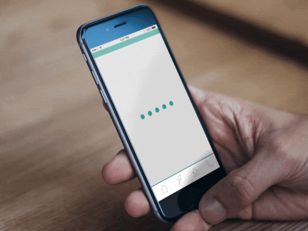
7. Preloading Animation
I haven’t said much about loading bars in this post, but they’re just as valuable to the overall experience. Most users don’t want to wait for data to load, but they definitely don’t want to stare at a blank screen while it loads.
Bret Kurtz did this amazing preloading screen that’s both fun and informative. The user can actually be entertained watching this little animation repeat. They can also be reassured that the application is still loading their data and hasn’t crashed.
Wrapping Up
All of these examples brilliantly demonstrate the value of microinteractions. Mobile apps get a lot more value from microinteractions because users physically touch the screens with their fingers. Users don’t tap their desktop monitors or their laptop screens, but everyone taps their smartphones because it’s the default state of interactivity.
It’s a much more personal experience, which is why mobile app design can be such a nuanced process. When done properly, the addition of great mobile microinteractions can build a powerful illusory user experience out of nothing but pixels and motion.