Unveiling the Hidden Meanings in 25 Ingenious Logos
Logos serve as a crucial element in branding. A well-designed logo can effectively help the public associate and recognize your brand. That’s why logos undergo rigorous design and redesign processes to accurately represent the brand they stand for.
However, not all logos succeed in conveying their intended meanings. For those that do, their clever design elements often go unnoticed. To shed light on this, we’ve curated a list of 25 logos with hidden messages in their designs.
Logo Evolution of 25 Famous Brands
A company's logo is a recognition tool for the public to link their services or products to the... Read more
1. Amazon
The name Amazon aptly reflects the online store’s extensive product range. The arrow connecting the letters ‘A’ and ‘Z’ signifies that the store offers everything from A to Z. Additionally, the arrow doubles as a smile, indicating customer satisfaction.

2. FedEx
At first glance, FedEx’s logo appears straightforward. However, a closer look reveals an arrow between the ‘E’ and ‘X,’ symbolizing speed and precision.

3. Sony VAIO
Sony’s VAIO line of laptops features a logo that’s more than just stylized text. The ‘V’ and ‘A’ represent analog waves, while the ‘I’ and ‘O’ symbolize the binary digits 1 and 0, highlighting the transition from analog to digital.

4. Sun Microsystems
Designed by computer science professor Vaughan Pratt, Sun Microsystems’ logo is an ambigram. This typographic design allows the word ‘Sun’ to be read from multiple directions.

5. Hershey’s
Hershey’s Kisses are not just delightful treats. If you tilt the logo sideways, you’ll notice a chocolate ‘Kiss’ shape between the ‘K’ and ‘I’.

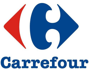
6. Carrefour
The name of the popular French hypermarket, Carrefour, translates to “crossroads.” This is symbolized by the red and blue arrows pointing in different directions. If you look closely, you can also see the letter ‘C’ cleverly integrated into the design through negative space.

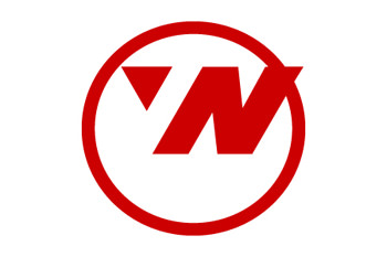
7. Northwest Airlines
Before its retirement in 2003, Northwest Airlines had a cleverly designed logo. It used negative space to represent both the letters ‘N’ and ‘W.’ Additionally, a triangle within a circle suggests a compass, pointing in the northwest direction.

8. NBC
Originally known as the Peacock Network, NBC’s logo has evolved over time. The peacock’s six-colored tail represents different departments: News, Sports, Entertainment, Stations, Networks, and Productions. The peacock faces right, symbolizing the network’s forward-looking vision.

9. Goodwill
Goodwill, a non-profit organization, has a logo that features a smile, representing its mission to improve lives. Upon closer inspection, you’ll notice that the letter ‘G’ also forms a half-smiley face. So, is it a ‘G’ or a smiley face?
(Image source: Wikipedia)

10. Toblerone
Toblerone’s logo is more intricate than it appears. If you look closely at the mountain, you’ll spot a bear. This is a nod to the company’s origins in Bern, Switzerland, also known as the City of Bears.
(Image source: Web Designer Depot)

11. Le Tour de France
The logo of Le Tour de France is not just about the name. If you look closely at the letter ‘R’ and the adjacent yellow circle, you’ll see a cyclist in a racing position. The yellow circle also symbolizes the sun, indicating that the race occurs during the day.

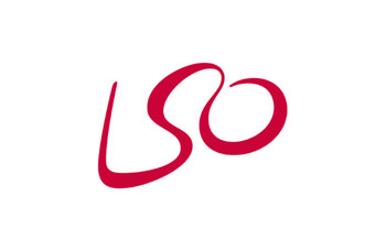
12. London Symphony Orchestra
The London Symphony Orchestra’s logo may seem simple at first, featuring only the initials. However, a closer look reveals that the wavy line also forms an abstract image of a conductor waving his baton.

13. MyFonts
MyFonts serves as a comprehensive resource for all your font requirements. The site showcases its expertise by featuring a unique font in its logo. The ‘My’ in the logo is designed to resemble a hand, indicating that you can easily “get your hands” on the fonts you need.

14. Facebook Places
Do you remember Facebook Places, the now-defunct rival to Foursquare? If you look closely at its logo, you’ll notice that the rectangle, which represents a map, seems to form the number 4.

15. Spartan Golf Club
This logo cleverly incorporates two elements. First, it depicts a golfer in mid-swing. Second, through the use of negative space, it also reveals the side profile of a Spartan warrior.

16. Cluenatic
As you might guess from its name, Cluenatic is a puzzle game. Its logo is equally puzzling, featuring the word ‘Clue’ arranged to resemble a maze. When viewed as a whole, the logo also takes on the shape of a key.

17. Cisco
Cisco is renowned for its networking equipment. Its logo features a digital signal, which also subtly resembles San Francisco’s iconic Golden Gate Bridge. This dual symbolism effectively communicates both the company’s function and location.

18. Eighty 20
This data company’s logo may seem like a random arrangement of squares, but it’s actually binary code. The top row reads ‘1010000’ and the bottom row ‘0010100’, representing the numbers 80 and 20, which together make up the company’s name.

19. Nintendo Gamecube
The Nintendo Gamecube logo is more than just visually appealing. The blue lines form the letter ‘G’, while the black space in between shapes the letter ‘C’. These initials stand for Gamecube, making the logo a clever play on words.

20. US Cyber Command
At first glance, the US Cyber Command logo may appear ordinary. However, a closer look at the inner golden ring reveals 32 characters. These characters are believed to be an encrypted version of the Cyber Command’s mission statement.

21. Microsoft XNA
XNA is a toolkit developed by Microsoft for game development. Interestingly, the orange dashed line forming one of the strokes in the ‘X’ is Morse Code for XNA. Specifically, “_.._” represents ‘X’, ” _.” represents ‘N’, and “._” represents ‘A’.

22. Picasa
Google’s Picasa is more than just an image editing and sharing platform. The name Picasa cleverly combines ‘Pic’ and ‘Casa’, where ‘Casa’ means ‘house’ in Spanish. So, do you see a house in the middle of the colorful shutters now?

23. Rdio
Rdio provides radio streaming services, despite missing an ‘A’ in its name. The logo ingeniously incorporates musical notes within the letters ‘D’ and ‘O’, specifically a semibreve and a crochet.

24. The Bronx Zoo
The Bronx Zoo, located in New York City, naturally incorporates animals like giraffes and birds in its logo. But if you look closely, you’ll notice that the space between the giraffes’ legs cleverly includes New York City’s skyline.

25. Pittsburgh Zoo
American zoos have a knack for using negative space in their logos, and the Pittsburgh Zoo in Pennsylvania is no exception.
If you look carefully, you’ll see a gorilla and a lion facing each other on either side of the tree.
