How to Style HTML5 Range Slider for Consistent Cross-Browser Appearance
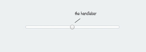
The range input type is a new addition in HTML5, allowing users to input numbers within a specified range using a slider control. This intuitive user interface, commonly found in applications, lets users slide the handle bar left or right to select a number within the range.
However, each browser renders this input type slightly differently, which may not meet some designers’ preferences. In this article, we will show you how to style the range slider for a more unified design. If you’re ready, let’s get started.
Creating & Styling Progress Bar With HTML5
HTML5 brought us the progress bar element, making it easier to visually represent the completion status of tasks... Read more
Chrome, Safari, and Opera
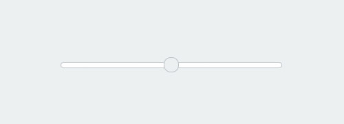
Safari and Opera are Webkit-based browsers. Although Chrome has adopted its own engine, Blink, it still inherits several code bases from Webkit. This provides an easy way to style any input type, including range. To start, we can select the input with the attribute selector and remove the native Webkit/Chrome styles by setting the -webkit-appearance to none.
input[type=range] {
  -webkit-appearance: none;
}
From here, we can add styles such as border, background color, and rounded borders.
input[type=range] {
  -webkit-appearance: none;
  width: 100%;
  border-radius: 8px;
  height: 7px;
  border: 1px solid #bdc3c7;
  background-color: #fff;
}
As shown below, the handle bar is the only part of the input that remains unaffected by the above code.
To apply styles to it, we use the Webkit proprietary pseudo-element selector ::-webkit-slider-thumb and remove the native styles with -webkit-appearance as shown below.
input[type='range']::-webkit-slider-thumb {
  -webkit-appearance: none;
  background-color: #ecf0f1;
  border: 1px solid #bdc3c7;
  width: 20px;
  height: 20px;
  border-radius: 10px;
  cursor: pointer;
}
That’s how we style the range input type in a Webkit browser. The style should take effect in Chrome, Safari, and the latest version of Opera. However, it will not affect Firefox and Internet Explorer as they use different engines. But don’t worry, we have workarounds for those as well.
Firefox
Adding styles directly with the attribute selector input[type='range'] won’t change the native styles of the input in Firefox. Instead, we use Firefox’s proprietary pseudo-element selectors ::-moz-range-track and ::-moz-range-thumb.
The ::-moz-range-track affects the input range track, while the ::-moz-range-thumb affects the input handle bar.
.firefox input[type=range]::-moz-range-track {
  border-radius: 8px;
  height: 7px;
  border: 1px solid #bdc3c7;
  background-color: #fff;
}
.firefox input[type=range]::-moz-range-thumb {
  background: #ecf0f1;
  border: 1px solid #bdc3c7;
  width: 20px;
  height: 20px;
  border-radius: 10px;
  cursor: pointer;
}
We apply the exact same styles. Open Firefox, and you should get a similar result as in Webkit browsers.
Internet Explorer
Internet Explorer displays the range input type quite differently from other browsers. To make it easier, here’s a diagram showing the components that form the input.
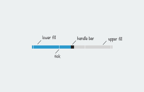
IE also shows a tooltip displaying the current value as you slide the handle bar.

Each of these input parts can be styled using IE’s proprietary pseudo-elements ::-ms-fill-lower, ::-ms-fill-upper, ::-ms-thumb, ::-ms-ticks, and ::-ms-tooltip. We will apply the same styles as in Webkit and Firefox.
input[type="range"]::-ms-fill-lower,
input[type="range"]::-ms-fill-upper {
  background: transparent;
}
input[type="range"]::-ms-track {
  border-radius: 8px;
  height: 7px;
  border: 1px solid #bdc3c7;
  background-color: #fff;
}
input[type="range"]::-ms-thumb {
  background-color: #ecf0f1;
  border: 1px solid #bdc3c7;
  width: 20px;
  height: 20px;
  border-radius: 10px;
  cursor: pointer;
}
However, the output is not quite what we expected. The tick marks are visible, and the top and bottom of the handle bar are hidden.
We can easily remove the tick marks by adding step="any" to the input element. However, making the handle bar fully visible is not possible. It’s as if the input element has overflow set to hidden, and this cannot be undone by setting overflow to visible. This is an issue I’m still trying to solve. If you have a solution, please share it in the comment box below.
Final Thought
The range input type is quite customizable, but each browser has its own approach, requiring longer code than expected. Hopefully, a standard will be established in the future to address this. Lastly, here are links to see the input range we have shown you in this article.