Creating Animated Tooltip Easily with Hint.css
Tooltip is a great way to display extra information on a website without taking extra space. The tooltip generally appears upon mouse hover, and there are probably of hundreds of jQuery plugins to include fancy tooltips on your website.
However, some common downsides of using jQuery plugin is that it comes with a set of useless options, and bloated with codes that slow down website performance.
So, today, we are going to take a look at an alternative of creating tooltip. With a bunch of new features in CSS3, it is now possible to create a comparable fancy tooltip only using CSS. Let’s get started.
Using Hint.css
In this post, we are not going to build it from scratch. We will be using Hint.css. Hint.css is a collection of classes and style rules, allowing us to create a simple tooltip more quickly. To use, simply add the stylesheet to your HTML document, or copy all the style rules to your own stylesheet.
<link rel="stylesheet" href="hint.css">
Now, in your document text, wrap the piece you want to insert a tooltip with an inline element, like using a span or anchor element. And add the tooltip content with the data-hint attribute, like so.
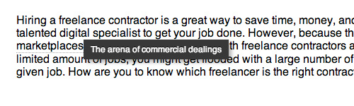
However, because the freelance <span data-hint="The arena of commercial dealings">marketplaces</span> across the globe are filled with freelance contractors all tendering for a limited amount of jobs.
Technically, this is all you required. If you preview your document in the browser and roll over your mouse, you should see the tooltip pop up.
This tooltip is displayed with pseudo-element, and using CSS3 Transition for the animated move.
Understanding Pseudo-Element :before and :after
Cascading Style Sheet (CSS) is primarily intended for applying styles to the HTML markup, however in some cases... Read more
Give it a clue
Unless you are using an anchor element that comes with distinctive styles by default, there is no indication showing that the particular word will show a tooltip like what you see in the screenshot above, and thus, users, will most likely be clueless.
So, for the sake of better user experience, we can add some extra styles to give it an indicator, for example:
span[data-hint] {
  border-bottom: 1px dotted #aaa;
}

span[data-hint]:hover {
  cursor: pointer;
}
These styles will give the span element with data-hint attribute a dotted border bottom. You can adjust the styles to meet your design requirement.
Tooltip Direction
We can show the tooltip in four different directions: top, bottom, right, and left using the provided classes.
Left
<span class="hint--left" data-hint="The arena of commercial dealings">marketplaces</span>
Right
<span class="hint--right" data-hint="The arena of commercial dealings">marketplaces</span>
Top
<span class="hint--top" data-hint="The arena of commercial dealings">marketplaces</span>
Bottom
<span class="hint--bottom" data-hint="The arena of commercial dealings">marketplaces</span>
Or keep showing the Tooltip
<span class="hint--always" data-hint="The arena of commercial dealings">marketplaces</span>
Final Thought
With more advanced properties in CSS3, today, we are no longer solely rely on JavaScript or jQuery to create a fancy UI, like creating a Tooltip, and using Hint.css, we can create one in snap. But as stated early in this post, this technique only allows us for creating a simple text-based tooltip.
If you want to create a more advanced tooltip, say, a tooltip with image or showing the tooltip upon mouse click rather than on mouse hover, using JavaScript or jQuery is still the better way to go.