A Look Into: CSS3 Box-sizing
Not too long ago, when we designed a box on a webpage using a div element, we typically set both width and height to 100px, adding 10px of padding and 10px borders.
 div {
   width: 100px;
   height: 100px;
   padding: 10px;
   border: 10px solid #eaeaea;
 }
This setup would cause browsers to increase the box’s size to 140px. The total width or height, 140px, comprises the original width/height plus twice the padding and twice the border thickness, calculated as 100px [width/height] + (2 x 10px [padding]) + (2 x 10px [border]).
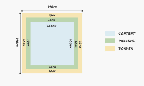
However, there are times when we want our box to maintain a consistent size of 100px, regardless of any padding or borders we add.
To address this common challenge in web page layout design, we can utilize the CSS3 box-sizing property. This allows us to dictate how the CSS box model.
Mastering box-sizing
The box-sizing property offers two choices: content-box, which is the default setting where the box model expands as previously described, and border-box. The latter option ensures the dimensions of the box are maintained as specified, with padding and borders included within the box’s total width and height.
div {
  width: 100px;
  height: 100px;
  padding: 10px;
  border: 10px solid #eaeaea;
  box-sizing: border-box;
  -moz-box-sizing: border-box; /* Firefox 1-3 */
  -webkit-box-sizing: border-box; /* Safari (old) */
}
With border-box, a box set to 100px square, factoring in 10 pixels for padding and borders, effectively sizes its content to 60px to keep the box’s outer dimensions at 100px. This calculation subtracts padding and borders from the overall dimensions, ensuring the box size remains constant.

Compatibility across browsers
The box-sizing property is well-supported across modern browsers, including Firefox 3.6+, Safari 3, Opera 8.5+, and Internet Explorer 8 and newer. Thus, if your site’s audience primarily uses these or later versions, leveraging this property can enhance layout design significantly.
box-sizing: border-box;
-moz-box-sizing: border-box; /* Firefox 1-3 */
-webkit-box-sizing: border-box; /* Safari */
}
Implementing the above CSS snippet universally applies the box-sizing rule to all elements on your site, simplifying layout management and ensuring consistency across various components.
Practical Application
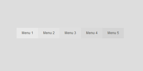
In this example, we’ll illustrate the practical use of the box-sizing property by creating a straightforward navigation bar. This bar will contain five links, structured using the following HTML code:
<ul>
  <li><a href="#">Menu 1</a></li>
  <li><a href="#">Menu 2</a></li>
  <li><a href="#">Menu 3</a></li>
  <li><a href="#">Menu 4</a></li>
  <li><a href="#">Menu 5</a></li>
</ul>
To enhance its appearance, we’ll define a fixed width of 500px for the navigation bar and set each link to 100px wide. We’ll align the list items horizontally and assign unique background colors to each link for visual distinction.
nav {
  width: 500px;
  margin: 50px auto 0;
  height: 50px;
}
nav ul {
  padding: 0;
  margin: 0;
}
nav li {
  float: left;
}
nav a {
  display: inline-block;
  width: 100px;
  height: 100%;
  background-color: #ccc;
  color: #555;
  text-decoration: none;
  font-family: Arial, sans-serif;
  font-size: 12pt;
  line-height: 300%;
  text-align: center;
}
nav li:nth-child(1) a {
  background-color: #E9E9E9;
  border-left: 0;
}
nav li:nth-child(2) a {
  background-color: #E4E4E4;
}
nav li:nth-child(3) a {
  background-color: #DFDFDF;
}
nav li:nth-child(4) a {
  background-color: #D9D9D9;
}
nav li:nth-child(5) a {
  background-color: #D4D4D4;
  border-right: 0;
}
Initially, our navigation appears standard.
Yet, challenges emerge upon introducing left or right borders to the links. This addition increases each link’s width from 100px to 102px, unexpectedly extending the total width of the navigation beyond the intended 500px.
nav a {
  border-left: 1px solid #aaa;
  border-right: 1px solid #f3f3f3;
  box-sizing: border-box;
  -moz-box-sizing: border-box;
  -webkit-box-sizing: border-box;
}
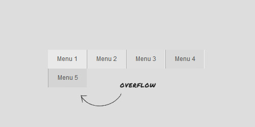
To rectify this, implementing the box-sizing attribute ensures that the navigation’s dimensions remain consistent, inclusive of border thickness.
Expand Your Knowledge
For those eager to delve further into CSS intricacies, here are some handpicked resources:
- Understanding the CSS Box Model – A comprehensive guide by Tech Republic.
- Box-sizing bug in Firefox – A detailed bug report on BugZilla.
- Box-sizing FTW – Insights by Paul Irish on the advantages of
box-sizing.