CSS3 Blending Mode
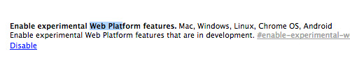
Note: Enabling a flag on the chrome://flags page was required for this CSS Tip to work when this article was written.
If you have ever used a graphic or photo editor like Photoshop or Pixelmator, you should already be familiar with blending modes. Blending modes are a collection of modes that enable an object to blend with other objects, producing a contrastive output from the mix. If done correctly, Blending Modes can produce a very enticing result, like this.
Blending modes have historically been a feature found only in graphic and photo editors. Nowadays, you can also find them in the CSS realm.
Mastering LESS Color Functions for Web Design
LESS is a powerful tool for web designers. We've previously discussed various aspects of LESS, from designing sleek... Read more
Getting Started
It’s worth noting that CSS3 Blend Mode was an experimental feature at the time of writing. Firefox and Chrome were the only browsers that shipped with this feature at the time of the writing.
Note: In Chrome, to render CSS3 Blend Modes, you previously had to enable the Enable experimental Web Platform features flag from the chrome://flags page. **Note:** This flag may no longer be necessary in current Chrome versions.
Background and Mix Blend Mode
There are two main CSS properties for Blending Modes: mix-blend-mode and background-blend-mode.
The mix-blend-mode property defines how the content of an element blends with the content underneath it. The background-blend-mode property, as the name implies, blends an element’s background layers (color, image, or gradient).
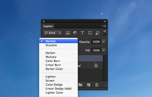
Similar to Photoshop, you can apply the following blending modes with these CSS properties: normal, multiply, screen, overlay, darken, lighten, color-dodge, color-burn, hard-light, soft-light, difference, exclusion, hue, saturation, color, and luminosity.
Using CSS3 Blend Mode
The Google logo is colorful and has been adapted in many forms for the Google Doodle project. In this post, we will apply the blend effect to the Google logotype to illustrate how this CSS3 feature works.
First, let’s set up the HTML markup. We wrap each letter in a <span> element so we can specify different colors and style rules for each letter.
<h1>
    <span>G</span>
    <span>o</span>
    <span>o</span>
    <span>g</span>
    <span>l</span>
    <span>e</span>
</h1>
Then, we add the Google brand colors, which can be found on sites like BrandColors. We use the nth-child CSS pseudo-class selector to target each <span>, allowing us to apply styles without adding extra HTML classes to the elements.
.demo-wrapper .title {
    letter-spacing: -25px;
}

span:first-child {
    color: #4285f4;
    position: relative;
    z-index: 100;
}

span:nth-child(2) {
    color: #db4437;
}

span:nth-child(3) {
    color: #f4b400;
}

span:nth-child(4) {
    color: #4285f4;
    position: relative;
    z-index: 100;
}

span:nth-child(5) {
    color: #0f9d58;
}

span:nth-child(6) {
    color: #db4437;
}
At this stage, here’s how the logo looks. The logo looks denser because we decreased the letter-spacing to -25px in the CSS.
Now we apply the Blend mode.
span {
    mix-blend-mode: multiply;
}
The original colors of the logo, as well as the colors where the letters intersect, become more vivid.
We have created two versions of the logo: one using standard opacity and one using CSS3 Blend Mode. The results are distinctive; the colors of the logo using opacity look pale and faded compared to the blended version. See a demo comparison below.