A Look Into: CSS3 2D Transformations
The Transformation module, a tremendous addition in CSS3, takes the way we manipulate elements on a website to the next level.
While some experiments are truly amazing, we are not going to build something like a CSS-only icon that can somehow transform into an Autobot, as it might be overwhelming and not quite usable in real life.
Instead, this time, we will step back and review the basics of CSS3 2D Transformations to see how they work at a fundamental level.
Beginner’s Guide to CSS3 (Updated)
Since its announcement back in 2005, the development of Cascading Style Sheet (CSS) level 3, or better known... Read more
The Syntax
The CSS3 Transformations module basically allows us to transform an element to a certain extent, such as translating, scaling, rotating, and skewing.
The official syntax is transform:method(value). However, like other great CSS3 additions still in the early stages, current browsers need the prefixed syntax version to run the transformations. So, the complete syntax looks like this:
transform: method(value);         /* W3C Official Syntax */
-o-transform: method(value);      /* Opera 10.5+ */
-ms-transform: method(value);     /* Internet Explorer 9.0+ */
-moz-transform: method(value);    /* Firefox 3.6+ */
-webkit-transform: method(value); /* Chrome / Safari 3.2+ */
Also, the method we are referring to above is the transform-functions, which can be replaced with one of the following: translate(), scale(), rotate(), or skew().
The Value
Most method values correspond to the X-axis and Y-axis. If you remember the Cartesian coordinates system from your Math class, the basic principle is similar: the X-axis represents the horizontal line, and the Y-axis represents the vertical line.

Rotations are an exception. Rotation uses polar coordinates, which are expressed in degrees ranging from 0 to 360.
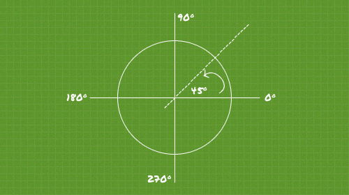
The values for all methods can be positive or negative. Note, however, that web pages are read sequentially from top to bottom, which makes the Y-axis in web coordinates work opposite to the standard Cartesian principle. This means adding a negative value to the Y-axis will move the element upwards.
Using the Transformations
Now, let’s look at the following basic demonstration to see Transformation in action.
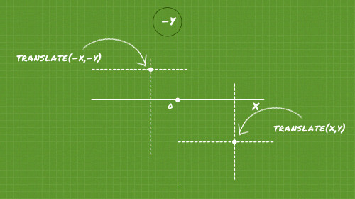
1. Translate
Don’t be confused by the term translate; it doesn’t refer to translating foreign languages. The translate method here moves elements in a specific direction.
The method contains two values: X and Y. The X value, as pointed out above, moves the element horizontally (left or right), while the Y value moves it vertically (bottom or top).
Now, let’s see some simple demonstrations below:
div {
  width: 100px;
  height: 100px;
  transform: translate(100px, 250px);
}
The snippet above moves the element 100px to the right and 250px to the bottom.
div {
  width: 100px;
  height: 100px;
  transform: translate(100px, 0);
}
The snippet above moves the element 100px to the right, as the Y-axis is zeroed. To move the element to the left, set the X-axis to a negative value, as follows:
div {
  width: 100px;
  height: 100px;
  transform: translate(-100px, 0);
}Alternatively, we can move the element in a single direction using these individual methods: translateX() and translateY(). The difference is that each of these methods accepts only one value.
So, practically speaking, transform: translate(-100px, 0) is equivalent to transform: translateX(-100px).
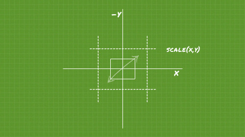
2. Scale
The scale method allows us to enlarge or reduce elements from their original size. The scale’s value structure is the same as the translate method; it contains X and Y values, but we don’t specify units. Here is an example:
div {
  width: 100px;
  height: 100px;
  transform: scale(1.5);
}
The example above enlarges the div to 1.5 times or 150% of its original size. Since we scale it equally for both the X and Y directions, we only need to declare one value. You can also declare it as transform: scale(1.5, 1.5); for more detail; it achieves the same result.
Furthermore, if we want to reduce the element, we use a value between 0 and 1 (e.g., 0.999 down to values slightly above 0). The example below reduces the size of the div by 50%:
div {
  width: 100px;
  height: 100px;
  transform: scale(0.5);
}
However, be cautious: if you set the value to absolute “0”, the div will disappear. Unless you have a valid reason, this is not recommended.
3. Rotate
As mentioned earlier, the rotate method uses polar coordinates, so the value is stated in degrees. Here are two examples:
The snippet below rotates the div 30 degrees clockwise.
div {
  width: 100px;
  height: 100px;
  transform: rotate(30deg);
}
A negative value, as illustrated below, rotates the div in the opposite direction (counter-clockwise) by the same degree.
div {
  width: 100px;
  height: 100px;
  transform: rotate(-30deg);
}4. Skew
The skew method enables us to create a parallelogram. It also accepts two values for the X and Y-axis. However, the values are stated in degrees, unlike the linear measurements used for the scale or translate methods. Here is an example:
div {
  width: 200px;
  height: 100px;
  transform: skew(30deg, 10deg);
}5. Multiple method
The transform property is not limited to handling only one method; in fact, we can include multiple methods in a single declaration, like this:
div {
  width: 100px;
  height: 100px;
  transform: translateX(100px) rotate(45deg);
}
The snippet above moves the element 100px to the right and simultaneously rotates it 45 degrees.
Transform Origin
The transform-origin property – as its name implies – controls the starting point of the transformation. If this property is not explicitly declared using the syntax transform-origin: X Y;, the browser defaults to 50% for X and 50% for Y.

Now, if we specify the transform-origin to 0 (X) 0 (Y), the transformation starts at the top-left corner.
Again, all browsers still need the prefixed version to invoke this property. Here is the complete version to ensure it works in most current browsers:
-webkit-transform-origin: X Y;
-moz-transform-origin: X Y;
-o-transform-origin: X Y;
-ms-transform-origin: X Y;
transform-origin: X Y;Conclusion
We have covered the four essential transformation methods: translate, scale, rotate, and skew.
However, as mentioned, this module is still in its early stages. If you apply these methods on your website, ensure it degrades gracefully for incompatible browsers (not referring to IE6 here).
Lastly, you can view the demo or download the source from the following links.