How to Create CSS-only Sticky Footer
Normally, we need JavaScript to perform scrolling effects related to different user actions on web pages. The script does the job of tracking how far up or down scrolling takes a page, and triggers an action when a threshold height is reached.
It’s not particularly a bad thing to use JavaScript for scrolling effects. In fact there are more complicated cases that are impossible to solve without JavaScript. However there are CSS hacks that can replace these scripts at times.
This post is going to show you how to create footer reveal effects on page scroll using CSS. We will be using two use cases to demonstrate this: one for the entire page (see demo) & one for individual page elements, such as articles.
Read Also: HTML5 Basic Elements: Header, Nav, and Footer

Full Page
We need to create a footer that appears from beneath the page while the user is scrolling down. Also, when they are scrolling the page back up the footer needs to be hidden beneath the page again.
To achieve this goal, first we have to create a footer with fixed position at the bottom of the screen.
1. Create a Fixed Footer
Let’s add some content and a footer to the page first. I’m using the HTML tags <main> and <footer> for semantics. However, <div> works as well.
In my demo, there’s a bat image shown inside the footer for a not-so spooky effect, but you can choose any other image you like.
<main>
  <h2>Keep scrolling till you see the footer</h2>
  <p>Lorem ipsum dolor sit amet...</p>
  <!-- some more paragraphs -->
</main>
<footer>
	<img src="bat.svg" width="100%">
</footer>
Moving to CSS, remove any space around the <body> tag by setting margins to 0, and make it long enough by adding a custom height to induce scrolling (if the body content in your page is long enough to cause scrolling, you don’t have to give it a height).
Give some dimensions (width and height) to the footer, and fix its position to the bottom of the screen with the position: fixed; and bottom: 0; properties.
body {
  font-family: Crimson Text;
  font-size: 13pt;
  margin: 0;
}
footer {
  width: 100%;
  height: 200px;
  position: fixed;
  bottom: 0;
  background-color: #DD5632;
}
2. Hide the Footer
Apply the z-index:-1 rule to the footer in order to place it behind all other elements on the page.
Color both the <body> and <html> tags white in order to cover the footer.
body, html{
	background-color: #fff;
}
footer {
  width: 100%;
  height: 200px;
  position: fixed;
  bottom: 0;
  background-color: #DD5632;
  z-index: -1;
}
3. Adjust the Bottom Margin
Set the margin-bottom of the <body> tag equal to the height of the footer (in my example 200px).
This way there will be enough space at the bottom for the footer to be visible when the user scrolls down the page.
body {
  height: 1000px;
  margin: 0;
  margin-bottom: 200px;
}
That’s it. The footer reveal effect for a full web page is done. Check out the Codepen demo below.
Individual Page Elements
This technique can be used for an individual HTML element (with a footer) that’s long enough for a proper page scroll effect. The method is a bit hacky, as it currently doesn’t work in Chrome and IE, but it has a decent fallback.
1. Create a Long Article
First, let’s create a long article with a footer. To promote semantic code, I chose <article> and <footer>.
<article>
    <h2>Article 1</h2>
    <p>Lorem ipsum dolor sit amet...</p>
    <!-- some more paragraphs -->
    <footer></footer>
</article>
Below you can see the basic styling of the article and the footer.
article{
    width: 500px;
    background-color:#FEF9F3;
    padding: 20px 40px;
}
article>footer{
    height: 100px;
    background-color: #FE0178;
}
body{
    font-family: cormorant garamond;
}
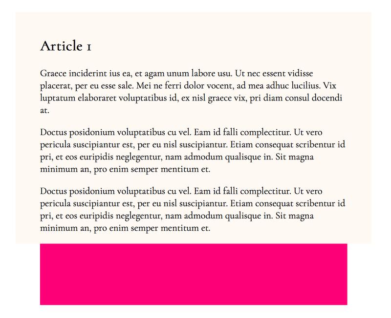
My article currently looks like this. Of course you can use other basic style rules as well.

2. Make the Footer Sticky
The previous footer was fixed, this one is going to be sticky. Apply the position:sticky rule to the footer, so it will move inside the boundaries of the article but still maintain its position on the screen while the user is scrolling up and down.
article>footer{
    height: 100px;
    background-color: #FE0178;
    position: -webkit-sticky;
    position: sticky;
    bottom: 80px;
}
The bottom:80px rule fixes the position of the footer 80px above the bottom of the article.
You can adjust its value to your taste, since it determines the point where the footer starts to appear or disappear while the user is scrolling down or up.
Give the same value for the bottom margin of the article, so that there will enough space at the bottom to reveal the full footer.
article{
    width: 500px;
    background-color:#FEF9F3;
    padding: 20px 40px;
    margin-bottom: 80px;
}
3. Add a Partially Transparent Background
Now we need an opening next the bottom of the article through which we can see the sticky footer scrolling down and up.
To achieve this, replace the background-color of the article with a linear gradient background-image, which from the top of the article to the top of the footer is colored with the background color of the article, and the remaining portion to the bottom is made transparent.
article{
    width: 500px;
    padding: 20px 40px;
    background-image:linear-gradient(
                  to bottom, #FEF9F3 calc(100% - 120px),
                  transparent 0);
    margin-bottom: 80px;
}
Thecalc(100%-120px) CSS function calculates the full height of the article minus the footer. In my example, it’s 120px (100px for height + 20px for padding).
4. Place the Footer Back
Finally, let’s place the footer behind the article using the z-index: -1 CSS rule.
article>footer{
    height: 100px;
    background-color: #FE0178;
    position: -webkit-sticky;
    position: sticky;
    bottom: 80px;
    z-index: -1;
}
And that’s it, the individual page element with the on-scroll reveal effect is done. Check out the Codepen pen below. You can also find both use cases on our Github page.
<div class="grid-container">
  <div class="grid-top">Top</div>
  <div class="grid-left">Left</div>
  <div class="grid-centre">centre</div>
  <div class="grid-right">Right</div>
  <div class="grid-bottom">Bottom</div>
</div>
.grid-container {
  width: 500px;
  height: 500px;
  display: grid;
  grid-template-areas:  "top    top    top"
                       "left   centre right"
                       "bottom bottom bottom";
}
.grid-top {
  grid-area: top;
}
.grid-bottom {
  grid-area: bottom;
}
.grid-left {
  grid-area: left;
}
.grid-right {
  grid-area: right;
}
.grid-centre{
  grid-area: centre;
}
.grid-container {
  width: 500px;
  height: 500px;
  display: grid;
  grid-template-areas: "top    top    top"
                      "left   centre right"
                      "bottom bottom bottom";
  grid-template-columns: 100px auto 100px;
  grid-template-rows: 50px  auto 150px;
}
.grid-container {
  width: 500px;
  height: 500px;
  display: grid;
  grid-template-areas: "top    top    top"
                      "left   centre right"
                      "bottom bottom bottom";
  grid-template-columns: 100px auto 100px;
  grid-template-rows: 50px  auto 150px;
  grid-gap: 5px 5px;
}