Create CSS-Only Image Reveal Effect with Transparent Borders
A CSS-only image reveal effect can be solved in different ways. It’s actually quite easy to code a design in which the image stands out of (is overflown by) its solid background —you just place an image over a smaller element with a solid background.
You can get the same result if you use transparent borders, where you keep the size of the background element the same as that of the foreground and add transparent borders in order to create an empty space for the foreground to overflow into.
Read Also: How to Create a Cut-out Border Design with CSS
There are some advantages in using the latter method. Since it’s the transparent borders that provide the area for the foreground to overflow into, we can control the direction of the overflow between the left, right, top and bottom borders. Also, having the same size for both the foreground and the background makes it easier to move both elements simultaneously across the page.
In a nutshell, we’re going to see how to create a CSS-only image reveal effect using a smaller solid background with a foreground image that has transparent borders. You can check out the final demo below.
1. Create the initial code
<div class=foo></div>
In the CSS, we use two CSS variables, --bgc and --dim for the background colour and the dimensions of the .foo container, respectively. In the example, I used the same value for the width and height to get a square-shaped box, create separate variables for the height and the width if you want a rectangular.
Read Also: A Look Into: Using CSS Variables
We also add the position:relative rule to .foo, so that its pseudo-elements, that we’re gonna use for revealing the image, can be absolutely positioned (see below), and thus stacked upon each other.
.foo {
    --bgc: #FFCC03;
    --dim: 300px;
    width: var(--dim);
    height: var(--dim);
    background-color: var(--bgc);
    position: relative;
}
We add an empty content property to both pseudo-elements, .foo::before and .foo::after, to get them properly rendered.
.foo::before,
.foo::after{
    content: '';
    position: absolute;
    left: 0;
    top: 0;
}
The .foo element, its two pseudo-elements, .foo::before, .foo::after, and their :hover pseudo-classes get a transition property that will add an ease-in transition to them for 500 milliseconds (half a second).
.foo,
.foo:hover,
.foo::before,
.foo::after,
.foo:hover::before,
.foo:hover::after {
    transition: transform 500ms ease-in;
}
Read Also: Understanding Pseudo-Element :before and :after
2. Add the image
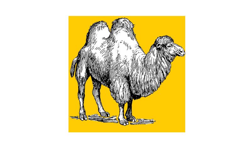
We add the image to the .foo::before pseudo-element as a background image, and size it to cover the whole pseudo-element with the width and height properties. We stack it right beneath the .foo element using the z-index: -1 rule.
.foo::before {
    width: 100%;
    height: 100%;
    background: url(camel.png) center/cover;
    z-index: -1;
}
The center keyword centres the image, while the cover keyword scales the image to cover the entire element while maintaining its aspect ratio.
On the screenshot below you can see what we have so far (z-index is removed from .foo::before so that it can be seen):
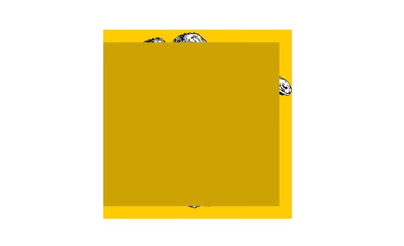
3. Add the slide-out background
To add the smaller (slide-out) background behind the image, we’ll use the other pseudo-element, .foo::after.
We create another CSS variable, --b, for the border width. We give three transparent borders to the ::after pseudo-element: top, right, and bottom.
.foo::after {
    --b: 20px;
    width: calc(100% - var(--b));
    height: calc(100% - calc(var(--b) * 2));
    border: var(--b) solid transparent;
    border-left: none;
    box-shadow: inset 0 var(--dim) 0 var(--bgc);
    filter: brightness(.8);
    z-index: -2;
}
The width is calculated as calc(100% - var--b)) that returns the total width of .foo minus the total width of its horizontal borders (right border only, since there’s not left border).
The height is calculated as calc(100% - calc(var(--b) * 2)) that returns the total height of .foo minus the total width of its vertical borders (top and bottom borders).
With the box-shadow property, we also add a horizontal inset shadow of the size same as .foo (which is var(--dim)).
A CSS filter of brightness(.8) darkens the background colour a little bit, and finally, the z-index: -2 rule places the ::after pseudo-element underneath ::before that contains the image.
Here’s the screenshot of the demo rendered so far (with z-index removed from both pseudo-elements so they can be seen):
4. Add the transformation
We add the transform property to the two pseudo-elements, so when the user hovers over .foo, both pseudo-elements are moved horizontally.
Read Also: A Look Into: CSS3 2D Transformations
As we already added the transition property to all elements at the end of Step 1, the movement of the image and its background are both animated.
.foo:hover::before,
.foo:hover::after {
    transform: translateX(100%);
}
Below, you can see the final demo.
Bonus: Optional margin
If you display .foo next to other elements on a page and want these other elements to move away when the image and its background slides out, then add a right
margin of the same width as that of .foo to the .foo:hover element.
.foo:hover {
    margin-right: var(--dim);
}