4 Ways to Create Beautiful CSS-Only Accordions
Accordions in design are quite handy. You can use them for menus, lists, pictures, short articles, little bits of text, and even videos.
Most accordions depend on JavaScript, especially jQuery. But now, with better CSS3 techniques, we also see good examples that use just HTML and CSS. This is great for times when JavaScript is turned off.
It’s not always easy to make accordions using only CSS. In this article, we’ll explore the key ideas developers use to make one.
There are usually two main ways to create CSS-only accordions. Each way has two common uses. One way uses hidden form elements. The other uses CSS pseudo-selectors.
1. The Radio Button Method
The Radio Button Method uses a hidden radio input and a matching label tag for each section of the accordion. It works like this: when you choose a section, you’re really checking the radio button for that section, just like filling out a form. When you click on another section, you select its radio button, and so on.
In this method, only one section can be open at a time. The HTML structure looks like this:
<div class="css-only-accordion">
    <!-- One Section Inside The Accordion -->
    <div>
        <input type="radio" name="tab-1" id="tab-1">
        <label for="tab-1">Title of Section 1</label>

        <div class="tab-content">
            <h2>Content Title (don't use h1 tag here)</h2>
            <p>Some content.... </p>
        </div>
    </div>

    <!-- Other Sections with The Same Structure -->

</div>
You need to add a separate radio-label pair for each section of the accordion. Just the HTML won’t create the effect you want. You’ll also need to add the right CSS rules. Let’s see how you can do that.
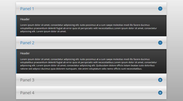
Fixed Height Vertical Tabs
In this solution (look at the image below), the developer made the radio button invisible using the display: none; rule. Then, he positioned the label tag, which has each tab’s title, relatively and gave an absolute position to the corresponding label:after pseudo-element.
This pseudo-element displays the green “+” sign handle that opens the tabs. The closed tabs have handles with green “-” signs. In the CSS, these closed tabs are selected using the element + element selector.
You also need to set a fixed height for the content of the open tab. For this, use the element1 ~ element2 CSS selector to select the body of the open tab (marked with the tab-content class in the HTML above).
The basic CSS logic for this is:
input[type=radio] {
    display: none;
}

label {
    position: relative;
    display: block;
}

label:after {
    content: "+";
    position: absolute;
    right: 1em;
}

input:checked + label:after {
    content: "-";
}

input:checked ~ .tab-content {
    height: 150px;
}
You can see the full CSS here on Codepen. The CSS was originally written in Sass, but you can view the compiled CSS file by clicking on the “View Compiled” button.
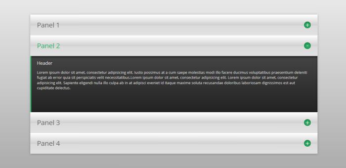
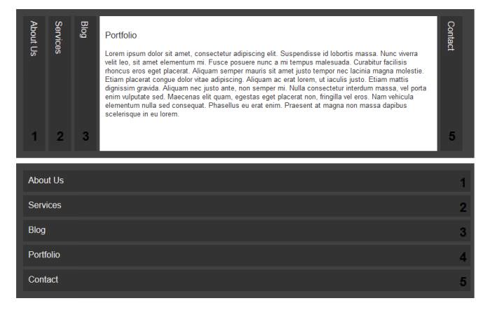
Image Accordion with Radio Buttons
This stunning image accordion also uses the radio button method. But instead of labels, here the developer used the figcaption HTML tag to make the accordion work.
The CSS is a bit different in this case because the tabs are arranged horizontally, not vertically. The developer used the element + element CSS selector (which was used in the previous example to select the toggles) to make sure that the edges of the overlapped images are still visible.
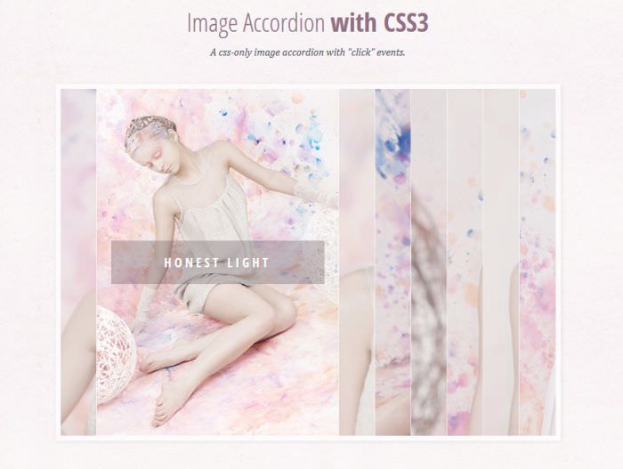
Read the detailed guide on how to create this elegant CSS-only image accordion.
2. The Checkbox Method
The checkbox method uses the checkbox input type instead of the radio button. When users select a tab, they basically tick the corresponding checkbox.
The main difference from the radio button method is that it’s possible to open multiple tabs at the same time, just like ticking multiple checkboxes in a form.
However, the tabs don’t close automatically when another one is clicked. The HTML setup is similar to before, but in this case, you need to use checkboxes for input types.
<div class="css-only-accordion">
    <!-- One Section Inside The Accordion -->
    <div>
        <input type="radio" name="tab-1" id="tab-1">
        <label for="tab-1">Title of Section 1</label>

        <div class="tab-content">
            <h2>Content Title (don't use h1 tag here)</h2>
            <p>Some content.... </p>
        </div>
    </div>

    <!-- Other Sections with The Same Structure -->

</div>
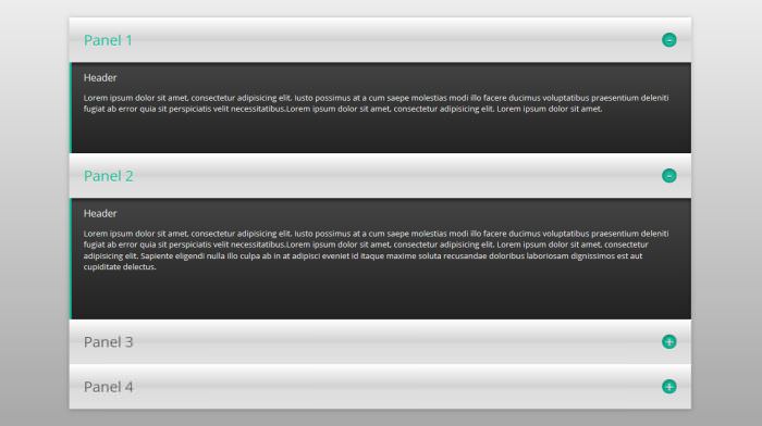
Fixed Height Checkbox Accordion
For fixed height content tabs, the CSS logic is similar to the radio button scenario, with the input type switched from radio to checkbox. You can examine the code on this Codepen pen.
Fluid Height Checkbox Accordion
When multiple tabs are open simultaneously, fixed height tabs can negatively impact user experience as the accordion’s height might grow significantly. This issue can be mitigated by switching from fixed height to fluid height, allowing the height of open tabs to adjust according to the content size.
To achieve this, alter the fixed height of the tab content to a max-height and use relative units:
input:checked ~ .tab-content {
    max-height: 50em;
}
To gain a deeper understanding of how this method functions, you can review this Codepen.
3. The :target Method
The :target pseudo-selector, part of CSS3, allows linking an HTML element to an anchor tag in this way:
<section id="tab-1">
    <h2><a href="#tab-1">Title of the Tab</a></h2>
    <p>Content of the Tab</p>
</section>
Clicking on a tab’s title triggers the opening of the entire section via the :target pseudo-selector, also altering the URL to a format like: www.some-url.com/#tab-1.
With CSS, the open tab can be styled using the section:target { … } rule. We offer an excellent tutorial at hongkiat on crafting appealing CSS-only accordions using the :target method for both vertical and horizontal designs.
A key limitation of the :target approach is that it modifies the URL upon tab selection. This impacts browser history, meaning the back button won’t return the user to the previous page but rather to the accordion’s former state.
4. The :hover Method
This latter shortcoming can be overcome if we utilize the :hover CSS pseudo-selector instead of :target, but in this case the tabs won’t react to the click but to the hover event. The trick here is that you need to either hide the unhovered elements, or reduce their width or height – depending on the layout of the tabs
The hovered element needs to be made visible, or set to full width/height in order to make the accordion work.
The following 3 CSS-only accordions were all made with the :hover method, click on the links below the screenshots to take a look at the code.
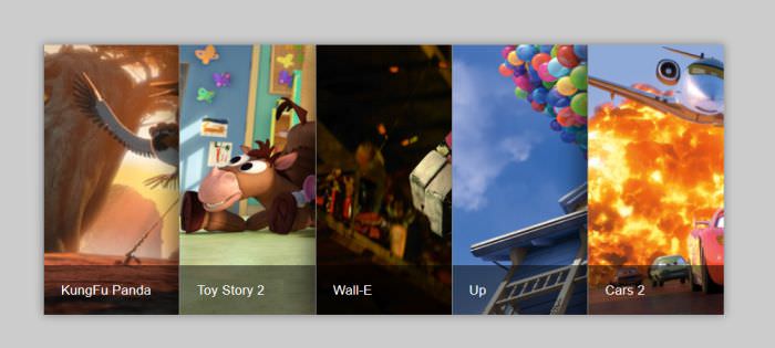
Horizontal Image Accordion
Skewed Accordion

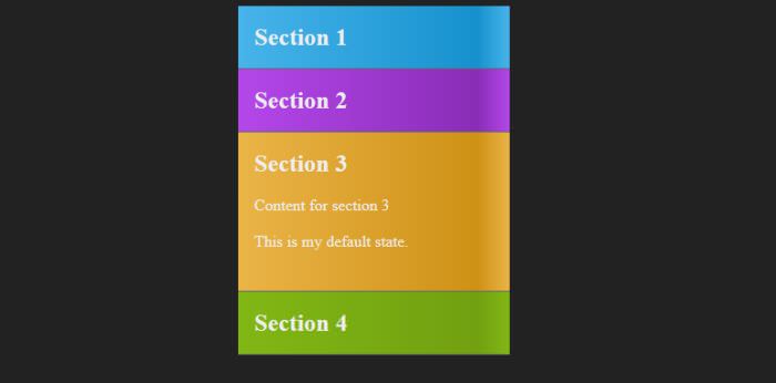
Hover-Activated Accordion With Default State