How to Change Default Text Wrapping with HTML and CSS
Unlike paper, web pages can almost infinitely extend sideways. As much as impressive that is, it’s not something we really need while reading. Browsers wrap text depending on the width of the text container and the width of the screen so that we can see all the text without having to scroll sideways much (only downwards).
Wrapping is something browsers do considering many factors, such as the language of the text or the placement of punctuation and spaces—they don’t just push down what doesn’t fit in the box defined for the text content.
Other than wrapping, browsers also take care of the spaces; they merge multiple consecutive spaces in the source code into one single space on the rendered page, and they also register forced line breaks before start working on the wrapping.
Read Also: 15 Beautiful Text Effects Created with CSS
When to change default text wrapping
That’s all great, and much appreciated. But, we can easily end up in circumstances where the default browser behaviour isn’t what we are looking for. It can be a headline that shouldn’t be wrapped or a word in a paragraph that better be broken than descend a line, leaving an odd-looking empty space at the end of the line.
It may also happen that we just desperately need those spaces preserved in our text, however the browser keeps combining them into one, forcing us to add multiple in the source code.
Wrapping preferences might also change with the language and purpose of the text. A Mandarin news article and a French poem not necessarily need to be wrapped in the exact same way.
There are a fair number of CSS properties (and HTML elements!) that can control the wrapping and the breakpoints and also define how spaces and line breaks are processed before wrapping.
Soft wrap opportunities & soft wrap breaks
Browsers decide where to wrap an overflowing text depending on word boundaries, hyphens, syllables, punctuations, spaces and more. These places are all called soft wrap opportunities and when the browser does break the text at one such place, the break is called a soft wrap break.
The simplest way to force an extra break can be done by using the good old <br> element.
Whitespace
If you are familiar with the white-space CSS property I bet you came to first know it in the same fashion as many others; while searching for a way to prevent the wrapping of text. The nowrap value of white-space does exactly that.
However, the white-space property is about more than just wrapping. First of all, what is whitespace? It’s a set of space characters. Each space in the set varies from each other in length, direction, or both.
A typical single horizontal space character is what we add by pressing the spacebar key. Tab key also adds a similar space but a with bigger length. Enter key adds a vertical space to start a new line, and in HTML adds a single unbreakable space to web pages. Like this, there are plenty types of spaces that constitute “whitespace”.
As I mentioned in the beginning, browsers collapse multiple spaces (both horizontal and vertical) in the source into a single space. They also consider these space characters for wrapping opportunities (places where a text can be wrapped) when wrapping is needed.
And, it’s precisely these browser actions that we can control with white-space. Note that the white-space property doesn’t affect all kinds of space, just the most frequent ones such as the regular horizontal single space, tab space, and line feeds.
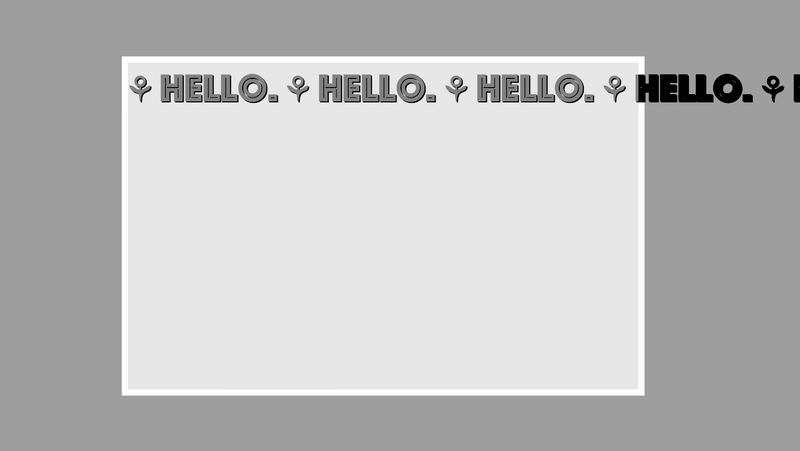
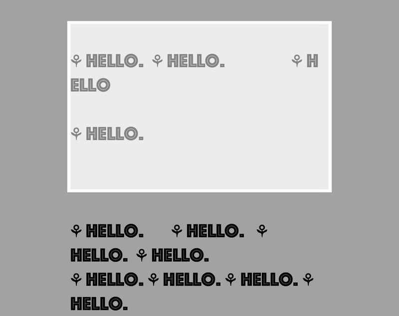
Below, you can see a screenshot of a sample text that’s wrapped by the browser to fit inside its container. The overflow happens at the bottom of the container and the overflown text is colored differently. You’ll notice the collapse of the consecutive spaces in the code.
<div class='textContainer'>
⚘ Hello.  ⚘ Hello.                 ⚘ Hello

⚘ Hello.


⚘ Hello.       ⚘ Hello.   ⚘ Hello.  ⚘ Hello.
⚘ Hello. ⚘ Hello. ⚘ Hello. ⚘ Hello.
⚘ Hello. ⚘ Hello.      ⚘ Hello. ⚘ Hello. ⚘ Hello.

⚘ Hello. ⚘ Hello.    ⚘ Hello. ⚘ Hello. ⚘ Hello.
⚘ Hello.               ⚘ Hello. ⚘ Hello.
⚘ Hello.   ⚘ Hello.
</div>
.textContainer {
  width: 500px;
  height: 320px;
}

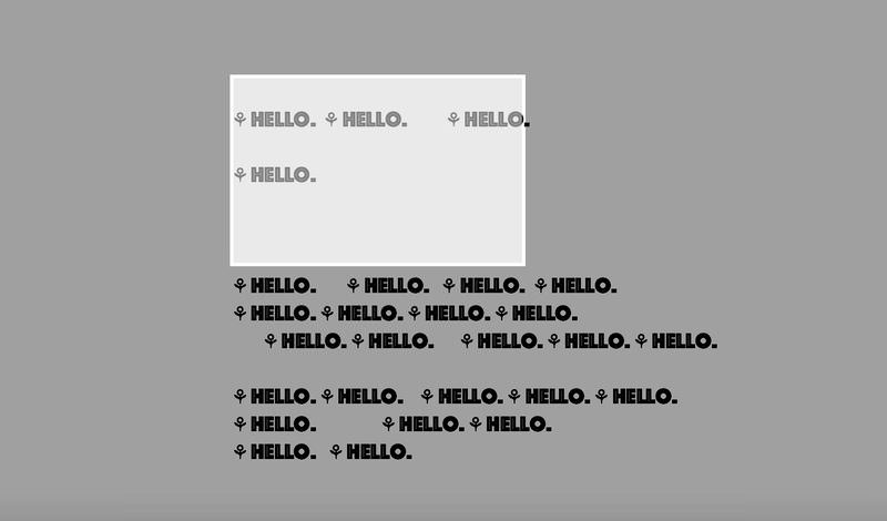
After applying white-space: nowrap; rule, the wrapping of the text changes in the following way:
.textContainer {
  /* ... */
  white-space: nowrap;
}
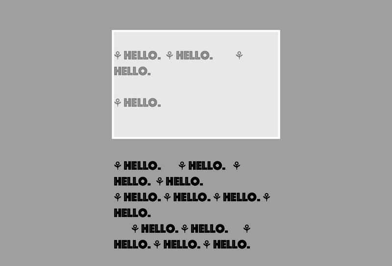
The pre value of white-space preserves all the whitespaces and prevents the wrapping of the text:
.textContainer {
  /* ... */
  white-space: pre;
}
The pre-wrap value of white-space preserves all the whitespaces and wraps the text:
.textContainer {
  /* ... */
  white-space: pre-wrap;
}
Finally, the pre-line value of white-space preserves the vertical whitespaces such as new lines and wraps the text:
.textContainer {
  /* ... */
  white-space: pre-line;
}

Word breaks
Another important CSS property you should know for controlling text wrap is word-break. You can see in all the above screenshots that the browser wrapped the text before the word “hello” on the right side, beyond which the text overflowed. The browser didn’t break the word.
However, if you have to allow the breaking of letters in a word so that the text would look even at the right side you need to use the break-all value for the word-break property:
.textContainer {
  /* ... */
  word-break: break-all;
}

The word-break property has a third value besides break-all and normal (belonging to the default line breaking). The keep-all value doesn’t allow breaking of words.
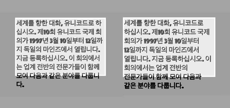
You might not be able to see the effect of keep-all in English. But, in languages where letters in a word are meaningful units on their own, the browser might break the words when wrapping, and this can be prevented using keep-all.
For instance, the letters in Korean words, initially broken for wrapping, are kept together when the white-space: keep-all; rule is specified.
<div class='textContainer'>세계를 ֥Õœ 대Ù”, 유니코드로 Õ˜ì‹Â시오. 제10ÚŒ 유니코드 êµÂ제 ÚŒì˜가 1997년 3월 10ì¼부Ä° 12ì¼까지 ëÂ…ì¼ì˜ 마ì¸즈ì—Â서 열립니다. 지금 등ë¡ÂÕ˜ì‹Â시오. ì´ ÚŒì˜ì—Â서는 업계 전반ì˜ 전문가들ì´ Õ¨ê»˜ 모여 다ìŒ과 같ì€ 분야를 다룹니다.</div>
.textContainer {
  /* ... */
  word-break: keep-all;
}
This property might support another value called break-word in the future. You’ll see how break-word works later, in the “Overflow wrap” section of this article.
Word break opportunities
Developers can also add wrap opportunities inside words, using the <wbr> HTML element. If a browser needs to wrap a text string it will consider the spot where <wbr> is present for a wrapping opportunity.
<div class='textContainer'>
⚘ Hello.  ⚘ Hello.                 ⚘ H<wbr>ello

⚘ Hello.


⚘ Hello.       ⚘ Hello.   ⚘ Hello.  ⚘ Hello.
⚘ Hello. ⚘ Hello. ⚘ Hello. ⚘ Hello.
⚘ Hello. ⚘ Hello.      ⚘ Hello. ⚘ Hello. ⚘ Hello.

⚘ Hello. ⚘ Hello.    ⚘ Hello. ⚘ Hello. ⚘ Hello.
⚘ Hello.               ⚘ Hello. ⚘ Hello.
⚘ Hello.   ⚘ Hello.
</div>
.textContainer {
  /* ... */
  white-space: pre-wrap;
}
Without <wbr>, the whole “Hello” word would have been rendered in a new line. By adding <wbr> to the HTML code, we informed the browser that it’s okay to break the word at that point for wrapping, in case it’s necessary.
Hyphens
The hyphens CSS property is another way to control breaks between letters in a word. We have a separate article on CSS hyphenation if you’re interested. In short, the property allows you to create wrapping opportunities through hyphenation.
Its auto value prompts the browser to automatically hyphenate and break words where needed while wrapping. The manual value forces browsers to wrap (if needed) at hyphenation opportunities added by us, such as the hyphen character (‐) or (soft hyphen). If none was given as value there would be no wrapping done near hyphens.
<div class='textContainer'>
bluehouse bluehouse bluehouse bluehouse bluehouse bluehouse bluehouse
bluehouse bluehouse bluehouse bluehouse bluehouse
</div>
.textContainer {
  /* ... */
  -webkit-hyphens: auto;
  -ms-hyphens: auto;
  hyphens: auto;
}

Overflow wrap
The overflow-wrap CSS property controls if a browser may break words (or preserved spaces, support for which might happen in the near future) on overflow. When the break-word value is given for overflow-wrap, the word will be broken in case no other soft wrap opportunities are found in the line.
Note that overflow-wrap is also known as word-wrap (they are aliases).
<div class='textContainer'>
bluehousebluehousebluehousebluehousebluehousebluehousebluehousebluehousebluehousebluehousebluehousebluehouse
</div>
.textContainer {
  /* ... */
  overflow-wrap: break-word;
}
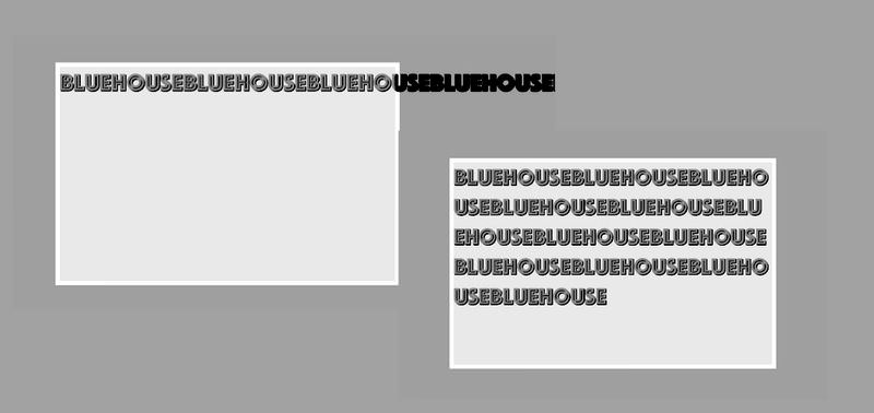
With no space in-between the letters in the HTML code above (i.e. no wrapping opportunities), the text wasn’t wrapped at first and was preserved as a single word.
However, when the permission was given to wrap the text by breaking words (i.e. the break-word value was given to overflow-wrap), the wrapping happened by breaking the whole string wherever it was necessary.
Read Also: Working with Text in Scalable Vector Graphics (SVG)