How to Animate SVGs with CSS
<animate> and <animateMotion> are native elements for animating SVGs, but if you’re more comfortable with CSS, you can use CSS Animation properties for the same purpose. In this post, we’ll explore what can be achieved with CSS animation in SVG.
CSS animation can also be a viable alternative to using JavaScript libraries like SnapSVG. Let’s see what we can achieve.
Creating the Shapes
First, we need to create the shapes and objects we wish to animate. Tools like Sketch, Adobe Illustrator, or Inkscape are perfect for this task.
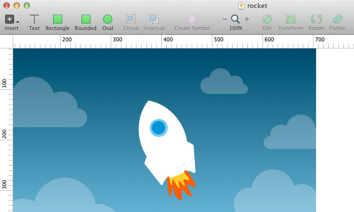
For this example, I have designed a scene with a cloudy sky and a rocket shooting upwards, complete with flames:
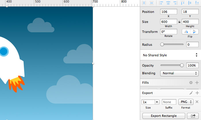
Once your design is complete, export each object into SVG format. Using Sketch as an example, select your object, click Make Exportable at the bottom right of your window, choose SVG format, and then click Export {object-name}. Repeat this for each object.
Insert the SVG into HTML
SVG code can be quite cluttered. Before using your SVGs, it’s a good idea to clean up the code with a tool like SVGO.
Open Terminal or Command Prompt and install SVGO with this command:
[sudo] npm install -g svgo
Next, run the svgo command on your SVG file with the --pretty option to clean up the code:
svgo rocket.svg --pretty
To optimize multiple SVGs in a directory, use the following command assuming the directory is named /images:
svgo -f images --pretty
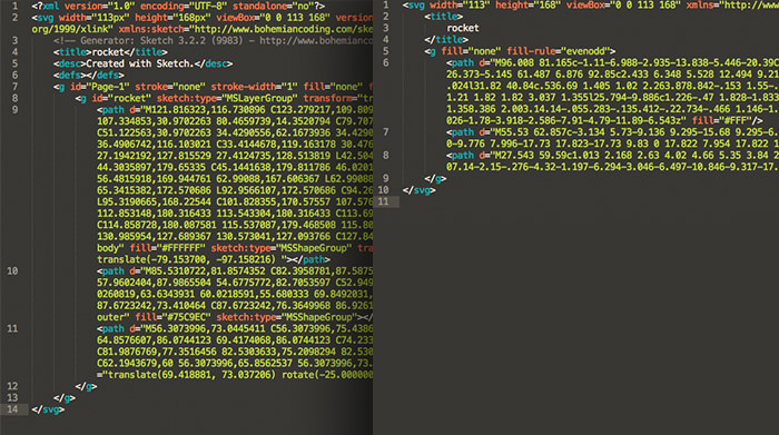
Below is a comparison of SVG code before and after optimization:
Copy the cleaned code from the SVG file and paste it into an HTML file. Let’s work within an 800px by 600px workspace. Remember to define the width attribute on the main <svg> element:
<svg width="600" height="420" viewBox="0 0 600 600" xmlns="https://www.w3.org/2000/svg">
  <g fill="none" fill-rule="evenodd">
    <path d="M96.008 ..." fill="#FFF"/>
    <path d="M55.53 ..." fill="#75C9EC"/>
    <path d="M27.543 ..." fill="#0096D5"/>
  </g>
</svg>
Define an ID for each object you intend to animate, such as the rocket, flames, and clouds, so you can target them with CSS:
<path id="cloud1" d="M-24.205 ..." opacity=".4" fill="#FFF" fill-rule="evenodd"/>
<path id="cloud2" d="M128.42 ..." opacity=".3" fill="#FFF" fill-rule="evenodd"/>
<path id="cloud3" d="M13.043 ..." opacity=".2" fill="#FFF" fill-rule="evenodd"/>
<path id="cloud4" d="M84.954 ..." opacity=".1" fill="#FFF" fill-rule="evenodd"/>

<g id="rocket" fill="none" fill-rule="evenodd">
  <g id="flame" fill="none" fill-rule="evenodd">
    <path d="M37.957.898s24.385 ..." fill="#FF5B0D"/>
    <path d="M30.482 ..." fill="#FFD03D"/>
  </g>
  <path d="M96.008 ..." fill="#FFF"/>
  <path d="M55.53 ..." fill="#75C9EC"/>
  <path d="M27.543 ..." fill="#0096D5"/>
</g>
Animate Using CSS
It’s time for some fun! Let’s make the rocket soar into space. The rocket consists of two parts: the body and the flame.
#rocket {
  transform: translate(260px, 200px);
}
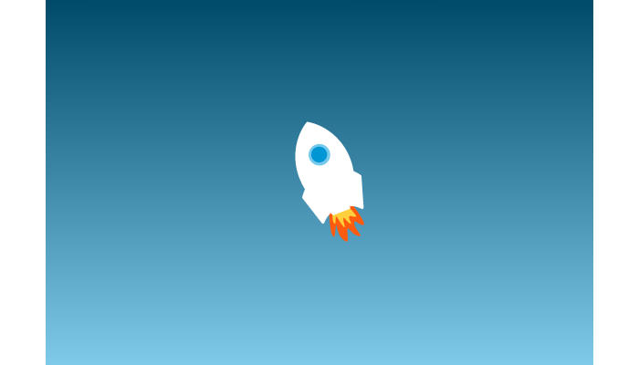
Here’s what the rocket looks like on its own:
To create the effect of the rocket moving upward, we’ll make the clouds appear to fall. Here’s the CSS for one of the clouds:
#cloud1 {
  animation: fall 1s linear infinite;
}

@keyframes fall {
  from {
    transform: translateY(-100px);
  }
  to {
    transform: translateY(1000px);
  }
}
We’ll animate several clouds to fall at different speeds and starting positions on the X-axis:
#cloud2 {
  animation: fall-2 2s linear infinite;
}

@keyframes fall-2 {
  from {
    transform: translate(200px, -100px);
  }
  to {
    transform: translate(200px, 1000px);
  }
}
Here’s how it looks now:
Let’s bring the rocket to life with the following animation:
#rocket {
  animation: popup 1s ease infinite;
}

@keyframes popup {
  0% {
    transform: translate(260px, 200px);
  }
  50% {
    transform: translate(260px, 240px);
  }
  100% {
    transform: translate(260px, 200px);
  }
}
And animate the rocket flame:
#flame {
  animation: shake 0.2s linear infinite;
}

@keyframes shake {
  0% {
    transform: translate(55px, 135px) rotate(7deg);
  }
  20% {
    transform: translate(55px, 135px) rotate(0deg);
  }
  40% {
    transform: translate(55px, 135px) rotate(-7deg);
  }
  60% {
    transform: translate(55px, 135px) rotate(0deg);
  }
  100% {
    transform: translate(55px, 135px) rotate(0deg);
  }
}
With these CSS rules applied, the animation should now be active on our SVG elements.
Here’s our rocket blasting into space:
Final Thoughts
Animating SVGs with CSS requires some effort, but this tutorial provides a solid foundation. There’s much more you can explore and achieve with CSS animations on SVGs!
Beginners might want to start with our introductory post: A Look Into: Scalable Vector Graphics (SVG) Animation, or explore the rest of our SVG series.