60+ Attractive PlayStation Games Cover Design
An attractive, visually appealing cover is probably one of the foremost steps for a PS3 game company to persuade gamers to buy their product. Therefore, the company must put a lot of effort into working with their designers to create the most attractive and promising cover for their product.
That’s why we’re showcasing 63 purely attractive PS3 game covers for you to get inspired by. Who knows, you might even grab yourself a copy!
#1 – Aliens vs Predator
Nicely designed game cover with appealing color scheme and absolutely different typefaces to distinguish 2 unique species.

#2 – Alone in the Dark
Character portrait is very nice that it evokes you a will to discover the story inside the game.

#3 – Armored Core for Answer
Probably one of the most persuading cover in the Armored Core series that expects you to have the coolest 3D machinery combat experience.

#4 – Assassin’s Creed II
Well designed mysterious assassin, that’s all enough for you to pick the game up and check out its back cover for more info.

#5 – Batman: Arkham Asylum
Batman series did exceptionally well to attract customer on its design for movie poster, so is its game cover.

#6 – Battlefield: Bad Company 2
Besides the attractive design, the cover designer placed nickname above each character to effectively indicate that the game would be more fun with its multiplayer mode.

#7 – BioShock
Named ‘Big Daddy’ (the big machinelike creature in the cover), this genetically enhanced human has done a really good job in attracting the gamer.

#8 – BioShock 2
The sequel of the series that showcases another type of eye cathy ‘Big Daddy’.

#9 – Borderlands
Very creative use of splatter effect, the overall design also shows how annoying would the game be.

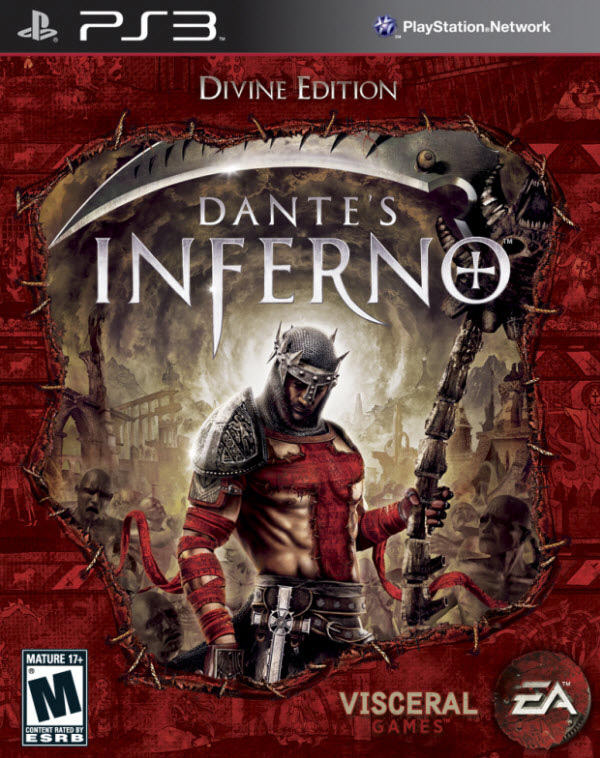
#10 – Dante’s Inferno
Nicely blended design that catches your eyes with horrible elements.
#11 – Darksiders
Strong color scheme, strong house and strong rider, there’s no reason for this game cover to be less attractive.

#12 – Dead to Rights: Retribution
Good combination of splatter and grunge effect that expresses violent gameplay, appealing to fierce gamer.

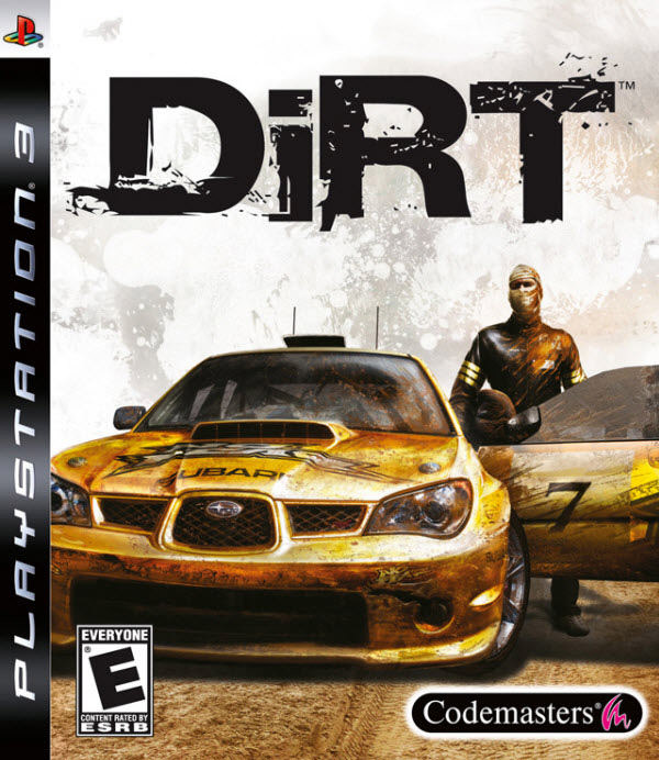
#13 – DiRT
Grunge and splatter effect were used to increase overall messiness that grabs a lot of attention.
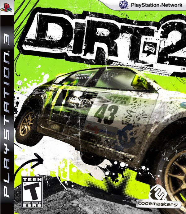
#14 – DiRT 2
Sequel of the series, this cover applied more ‘dirty’ elements on the design to make itself looks far more different from other, mostly neat designs.
#15 – Eat Lead
Massive use of gun elements makes the cover really appealing to wargamer, I thought it’s the sequel for the return of Serious Sam before.

#16 – Fairytale Fights
I’ve never seen Fairytale as this bloody before…and this cover really tempts me to check out what’s going on in the game.

#17 – Fallout 3
Good use of old photo effects which suits this game’s conspiracal topic, looks tasty for wargamer.

#18 – Final Fantasy XIII
Instead of using beautiful background design, Square Enix made Final Fantasy XIII’s cover to be so minimal that gamer can see how impressive the rendered game character is.
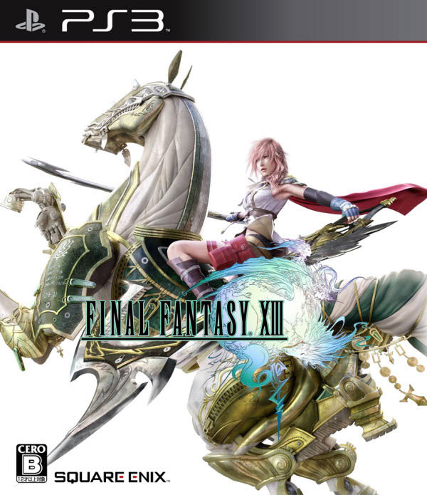
Second version of cover that shows you how detail the character rendering that you can expect from the actual game.

#19 – Front Mission Evolved
Another Square Enix’s cover design that attracts you with its cool in-game machinery model.

#20 – God of War 3
Probably one of the most eye cathy cover design, but it might be tricky for someone who’s new to the series to know that it’s the 3rd installation of the series.

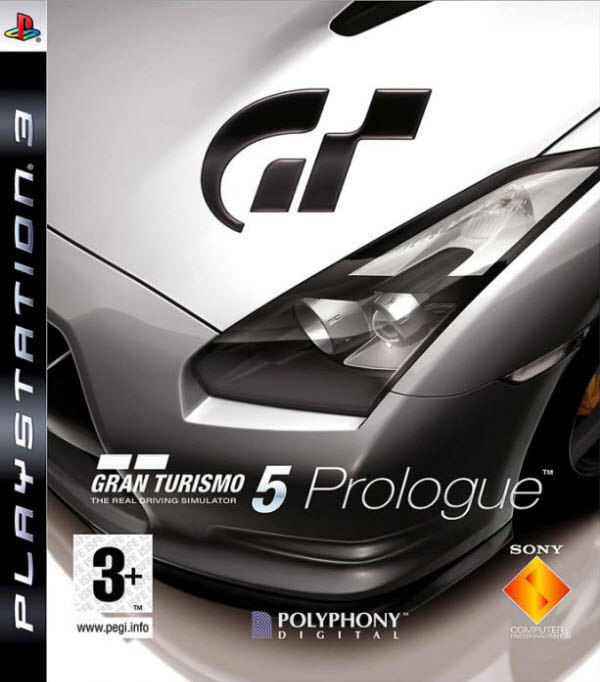
#21 – Gran Turismo 5: Prologue
Elegant cover design makes this series of Gran Turismo looks really gorgeous, worth a buy.
#22 – Guitar Hero: World Tour
Good job on the character design to show how crazy would the game be, rocker!

#23 – Heavy Rain
Mix of emotional character and mysterious origami makes the cover itself nice enough for gamer to check out its content.

#24 – inFamous
Infamous people with special ability doing extraordinary things are always a heating topic for gamer.

#25 – Killzone 2
Wargamer never resisted to check out this kind of cover with fierce game title and character illustrated.

#26 – LittleBigPlanet
You can’t hardly ignore to stare on this cover with one of the cutest illustrated creature in this planet!

#27 – Lost Planet 2
Impressively designed logo, characters and monster get this cover a lot of impression.

#28 – MAG
Guns, missiles, war scenes, that’re all what you need to attract wargamer.

#29 – Medal of Honor
Medal of Honor focuses solely on portraying 1 character with monochrome color scheme, which acutally makes it looks unique from other war related titles.

#30 – ModNation Racers
Another game with cute and charming characters, greatest hit for kids and girls.

#31 – Naughty Bear
You must be wondering what makes this extremely cute bear so naughty!

Another version of cover that looks bloody, yikes.
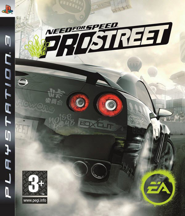
#32 – Need for Speed: Prostreet
Prostreet series’ car has always done well on grabbing gamer’s attention in its every platform’s cover.
#33 – Nier
A very realistic cover design that features promising graphics from the game.

#34 – Prototype
Despite the mutated arm, covered face is really the effective yet overused element to attract gamer.

#35 – uantum Theory
Quantum Theory looks fantastic to play with its beautifully crafted character and weapon.

#36 – Red Dead Redemption
A game cover presented in totally different way of illustration which suits American gamer’s taste very much.
#37 – Reflex: MX vs ATV
Nice application of modern design skill on this game’s cover, which makes it absolutely different with common motocar racing game’s cover design.

#38 – Resident Evil 5
Resident Evil series never failed to create terrible atmosphere from its cover design.

#39 – Resident Evil 5: Gold Edition
Gold edition’s cover which features 2 of the most welcomed character in the series, Chris Redfield and Jill Valentine.

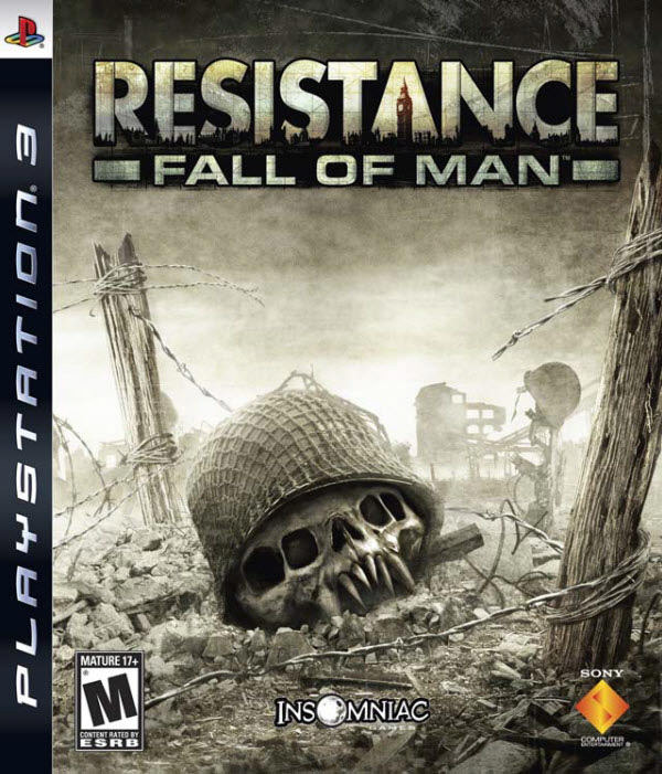
#40 – Resistance: Fall of Man
The unique concept of putting a mutated human skull in the cover makes it uncommonly attractive.
#41 – Ridge Racer 7
Another gorgeous cover design for a car game that focuses more on racing car.

#42 – Sacred 2: Fallen Angel
The cover highlighted the battle between the holy being and evil creature, which is the kind of story that never failed to entertain gamer.

#43 – SAW
This terrible mask can probably catches your attention…and a cold breath.

#44 – Silent Hill: Home Coming
Absolutely the most horrible-looking cover among all PS3 games that summarizes the game would deliver you horror, horror and more horror.

#45 – Skate 3
An inspiring and cool cover design for skating title which always want you to act cool in the game.

#46 – Star Ocean: The Last Hope
Very beautiful and promising characters for a fantastic role playing game.

#47 – Tekken 6
This sequel’s cover shows that the character is far more realistic than its prequels.

#48 – The Club
Very nice use of splatter effect that converts common looking faces into very different pieces.

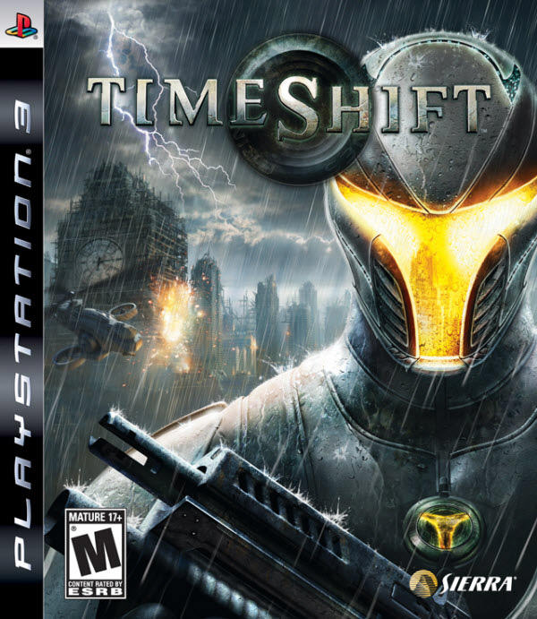
#49 – TimeShift
Visually impressive game title and character.
#50 – Trinity Universe
All charming characters from 3 titles gather in 1 game with extra features, looks like a must have collection for those series’ fans.

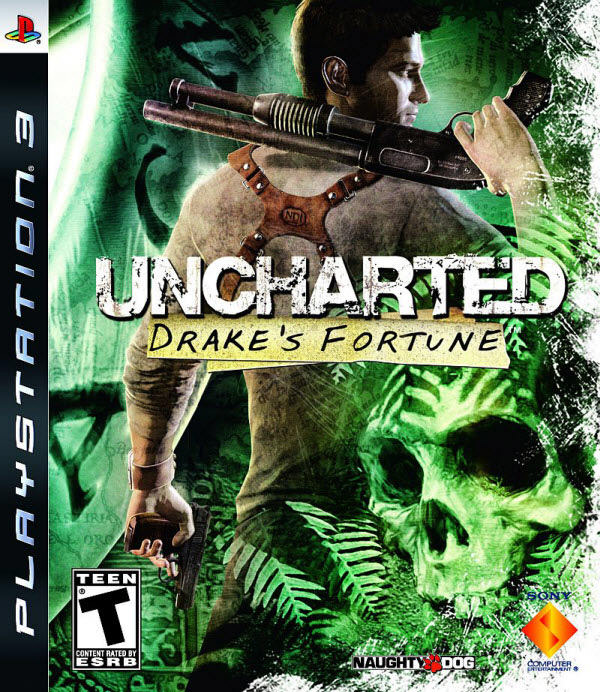
#51 – Uncharted: Drake’s Fortune
Remarkable design of character and cover that promises you amazing storyline and gameplay.
#52 – Uncharted 2: Among Thieves
Sequel of the series which its cover design looks as irritating as the prequel.

Second version of the cover which features another irritating game scene.

#53 – Unreal Tournament III
Deadliest Unreal engine hardly disappoint gamer.

#54 – Viking: Battle for Asgard
Nicely portrayed character in a rare setting, looks nice to check it out.

#55 – Wanted: Weapons of Fate
Just look like it would be another thrilling adventure with guns and bullets.

#56 – WET
Girl is the rare appearance as a main character in shooting game, so this is probably the outstanding piece from shooting titles.

#57 – White Knight Chronicles
I would say it’s one of the most beautiful white knight I’ve ever seen, and it’s really good to put it in the game cover for aggresive attraction.

Another version of cover that showcases the better portrait of the white knight.

#58 – Alpha Protocol
A futuristic design with awesome graphic and typography effects that make this game cover stand out from others.

Reflection
So you arrived to the end of this showcase, did you get your favorite cover? Or do you have a nice PS3 game cover to share with us?
Besides, what do you think a game cover should get to attract gamer efficiently? We’re exciting to hear from your sharing!