Freebie Release: “Bare Responsive” – A blank and responsive WordPress Theme
Creating WordPress Themes from scratch can be challenging. After completing this task multiple times, you might start seeking a more straightforward approach. I’ve discovered that building on a basic template can significantly speed up the project timeline and reduce stress.
Therefore, I’ve designed a unique WordPress template called “Bare Responsive”, available for download below. The design is mobile-friendly and responsive to various screen sizes. It includes all the standard WordPress template files, and you have complete freedom to modify them as you wish.
My goal is for this template to serve as a foundation for WordPress development, offering a better starting point than a blank slate.
Along with the template files, I’ve also provided some sample data (also available for download below) that you can import and use to test the design.
In the following article, I’ll discuss some of the WordPress features and how you can leverage them in your themes.
Inside the Header
Within the header.php file, I’ve added numerous extra metadata and third-party scripts. It’s advisable to modify the author meta tag to reflect your name or your website’s name.
I’ve also incorporated an external stylesheet link to the Google web font Quando, which I utilize for the header text.

You might observe that I’ve employed a custom navigation setup within the WordPress Themes. There’s no strict need to modify the PHP code. However, it’s beneficial to review the parameters for wp_nav_menu() to determine any desired alterations.
What you should consider is creating a new menu within the WP Admin under Appearance > Menus. Subsequently, you can link this new menu to the “header-menu” located in the template file.
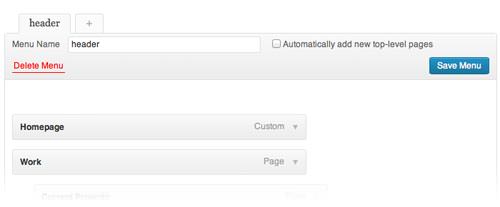
This approach allows you to integrate custom links, pages, and even sub-pages into the top navigation without needing any coding.
Custom Theme Functions
One of the most intriguing sections of code to customize is within the functions.php file. It contains all the default theme properties, encompassing navigation menus and widgetized sidebars.
I’ve configured two separate, widgetized sidebars. By default, there’s no need to add anything to them, as the template displays non-widgetized data. However, it’s straightforward to locate these sidebars under Appearance > Widgets.

The main sidebar is positioned to the right for all standard layout styles. As the screen width decreases, this sidebar becomes hidden and is substituted with a responsive sidebar. This new mobile-friendly sidebar comprises only two elements and appears below the page content.
Having this flexibility is beneficial, as you might opt to populate both sidebars with the same content. Alternatively, you can establish entirely distinct content for each sidebar, which might be more effective.
I’ve also defined several other functions within the theme file.
Initially, I’ve removed the #more hash from the end of blog post links. I’m not fond of this standard WordPress feature, as it seems somewhat intrusive.
Additionally, the archive pages don’t include a “read more” link by default. To address this, I’ve incorporated it into the HTML using a custom WordPress filter.
Potential User Modifications
The “bare-responsive” theme is designed to be straightforward, allowing you to upload the template and begin editing files directly within the WordPress admin panel. While you have the option to work with the files individually, this can be challenging without a WordPress blog to test the modifications.
Emphasizing simplicity, I’ve restricted the theme files to just the essentials. Additionally, all the responsive mobile CSS codes are consolidated in the style.css stylesheet.

You can adjust the template styles as needed to better align with your preferences.
The custom script.js facilitates the mobile responsive dropdown navigation panel. I believe this approach offers an optimal solution for header navigation, resulting in a seamless appearance.
If you wish to modify the CSS styles of the mobile menu, ensure that you maintain the consistency of the IDs and classes with the jQuery script.

Concluding Remarks
I genuinely hope that this “bare-responsive” template serves as an inspiration for budding developers. Navigating WordPress can be daunting, and having a foundational code can be immensely beneficial.
I’m open to addressing queries and welcoming feedback, recognizing that no template is flawless.
Collaborating with fellow developers is a valuable way to enhance your skills and identify common pitfalls. So, dive in and start coding!
Downloads Theme and Related Files
wptestdata.xml
Download and import this XML file into your WordPress to give it some dummy content.
Bare-responsive WordPress Theme
This whole project is purposefully released as open source under the MIT license which means you can edit and distribute unlimited copies for any project as long as you do not claim it your own, or re-sell it.