Discover the Best Features of WordPress 4.1 Twenty Fifteen Theme
By the time you are reading this WordPress 4.1 is near release (or has been) and it will carry a new default theme, Twenty Fifteen. I actually like this theme so much that I changed my personal website to it as soon as the first preview came out.
In this article I want to show you my favorite features of Twenty Fifteen and why I think it is a worthy addition to WordPress. To me Twenty Fifteen is a “back to basics” theme in a good way. It showcases all the great features of WordPress without adding bloat, or features which really should be added by plugins, not themes. Themes are meant to style functionality not to add them; in this sense Twenty Fifteen is spot on.
Recommended Reading: A Look Into: WordPress UI Evolution For The Past 10 Years
1. Overall Design
I was not a fan of the overly-busy Twenty Fourteen. In comparison the new default theme is a breath of fresh air. I enjoy the very light default color scheme – it provides enough contrast but doesn’t overwhelm. It is easy on the eyes and well-placed featured images provide splashes of color where it is needed. There is plenty of white space and the text is easily readable.
Noto Serif and Noto Sans are great choices for fonts. They remain legible at small sizes and they are nice and elegant on desktop-sized screens.

2. Content Focus
The design and structure of the theme focus heavily on content. More importantly, they focus on quality content. My feeling with Twenty Fourteen was that it tried to do too much, the focus was on quantity, not quality.
The sidebar does give you great opportunities to cross-promote content but the main section gets the most attention. This is ideal for bloggers or casual writers.
If you have an online store this theme is of course not for you, but that was never the intention. Keep in mind that default themes are for showcasing default functionality, not to cater to all plugins out there.
3. Social Icon Menu
The social icons you see on the screenshot above have been added using the regular old menu editor. Just add the URLs of your social services along with the names and the theme will automagically convert them to the correct icons.

One issue I have here is that this functionality isn’t terribly obvious. I’ve been working with WordPress for quite some time so to me this came naturally but for casual users or newcomers this feature may be completely overlooked.
4. Static Sidebar
The sidebar scrolls with the content while there is content but remains stationary when content runs out in the sidebar. This means that you never see an empty strip next to your content.
This allows authors to put more thought into their sidebars and in general it shortens unnecessarily long asides. It forces you to think about what is important and what isn’t and this will result in a more organized, better streamlined site.
5. Featured Image Flexibility
The featured image doesn’t give you a huge number of options but the way it is presented offers enough flexibility to make your site look good with a large variety of images. You can go with no featured image, a high featured image, or perhaps just a small strip. Depending on the image used you can make the site look upbeat and fun (like in the first example image), or more polished and elegant, like below:
6. Customization
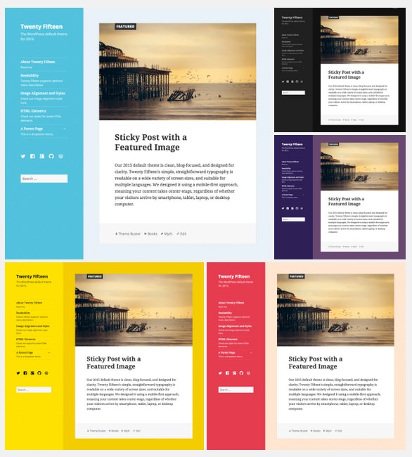
You won’t find a powerhouse of options at your disposal like you might with a premium theme, but Twenty Fifteen gives you just enough control to make it your own. The two most important controls allow you to specify the background of the sidebar and the content sections. This provides a surprising amount of variation:
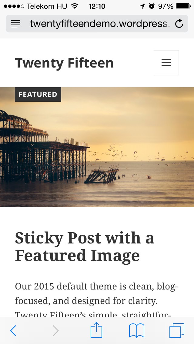
7. Responsiveness
Responsiveness in Twenty Fifteen is beautifully executed. The menu is neatly tucked away behind a button (which is easy enough to do) and when it is displayed it remains easy to browse and will get you where you need to be (which isn’t easy to do at all). Even child pages are intuitive to access – kudos to the theme team on this one!
Images, galleries and post meta sections all look great and readability is maintained on every page. Reading a website running Twenty Fifteen on a mobile phone is a genuine pleasure.
8. Overall Harmony
This one is probably the most subjective one on the list. To me the theme looks like a harmonious whole which radiates simplicity. The theme looks “properly put together”, it seems well thought out and deliberate. It’s obvious that a lot of thought was put into the direction both visually and feature-wise and I think it really shows in the end result.
Conclusion
As with any other theme there will be people who love it and people who will hate it. I think the key element to think about is: is this theme right for me?
Twenty Fifteen is for those of us who enjoy writing on a minimal interface. It won’t appeal to everyone and you may disagree with some of my points above. Thats perfectly ok, the point is that Twenty Fifteen is right for a lot of people. If you think another theme does the job better, let us know in the comments!