Create Beautiful <SELECT> Dropdown With EasyDropDown.js
<SELECT> is a HTML element that is used for selecting items using a drop-down list. It’s useful for when you have a very long list of items to select such as dates. Unfortunately, for those who want to create a fancy web page, the default<SELECT>in their web browser is not very user-friendly and doesn’t look great style-wise.
To style the element, CSS should be enough. But, well, it isn’t quite enough in terms of accessibility. Introducing EasyDropDown.js, a free jQuery plugin to cover up all those flaws.
EasyDropDown.js can easily style the old-fashioned select element in your web page with a lot of features. After the<SELECT>element has been applied with this plugin, it will obtain full keyboard control with textual search. This tool also provides an inner-scroll for items in long lists to limit the drop-down box size. Form and validation are available as well which helps with compatability.
How to Install EasyDropDown
Installing EasyDropDown is straightforward. Start by adding the jQuery library to your webpage. Then, incorporate EasyDropDown’s JavaScript file, which you can download here:
<script src="http://ajax.googleapis.com/ajax/libs/jquery/1.10.2/jquery.min.js"></script>
<script src="js/jquery.easydropdown.js" type="text/javascript"></script>
Next, include its CSS file within the head tag of your HTML document:
<head>
 ..
<link rel="stylesheet" type="text/css" href="themes/easydropdown.css"/>
 ..
</head>
If you opt for a different theme, simply place the theme files in your website’s folder. There’s no need to link these files in your HTML directly, as the plugin will automatically recognize them.
Customizing Your Dropdown Menu
With EasyDropDown.js, crafting a customizable dropdown menu becomes a breeze. It supports clean and semantic markup, allowing for easy customization directly within HTML. You can effortlessly disable the dropdown, specify a selected option, or include a label.
To begin styling, add a dropdown class to your select tags. For labels, assign a label class to an option. Here’s how to set it up:
<select class="dropdown">
    <option value="" class="label">Setting</option>
    <option value="1">Option 1</option>
    <option value="2">Option 2</option>
    <option value="3">Option 3</option>
    <option value="4">Option 4</option>
    <option value="5">Option 5</option>
</select>
That’s all there is to it-no need for custom JavaScript. Just like that, the standard <SELECT> transforms into an attractive, modern dropdown input.
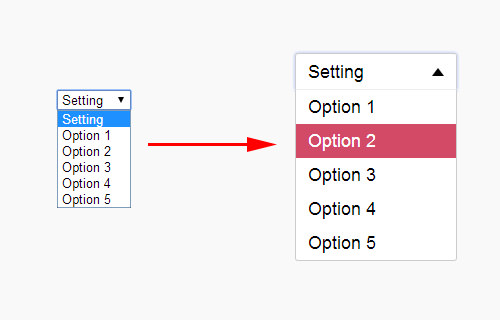
To set a pre-selected option, use the selected attribute on your desired option. However, it’s best not to combine a label with a pre-selected option, as the selected value will take precedence over the label.
<select class="dropdown">
...
<option value="2" selected>Option 2</option>
...
</select>

Disabling the dropdown is as simple as adding the disabled attribute:
<select class="dropdown" disabled>
...
</select>
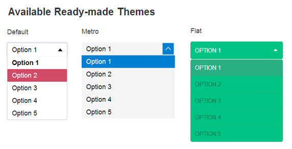
Exploring Ready-to-Use Themes
EasyDropDown.js enriches your web designs with two additional themes: Metro and Flat. Integrating these themes is a breeze, thanks to HTML5’s data-attribute.
To switch themes, simply use the data-settings='{"wrapperClass":"theme-name"}' attribute within your <SELECT> tag. Replace theme-name with either metro or flat to apply your desired theme. Check out this example for clarity:
<select class="dropdown" data-settings='{"wrapperClass":"metro"}'>
...
</select>
Aside from wrapperClass, EasyDropDown.js offers a variety of other settings to tailor your dropdowns even further. For a deep dive into all the possibilities, visit the documentation page. If you’re comfortable with JavaScript, you’ll find the tutorial there especially helpful.