10 Hidden CSS3 Properties You Should Know
CSS3 has made designing the web more exciting with the introduction of new properties. While you might know of the popular ones, such as the box-shadow, border-radius, and transform, there are plenty more properties that you may not have heard of or tried, but would be glad to know of its existence.
W3C is constantly working on new CSS properties to make the web much better for designers, developers, and users. In the meantime, let’s take a look at these ten properties you may not know of but should really check out.
Recommended Reading: Beginner’s Guide to All Things CSS3
1. Tab Size
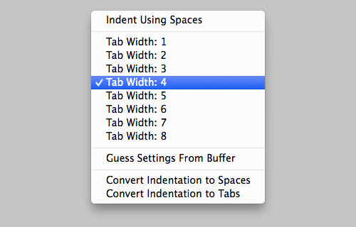
Most code editors are equipped with Tab Size control that allows developers to specify the code indentation width made with the Tab key. It was only recently that we were also able to customize the indentation of the code embedded on webpages.
pre {
	tab-size: 2;
}
Note that each browser may have their own interpretation of how long the tab-width unit should be. So, we may expect to see some discrepancies among different browsers. In terms of browser support, the tab-size property works in Chrome, Opera, Firefox, and Safari according to CanIUse.
2. Text Rendering
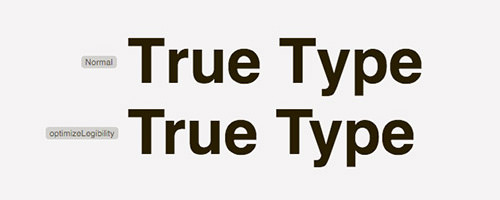
The text-rendering property will tell browsers how they should render the text within webpages. The text will be optimized for performance, legibility, or precision, which will eventually determine the text quality. Take a closer look at the kerning of the text in the following screenshot for a comparison between ‘normal’ text and optimizedLegibility text:
Display Text on Image With CSS3 mix-blend-mode
Image backgrounds look great behind large display texts. However, its CSS implementation is not that straightforward. We can... Read more
For more advice on good typography, check out Practical Typography.
3. Font Stretch
Some fonts provide additional faces aside from the regular Normal, Bold and Italic. Helvetica Neue or Myriad Pro as an example comes with faces such ‘Condensed’, ‘Ultra-condensed’, and ‘Semi-condensed’. This is where a new property called font-stretch is introduced; it allows us to apply these faces.

We may use font-stretch in conjunction with font property like for instance,font-style. Here is an example:
h1 {
	font-style: bold;
	font-stretch: ;
}
The font-stretch property currently only works in Firefox and Internet Explorer 9 (and above).
4. Text Overflow
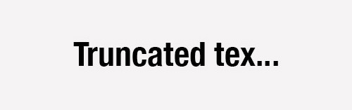
The text-overflow property specifies presentation of content that is overflowing or truncated by its container. The default value is set to clip which simply hides the truncated text. Alternately, you can set it to ellipsis to depict the truncated text or content with horizontal ellipsis, as follows.
.content-box {
	text-overflow
}
In case you are wondering, horizontal ellipsis is the three dots at the end which usually indicates omitted content.
5. Writing Mode
Not every language is written from the left to right direction. A few languages are instead written from top to bottom like Japanese or right to left like Arabic and Hebrew.

To accommodate these languages, a new property named writing-mode is introduced to let developers change the content writing direction through CSS. This code snippet, as an example, directs the content flow from the left to the right (regardless of the language).
p {
	writing-mode: rl-tb;
}
To change the flow of content, moving from top to bottom, set the property with the vertical-lr value:
p {
	writing-mode: vertical-lr;
}
6. Pointer Events
The pointer-events property allows us to control element behavior under pointer events like dragging, hovering and clicking. Using this, the affected link will do nothing when it is clicked; the link will be completely disabled, and will not even direct users to the address specified in the href attribute.
a {
	pointer-events: none;
}
Due to some critical issues however the pointer-events property is put on hold until the next CSS revision, CSS4.
7. Image Orientation
In an image editor such as Photoshop, you can change the image orientation by rotating or flipping the image. Now CSS3 allows you to do the same to the images on webpages through a new property called image-orientation. Here is an example on how we can flip an image horizontally using this property.
img {
	image-orientation: flip;
}
You can also retain the original image orientation by specifying the property value to from-image, like so.
img {
	image-orientation: from-image;
}
8. Image Rendering
Similar to the text-rendering property, image-rendering defines the image quality on webpages, in particular when the image is forcefully resized. With the advent of this property comes a number of new values, and browsers have their own specifications in this matter. The crisp-edges value, for example, which preserves contrast and prevents blurry edges of images, is currently translated as -webkit-optimize-contrast in Webkit browsers and nearest-neighbor in Internet Explorer.
img {
	image-rendering: crisp-edges;
	image-rendering: -webkit-optimize-contrast;/* Webkit */
	-ms-interpolation-mode: nearest-neighbor;  /* IE */
}
It’s an experimental technology, so we will likely see a few changes in the implementation.
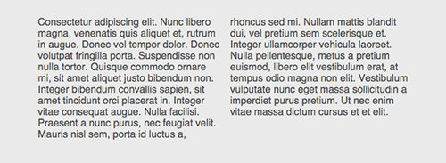
9. Columns
The columns property allows developers to arrange web content into columns with ease. We split the content into two columns like this:
.content {
	columns: 2;
}
In the browsers that support this property – like Chrome and Safari – we will see the content arranged like so.
Coupled with CSS Shape and a bit of creativity, you can have a fluid and more enticing content layout much like what you see in a fashion magazine on your websites.
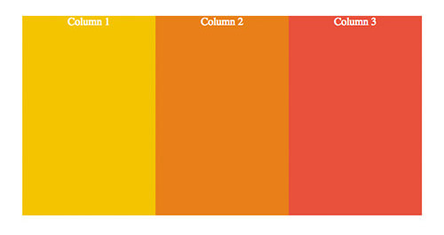
10. Flex
The flex property aims to make building responsive grid more seamless while solving a couple of issues in the current mainstream method for web layout arrangement – the float property.
On top of that, by using the flex property, the web layout will take the full height of its container, which was quite cumbersome to deal with previously (take a look at our previous post on this matter: Equal Column Height With CSS).
Now, assuming you would like to build a web layout that comprises of three columns, you can have the markup arranged this way.
<div id="container">
	<div class="col">Column 1</div>
	<div class="col">Column 2</div>
	<div class="col">Column 3</div>
</div>
Then, build them into columns using the flex property, like so.
#container {
	width: 600px;
	height: 300px;
	display: flex;
}
#container .col {
	flex: auto;
}
With additions of decorative styles like font and background color, we will get the following result.