How to Add CSS3 Border Radius Support in IE8 and Earlier Versions
CSS3 allows us to create rounded corners using the border-radius property. However, this feature is not supported in Internet Explorer 8 (IE8) and earlier versions. So, when you apply the CSS3 Border Radius to an element, it still appears as a box with sharp corners.
There is a lot of advice online suggesting you ignore IE8. You might wish you could, but if you’re working on a website for a government institution or a bank, you may not have that option. You still need to ensure the website looks as good in IE8 as it does in modern browsers, which includes the use of the CSS3 Border Radius.
If you need to make your website compatible with IE8 while using CSS3 features, we have a useful tip for you.
Beginner’s Guide to CSS3 (Updated)
Since its announcement back in 2005, the development of Cascading Style Sheet (CSS) level 3, or better known... Read more
<
CSS3Pie
CSS3Pie is a type of polyfill for CSS3 decorative features. In addition to the CSS3 Border Radius we’re discussing in this article, CSS3Pie also supports Box Shadow and Gradients, although it’s limited to the Linear Gradient type.
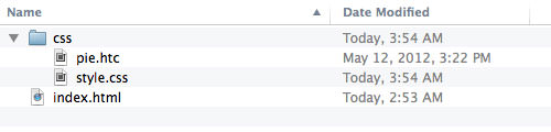
Download CSS3Pie here. Place it in your project directory – I put it in the css folder. As shown in the screenshot below, I’ve created one stylesheet and one HTML file.
Open the stylesheet in your code editor and apply rounded corners to an element in the HTML file, like this:
.border-radius {
  height: 100px;
  width: 100px;
  background-color: #2ecc71;
  -webkit-border-radius: 50px;
  -moz-border-radius: 50px;
  border-radius: 50px;
}
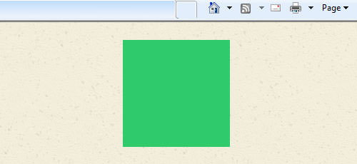
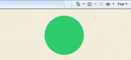
Since the element’s width and height are both 100px, and the border-radius is set to 50px, the element will become a circle:

In IE8, as expected, it will still appear as a square, but don’t worry.
To enable the rounded corner effect, add this line: behavior: url(css/pie.htc);, like this:
.border-radius {
  height: 100px;
  width: 100px;
  background-color: #2ecc71;
  -webkit-border-radius: 50px;
  -moz-border-radius: 50px;
  border-radius: 50px;
  behavior: url(css/pie.htc);
}
Note that the file path in url() must be either an absolute path or relative to the HTML file. You can also add this line in a separate file.
If you have a stylesheet specifically for Internet Explorer, you can place behavior: url(css/pie.htc); in that file, ensuring it’s within the same CSS selector, like this:
/* declared in ie.css */
.border-radius {
  behavior: url(css/pie.htc);
}
Refresh the page in IE8. The rounded corner should now be visible (ta-da!). It should work in IE7 as well.
Troubleshooting
Internet Explorer may behave unexpectedly. If this does not work (e.g., the rounded corner does not appear, or the selected element disappears), adding the position and zoom properties should solve the problem:
.border-radius {
  behavior: url(/css/pie.htc);
  position: relative;
  zoom: 1;
}
Using CSS3 Pie in WordPress
You’ve finished creating your website in HTML and used pie.htc to enable CSS3 in IE8. Now, you’re ready to convert the website into a functional WordPress theme. Since WordPress is dynamic and pages can have different URL levels, we need to specify an absolute path.
You can change the path in your CSS like this:
.border-radius {
  behavior: url(http://localhost/{website}/wp-content/themes/{the_theme}/css/pie.htc);
  position: relative;
  zoom: 1;
}
Or, you can add internal styles in header.php like this:
<style>
.border-radius {
  behavior: url(<?php echo get_template_directory_uri(); ?>/css/pie.htc);
  position: relative;
  zoom: 1;
}
</style>
Final Thought
Making cool features like CSS3 Border Radius work in IE8 is exciting, and CSS3Pie helps achieve that, giving us one less reason to dislike IE8.