An Introduction to CSS Scroll Snap Points
The CSS Scroll Snap Module is a web standard that gives us some control over scrolling on a web page so that we can make users scroll to certain parts of a page rather than to just anywhere on it.
Scrolling is one of the most performed actions on a website. Browsers, over the years, have improved their scrolling performance to match users’ agile finger strength. And, developers have used scrolling creatively to achieve a better or an out-of-the-box user experience.
However, when it comes to the correlation between coding and scrolling, only JavaScript seemed to have any amount of control over the latter. This was so for a long period of time, but with the introduction of scroll snap points, CSS began to catch up.
Read Also: 15 Examples Of Scrolling Done Right In Website Designs
Scrolling without scroll snap points
Typically, we don’t scroll very slow, especially on phones. The faster you scroll, the less control you have over where on the screen you’ll end up when you stopped scrolling.
Imagine you are scrolling through an array of product image on a website, or a gallery of photos, or online slides. What you’d prefer in such applications is to see the whole product, photo, or slide every time you scroll. Not only a part of the product image, photo, or slide.
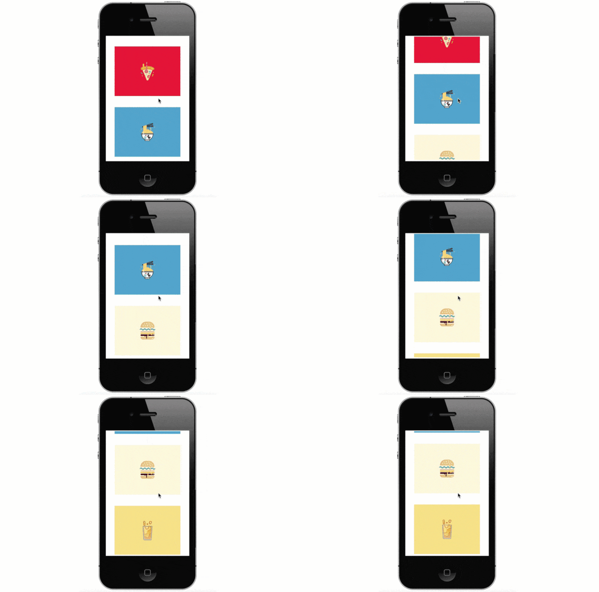
For example, on the demo below you can see whenever the user stops scrolling, only about half of the image is visible at the bottom of the screen. However, most users would prefer to see the last image fully.

Scrolling with scroll snap points
This is where we bring in CSS scroll snap points. The name is self-explanatory; it’s a CSS standard that allows us to snap items into place when scrolling.
There are five CSS properties that constitute this standard:
scroll-snap-typescroll-snap-points-xscroll-snap-points-yscroll-snap-coordinatescroll-snap-destination
Browser support
The properties need -webkit and -ms prefixes for the relevant browsers. As of writing this article, CSS scroll snap is not supported in Chrome and Opera.
Note that the last four properties are likely to be dropped by user agents in the near future. Instead, new properties, namely scroll-snap-align, scroll-snap-margin, and scroll-snap-padding, might be created, as defined in this specification.
However, they will have a similar purpose as the former properties. Currently, the former set of properties will work just fine.
Properties
You need to add the scroll-snap-type property to the scroll container (the container element whose children are overflowing while it’s scrolled). It specifies the strictness of the snap action. It can take three values:
mandatory– when the scrolling is finished, the scrolling will snap at a relevant snap pointproximity– less strict thanmandatory; it will depend on the judgement of the UA whether the element will snap at a given snap pointnone– no snapping is done
The scroll-snap-points-x and scroll-snap-points-y properties belong to the scroll container, too. They refer to points on the x- and y-axis where the snap points will exist. Their value is given by the repeat() function. For instance, if you want to add snap points along the x-axis at the interval of 100px you need to use the scroll-snap-points-x: repeat(100px) rule.
The scroll-snap-destination property is also added to the scroll container. It defines a coordinate on the container where a snap destination lies. It is at this snap destination where the container’s children will snap into place when scrolled.
You can use the scroll-snap-coordinate property in conjunction with scroll-snap-destination. You need to add it to the container’s child elements. It defines the coordinates of child elements, that will align with the destination coordinates of their scroll container when the user scrolls the screen.
Note you don’t have to use all the properties at once. Only scroll-snap-type is compulsory. Along with that, you can either define individual snap points or use the destination-coordinate combination.
Code example
Here is an example code snippet for a typical scroll container, with scrolling in vertical direction & some images inside. It outputs the demo you can find in the beginning of this post.
<div>
  <img src='Pizza.png' alt='pizza'>
  <img src='Noodle.png' alt='noodle'>
  <img src='Burger.png' alt='burger'>
  <img src='Juice.png' alt='juice'>
</div>
div {
  width: 300px;
  height: 300px;
  overflow: auto;
  ...
}
div > img {
  width: 250px;
  height: 150px;
  ...
}
Now, we add some snap points to the scroll container:
div {
  width: 300px;
  overflow: auto;
  scroll-snap-points-y: repeat(150px);
  scroll-snap-type: mandatory;
}
Below, you can see how the output looks like with CSS snap points added. Notice whenever the scrolling stops while the bottom image is only partially visible, the full image appears after the scrollport snaps into a snapping point above it.
