How to Create a Cut-out Border Design with CSS
With a cut-out border design we can show to users what can be found underneath the border area of an HTML element. This task is typically solved by stacking two or more block elements (in most cases divs) of different sizes on top of each other. First this seems an effortless solution, but it gets more frustrating when you want to reuse the layout multiple times, move around the elements, optimize the design for mobile, or maintain the code.
In this post, I’m going to show you an elegant CSS-only solution that uses only one HTML element to achieve the same effect. This technique is also great for accessibility, as it loads the background image in the CSS, separated from the HTML.
By the end of this post, you’ll know how to display a background image in the border area in order to create the cut-out border design you can see below. I’ll also show how you can make the design responsive using viewport units.
Read Also: CSS Gradient Border Colors
Initial Code
The only requirement in the HTML front is a block element:
<div class="cb"></div>
We’ll need to reuse the dimensions (width & height) and border width values of the div, so I’m introducing them as CSS variables. The variable --w denotes the width of the .cb block element, --h indicates its height, --b goes for the border width, and --b2 for the border width multiplied by 2. We’ll later see the use of the last variable.
I’m sizing the <div> relatively to the width of the viewport, hence the use of the vw unit (you can use fixed units if you want).
.cb {
  --w: 35vw;
  --h: 40vw;
  --b: 4vw;
  --b2: calc(var(--b) * 2);
}
Quick explanation – vw and vh units
The unit vw represents the 1/100th of the width of the viewport. For instance, 50vw is 50 parts of a viewport width sliced vertically into 100 equal parts, while 50vh is 50 parts of a viewport height sliced horizontally into 100 equal parts.
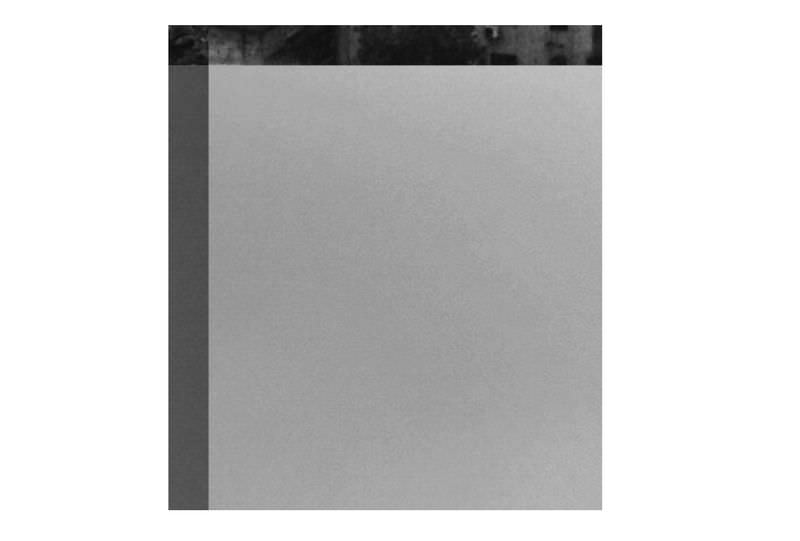
Let’s improve the above code by adding a background, and setting the border, height and width by using our predefined CSS variables.
.cb {
  --w: 35vw;
  --h: 40vw;
  --b: 4vw;
  --b2: calc(var(--b) * 2);
  background: url(bg.jpg);
  border: var(--b) solid transparent;
  height: var(--h);
  width: var(--w);
}
Here’s how the demo is supposed to look like right now:
Size the background image
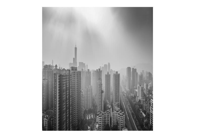
We need the background image to cover the whole area of the <div> including the border area, so the background image needs to be sized accordingly.
If you want to give the background image a fixed size, just make sure the size you’re giving enables it to cover the border area of the <div> as well. As for the code used in the post so far, here’s the background value I’m giving it:
.cb {
  --w: 35vw;
  --h: 40vw;
  --b: 4vw;
  --b2: calc(var(--b) * 2);
  background: url(bg.jpg) center/calc(var(--w) + var(--b2))
      calc(var(--h) + var(--b2));
  border: var(--b) solid transparent;
  height: var(--h);
  width: var(--w);
}
The width of the background image [calc(var(--w) + var(--b2))] is the sum of the width of the div [var(--w)] and the width of the left & right borders [var(--b2)].
Similarly, the height of the background image [calc(var(--h) + var(--b2))] is the sum of the height of the div [var(--h)] and the width of the top & bottom borders [var(--b2)].
This way, we’ve sized the background image to an area that is same to the size of the div (including the border area).
The center keyword aligns the background image to the centre of the div.
Note: If you’re adding padding to the div, remember to include the padding area to the background size as well, same as the border area.
This is what we have right now:
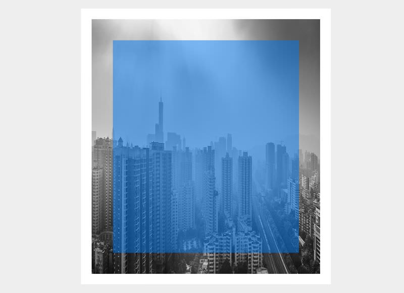
Cover the border-exclusive area
Now that we’ve covered the border-inclusive area with the background image, all that remains is to cover the center area inside of the border (border-exclusive area) with a solid color, for which we reach for a box-shadow inset.
.cb {
  --w: 35vw;
  --h: 40vw;
  --b: 4vw;
  --b2: calc(var(--b) * 2);
  background: url(bg.jpg) center/calc(var(--w) + var(--b2))
      calc(var(--h) + var(--b2));
  border: var(--b) solid transparent;
  box-shadow: inset var(--w) 0 0 rgba(0,120,237,.5);
  height: var(--h);
  width: var(--w);
}
The horizontal shadow with value var(--w) covers the entire width of the div. The use of rgba color function allows some transparency to be added in the mix, however you can also use an opaque color if you want to fully cover the center area.

Add an extra border with box-shadow
In the Codepen demo, you could see a white border around the image. There’s a famous trick of using box-shadows to create multiple borders—we can use the same technique to add one or more solid colored borders to our design.
The updated box-shadow value is:
.cb {
--w: 35vw;
--h: 40vw;
--b: 4vw;
--b2: calc(var(--b) * 2);
background: url(bg.jpg) center/calc(var(--w) + var(--b2))
    calc(var(--h) + var(--b2));
border: var(--b) solid transparent;
box-shadow: inset var(--w) 0 0 rgba(0,120,237,.5),
    0 0 0 calc(var(--b) / 2) white;
height: var(--h);
width: var(--w);
}
The calc(var(--b) / 2) function creates a shadow of the half of the border width.
Optional: Separate layout & aesthetics
In my final Codepen demo, I’ve placed the code for the background image and the box-shadow color into a separate class. This is optional, but can be extremely useful if you want to reuse the layout of the cut-out border design in multiple elements, and add the aesthetics (background image + color) for each element independently.
I have added a class named .poster1 to the <div> to achieve this goal.
.poster1 {
  --tbgc: rgba(0,120,237,.5);
  background-image: url("https://bitly.com/2eQBij2");
}
Since background is a shorthand property, its longhand properties can be overridden/set individually. Hence, we can set background-image in .poster1, and remove the url value from the background property in .cb.
To set the value of the box-shadow, we can use another CSS variable. The --tbgc variable holds the color value we want to give to the box-shadow (lightblue in the demo), so among the style rules for .cb we replace the color value of the box-shadow property with var(--tbgc).
.cb {
  --w: 35vw;
  --h: 40vw;
  --b: 4vw;
  --b2: calc(var(--b) * 2);
  background: center/calc(var(--w) + var(--b2))
      calc(var(--h) + var(--b2));
  border: var(--b) solid transparent;
  box-shadow: inset var(--w) 0 0 var(--tbgc),
      0 0 0 calc(var(--b) / 2) white;
  height: var(--h);
  width: var(--w);
}
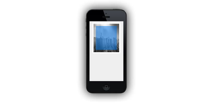
Code for portrait mode
Since the dimensions are all in the unit vw, it will look too small when you’re viewing the design in portrait mode (smaller width relative to the height)—which all mobile devices are in by default. To solve this issue, switch vw with vh, and resize the design as you see fit for portrait modes.
@media (orientation: portrait) {
  .cb {
      --w: 35vh;
      --h: 40vh;
      --b: 4vh;
  }
}
Note: Don’t forget to add the viewport meta tag to your HTML page if you’ve decided to optimize it for mobile view.