A Look Into: Cubic-bezier in CSS3 Transition
CSS3 Transition is a fantastic feature of CSS3, enabling us to add dynamic effects to CSS properties over time. For those who know the basics, it’s crucial to choose the right speed or timing function for these transitions.
There are four built-in timing functions available: ease, ease-in, ease-out, ease-in-out, and linear.
Read Also: Create a Fan-Out with Bounce Effect Using CSS3 Animation
However, a detail often missed about these timing functions is their foundation on the Bezier curve.
Understanding the Bezier Curve
The Bezier curve is widely used in computer graphics, especially in vector graphic editors like Adobe Illustrator or Inkscape. When you draw with the pen tool in these programs, you’re using the Bezier curve, which relies on four key points as shown below:

In CSS3 Transitions, we use the cubic-bezier function, which follows this format:
cubic-bezier(P0,P1,P2,P3);
It’s important to remember that in the Cubic-bezier curve, each point’s values must be between 0 and 1. Now, let’s revisit the timing functions in CSS3 transitions and understand how they map onto the Cubic-bezier curve.
ease is the standard timing function in CSS3 Transitions. Its cubic-bezier equivalent looks like this:
cubic-bezier(0.25,0.1,0.25,1);
linear keeps the animation speed consistent from start to finish. In cubic-bezier terms, it is defined as:
cubic-bezier(0,0,1,1);
ease-in starts the animation slowly, then speeds up, maintaining a steady pace until the end. Its cubic-bezier representation is:
cubic-bezier(0.42, 0.0, 1.0, 1.0);
ease-out works in the opposite way to ease-in, beginning at a steady and fast pace before slowing down towards the end. Its cubic-bezier formula is:
cubic-bezier(0.0, 0.0, 0.58, 1.0);
ease-in-out combines the effects of ease-in and ease-out, starting and ending slowly with acceleration in the middle. In cubic-bezier, it is expressed as:
cubic-bezier(0.42, 0.0, 0.58, 1.0);
Creating Custom Animation Speeds
With the Cubic-bezier function, creating custom animation speeds is possible. However, visualizing and intuiting these speeds isn’t straightforward, making it challenging to see the speed’s progression. Fortunately, we have access to a helpful tool, cubic-bezier.com, for this purpose.
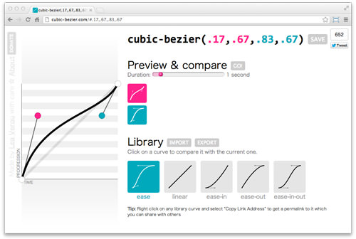
Developed by Lea Verou, a renowned CSS expert, this tool features an interactive Bezier curve. By adjusting the curve, it instantly generates corresponding values. Additionally, it allows for the visualization of transition movements and speed comparison.
Here’s an example showcasing the cubic-bezier function’s capability to simulate a rocket’s launch speed.

Explore the demonstration and download the source code from the following links. We hope you find this tool as exciting as we do.