Beginner’s Guide to jQuery Mobile to Mobile App Development
Note: This post was first published on the 17th Jan, 2012.
Over the past 2-3 years, we’ve seen tremendous growth in browser and OS support for mobile websites. Most notably, Apple’s iOS and Google’s Android platforms come to mind. But others such as PalmOS and Blackberry are still in the mix. Up until recently, it was very difficult to match a single mobile theme into all of these platforms.
JavaScript was a start, but there hasn’t been any truly unified library until now. jQuery Mobile takes all the best features of jQuery and ports them over to a mobile-based web source. The library is more like a framework that includes animations, transition effects, and automatic CSS styles for basic HTML elements. In this guide, I hope to introduce the platform in a way that you can feel comfortable designing your own jQuery mobile apps.
Mobile App Design/Dev: Custom Themes with jQuery Mobile
In our earlier jQuery Mobile tutorial I had introduced much of the underlying framework and how to go... Read more
Features & OS Support
The reason I suggest learning jQuery Mobile over any other frameworks is simplicity. The code was built on the jQuery core and had an active team of developers writing scripts and editing bugs. Of the many features include HTML5 support, Ajax-powered navigation links, and touch/swipe event handlers.
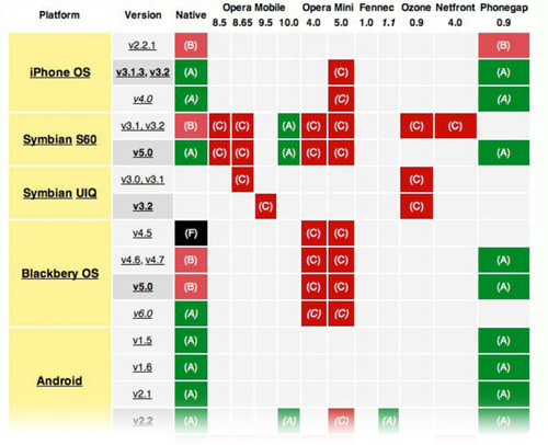
Support is varying between phones and is broken into a chart of 3 categories from A-C. A is the top tier which boasts full support of jQuery Mobile, B has everything except Ajax while C is basic HTML with little-to-no JavaScript. Luckily most of the popular operating systems are fully supported – I added a list below of just a few examples.
- Apple iOS 3-5
- Android 2.1, 2.2, 2.3
- Windows Phone 7
- Blackberry 6.0, Blackberry 7
- Palm WebOS 1.4-2.0, 3.0
If you want to learn more try reading up on their official docs page. It’s not written in gibberish and actually feels very easy to follow along. Now let’s focus on the basics of writing a jQuery mobile page and how we can build a small application!
The Standard HTML Template
To get your first mobile app working, there is a set template you should start with. This includes the jQuery base code along with the mobile JS and CSS, all externally hosted from the jQuery CDN. Check out my example code below.
 <!DOCTYPE html>
 <html>
 <head>
 <title>Basic mobile app</title>
 <meta charset="utf-8">
 <meta name="viewport" content="width=device-width, initial-scale=1">
 <meta http-equiv="X-UA-Compatible" content="IE=edge,chrome=1">

 <link rel="stylesheet" href="http://code.jquery.com/mobile/1.0rc2/jquery.mobile-1.0rc2.min.css">
 <script type="text/javascript" src="http://code.jquery.com/jquery-1.6.4.min.js"></script>
 <script type="text/javascript" src="http://code.jquery.com/mobile/1.0rc2/jquery.mobile-1.0rc2.min.js"></script>
 </head>
 <body>

 </body>
 </html>
The only foreign elements here should be the two meta tags. The top viewport tag updates mobile browsers to use a full zoom effect. Setting the value width=device-width will set the page width at exactly the width of the phone screen. And best of all, it doesn’t disable the zoom features since jQuery Mobile can adapt to shifting layouts.
The next meta tag X-UA-Compatible just forces Internet Explorer to render the HTML in it’s most recent iteration. Older browsers and especially mobile, will try to get around unfamiliar rendering bugs.
Constructing the Body Content
Now, this is where jQuery mobile can get tricky. Each HTML page isn’t necessarily 1 page on the mobile site. The framework uses HTML5’s data attributes, which you can create at a whim by appending data- beforehand. In a similar fashion data-role="page" can be set to multiple divs in a single HTML file, giving you more than one page.
You would then move between these pages with anchor links and a unique ID. This setup is a good idea for basic, simple apps. If you only need 3-5 pages, then why not store it all in a single file? Unless you have a lot of written content, in which case try using PHP includes to save time.
Check the code example below if you’re lost.
 <body>
 <div data-role="page" id="index">
 <header data-role="header">
 <h1>Top title bar</h1>
 </header>

 <div data-role="content">
 <h3>Show another page??</h3>
 <p>hint: click the button below!</p>
 <p><a href="#about" data-role="button" data-theme="c">About us</a></p>
 </div>

 <footer data-role="footer">
 <h2>© footer here.</h2>
 </footer>
 </div>

 <div data-role="page" id="about">
 <header data-role="header">
 <h1>Page 2 Here</h1>
 </header>

 <div data-role="content">
 <p>just some extra content as well.</p>
 <p>I mean, you can <a data-rel="back" href="#index">go back</a> at any time.</p>
 </div>
 </div>
 </body>
 </html>
Take a look at the anchor link from the index page for a moment. Notice I added the attribute data-role="button" to set up the link as a button. But instead of using the default styles we include data-theme="c". This switches between 1 of 5(themes a-e) templates which come packaged by default as CSS styles within jQ Mobile.

My button also spans the entire page width. To remove the behavior, we need to set the element from block to inline display. The attribute for doing this is data-inline="true" which you could append onto any anchor button.
Header and Footer Bars
Along the very top and bottom of your applications, you should append header and footer content. This design style is often attributed to iOS apps which first became popular using Apple’s mobile App Store. jQ Mobile uses attributes of data-role to define the header, footer, and page content. Let’s take a brief look at these areas.
Top Bar Buttons
By default, the top bar supports a set of two(2) links in a similar fashion to other mobile apps. iOS defaults to using a “back” button to the left and often an “options” or “config” on the right.
 <div data-role="page" id="about" data-add-back-btn="true">
 <header data-role="header">
 <a href="index.html" data-icon="gear" data-theme="b" class="ui-btn-right">Settings</a>
 <h1>Page 2 Here</h1>
 </header>
The code above is just focusing on the div container for our About page along with header content. The additional HTML attribute data-add-back-btn="true" will only work when added onto a page data role. The purpose is to automatically include a back button which works similar to your browser’s back button.

We could have added a back button manually with similar code as we used in the content area. But I feel this takes a lot longer to set up, especially on multiple pages. All anchor links within the header section will default into left/right button positions. By using class="ui-btn-right" this re-positioned my Settings button so there is free space for the back button. Also, I’m using the secondary theme styles to give it some extra spunk!
Footer Navigation
The footer area may not feel very useful at first. It’s a place where you can store copyright stuff and more important links, but this could just as easily be added at the bottom of your content area. So what good is using the footer?
Well the best example I’ve seen utilizes footer space as a navigation system where tab links appear to control the page navigation. There are plenty of options where you can select fullscreen effects, add icons, adjust placement, and a few other attributes as well. But let’s just build a simple footer nav with three buttons to get an idea of how this works.
 <footer data-role="footer" class="ui-body-b">
 <div data-role="navbar">
 <ul>
 <li><a href="#index" data-direction="reverse">App Homescreen!</a></li>
 <li><a href="https://www.google.com/" data-rel="nofollow">Google Me</a></li>
 <li><a href="https://www.hongkiat.com/" data-rel="nofollow">Hongkiat Blog</a></li>
 </ul>
 </div>
 </footer>
So here is some footer code for the about page section. data-role="navbar" should be added onto the container element housing an unordered list and NOT the UL element itself. Each link within the list is treated as a tab bar, which then gets equally divided based on the total number of links. The additional class of ui-body-b just adds aesthetic effects as we switch between the few available styles.

If you notice on the first button I have the attribute data-direction="reverse". Even though I could use the back button setup as before to return to the home page, I’ve instead used the page ID of #index. By default the app window will transition to the right, which looks pretty tacky since you expect the animation to move backward. You can play around with even more of these animated effects if you have time. Check out the transitions info page in the jQuery documentation.
Ajax & Dynamic Pages
The first segment has really opened up the key points to building a mobile app with jQuery. But I want to start a new app that loads data from an external page. I’ll be using a very simple PHP script to attain the $_REQUEST[] variable and display a small Dribbble shot accordingly. The screenshot below should give you an idea what we are going to build.
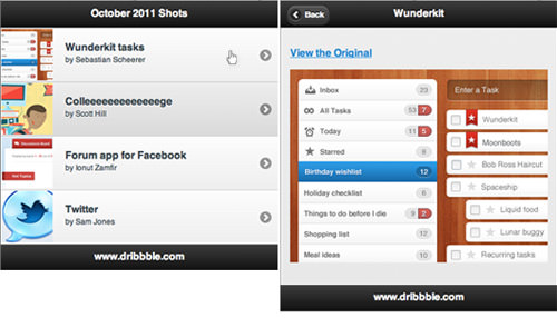
First, I’ll make an index.html page set on the default template. For this home screen, I’m using a list view setup to display each link in order. This is done in the content area with a data-role="listview" attribute on the list container. Cutting out the same header stuff as before, I added all my code from this new index page below.
 <body>
 <div data-role="page" id="img-listing">
 <header data-role="header">
 <h1>October 2011 Shots</h1>
 </header>

 <div data-role="content">
 <ul data-role="listview" data-theme="c">
 <li><a href="image.php?imgid=1">First image</a></li>
 <li><a href="image.php?imgid=2">Second image</a></li>
 <li><a href="image.php?imgid=3">Third image</a></li>
 <li><a href="image.php?imgid=4">Fourth image</a></li>
 </ul>
 </div>

 <footer data-role="footer"><h3>www.dribbble.com</h3></footer>
 </div>
 </body>
 </html>
Each anchor link in my list viewpoint to the same file – index.php. But we’re passing in the parameter imgid as a request variable. On the image.php file, we take the ID and test it against four preset values. If any match up, we use the matching image URL and title; otherwise, we just display a default Dribbble shot.
Image Loader Script
The image.php script still has the default jQuery mobile template added into the code. It actually shares a very similar header and footer, except for the addition of our backlink attribute data-add-back-btn="true". Notice this button will only show up if we come from index.html first! Try directly loading image.php and nothing will appear since there’s no “back” to move to.
I think we can make a bit more sense of the code by examining my PHP logic first. We use a switch / case method to check against the 4 different IDs and provide a header title, image URL, and original artist source link.
<?php
 $theid = $_REQUEST['imgid'];

 switch($theid) {
 case 1:
 $heading = "Wunderkit";
 $origin = "https://dribbble.com/shots/297593-Wunderkit-tasks";
 $source = "wunderkit.png";
 break;
 case 2:
 $heading = "College";
 $origin = "https://dribbble.com/shots/298643-Colleeeeeeeeeeeeege";
 $source = "college.jpg";
 break;
 case 3:
 $heading = "Forum app";
 $origin = "https://dribbble.com/shots/298649-Forum-app-for-Facebook";
 $source = "forum-app.jpg";
 break;
 case 4:
 $heading = "Twitter";
 $origin = "https://dribbble.com/shots/298069-Twitter";
 $source = "twitter.png";
 break;
 default:
 $heading = "Abandoned lighthouse";
 $origin = "https://dribbble.com/shots/298615-Abandoned-lighthouse";
 $source = "lighthouse.jpg";
 }
 ?>
All seems fairly straightforward – even a novice PHP dev should be able to follow along! And if you don’t understand, it’s not important to the jQuery code anyway, so don’t worry. We should switch now and take a look at the template I’ve built within this new page. All the HTML code is added after that whole PHP block above. I used the ID of “images” for the container and even set up the header to change with each new photo.
 <div data-role="page" id="images" data-add-back-btn="true">
 <header data-role="header">
 <h1><?php echo $heading; ?></h1>
 </header>

 <div data-role="content">
 <p><strong><a href="<?php echo $origin; ?>" data-rel="nofollow">View the Original</a></strong></p>
 <p><a href="<?php echo $origin; ?>" data-rel="nofollow"><img src="img/<?php echo $source; ?>" /></a></p>
 </div>

 <footer data-role="footer"><h3>www.dribbble.com</h3></footer>
 </div>
You can probably see how simplistic this demo is. But the whole purpose is to demonstrate the scalability of jQuery mobile. PHP can easily be added into the mix, and you can churn out some really neat apps with just a few hours of development.
Fancy Design with List Thumbnails
One last added effect we can implement is the use of thumbnails to liven up the listing page. I’m also going to split the text into a heading and description box to display both the artwork title and the artist’s name.
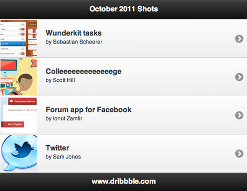
To begin open up Photoshop and create an 80×80 px document. I’m going to quickly re-size each image and save thumbnails from matching each one. Then update the list view items we should include a few more elements.
Check out the code below to see what I mean.
 <div data-role="content">
 <ul data-role="listview" data-theme="c">
 <li><a href="image.php?imgid=1">
 <img src="img/wunderkit-t.png" class="ui-li-thumb" />
 <h3 class="ui-li-heading">Wunderkit tasks</h3>
 <p class="ui-li-desc">by Sebastian Scheerer</p></a></li>

 <li><a href="image.php?imgid=2">
 <img src="img/college-t.jpg" class="ui-li-thumb" />
 <h3 class="ui-li-heading">Colleeeeeeeeeeeeege</h3>
 <p class="ui-li-desc">by Scott Hill</p></a></li>

 <li><a href="image.php?imgid=3">
 <img src="img/forum-app-t.jpg" class="ui-li-thumb" />
 <h3 class="ui-li-heading">Forum app for Facebook</h3>
 <p class="ui-li-desc">by Ionut Zamfir</p></a></li>

 <li><a href="image.php?imgid=4">
 <img src="img/twitter-t.png" class="ui-li-thumb" />
 <h3 class="ui-li-heading">Twitter</h3>
 <p class="ui-li-desc">by Sam Jones</p></a></li>
 </ul>
 </div>
The classes for ui-li-heading and ui-li-desc are added by default into the jQuery Mobile stylesheet. This is similar to the image class ui-li-thumb, which automatically re-sizes each list view bar according to the image height. Now from here, you could build more on the frontend with animations, page effects, stylesheets, etc.
Alternatively, you could begin constructing a backend system to upload new images and automatically trim thumbnails to include in the list. There is so much flexibility with jQuery Mobile you almost can’t label it solely as a JavaScript library. It’s more of an entire HTML5/CSS/jQuery framework for building quick and scalable mobile apps.
Conclusion
As of writing this article, the jQuery Mobile team has officially put out RC1.0 of the code library. This means most if not all of the major bug fixes have been squashed, and now testers are gearing up for a full release. Because of this, you won’t find a whole lot of information on the web.
But as the month’s advance, web developers are sure to pick up on the trend. Mobile applications and even mobile web layouts are growing in popularity with the huge increase in smartphones. Web developers don’t have the time to learn a full programming language for building Android/iOS apps. Thus jQuery Mobile is a slim alternative that includes support for most of the mobile industry software and continues growing daily with an active developer community.