How to Build HTML Bootstrap Layouts With LayoutIt!
p>If you want to build a responsive website then Bootstrap will be a handy tool for you. This latest framework innovation has brought web developers a new approach of creating easier, faster and better responsive websites and apps in general.
But it’s pretty hard and not to mention time-consuming to build a layout from scratch. To make this process easier and faster, in this post we will be looking at LayoutIt! which helps you easily design HTML layouts based on Bootstrap.
LayoutIt! is a web-based tool to layout a web page design with drag-and-drop. LayoutIt! supports the latest Bootstrap version and if you don’t want to start completely from scratch, it has 3 basic templates you can use. The design then, is ready to be used in your project complete with built-in Bootstrap code. So far, it’s still in beta mode, but so far, it works well without a hitch.
Getting Started
To get started with LayouIt! you need to head over to the Edit page. As you can see in the following screenshot, there are various tools and options to check out. Near the top, you can see the 3 modes you can build under: Edit mode, Developer mode and Preview mode.
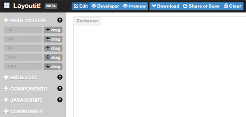
Below the top bar you can see the elements on the left sidebar and the Container on the right. The Container is your canvas on which you can build and customize your elements. Once you are done building just Download the code, Share or Save it.
Elements
There are 4 types of elements: Grid System, Base CSS, Javascript and additional Components. Just drag and drop your required element to the Container and customize it accordingly.
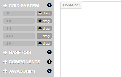
To start off, pick a Grid System or several to create the layout you want to see on your website. The grid basically give you rows and columns for you to work on.
Once you have the grid you can add some basic CSS elements with Base CSS, such as title, paragraph, blockquote, table, button, image and so on. You can find other additional preferences in each element, such as alignment for paragraphs, emphasis, or making it as the lead.
To add common attributes, Components provide you with several basic elements of website, such as button, header, text, breadcrumb, pagination and so on. And finally, to enhance your website, just drop in some Javascript elements: modal, navbar, tabs, alerts, collapse or carousel.
Usage Guide
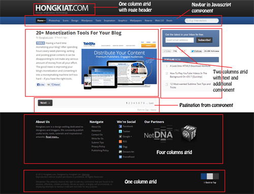
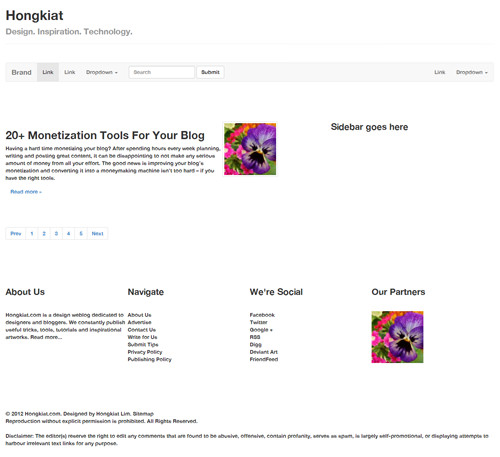
To see how LayoutIt! works in action, we are going to try to build Hongkiat.com’s homepage layout. Here’s a breakdown of the layout.
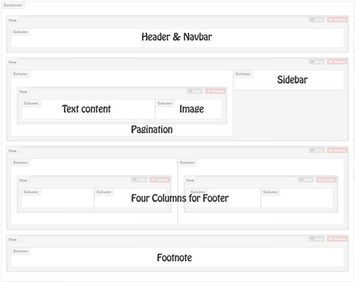
First, we need to work on the grid layout.
The layout needs four main rows: a single-column for the header and navbar; two-column for text content, image and pagination; a single-column for the sidebar; four columns for the footer, and one column for footnote. The following screenshot is how the layout looks like on a skeleton grid.
Now to add the other elements:
- We add a Header from "Components" and a Navbar from "Javascript".
- To put the image beside the text content, another 8 4 grid should be inserted inside the first 8 grid (see shot above).
- Add Text from "Components" and add Image from "Base CSS".
- Under Text and Image, insert Pagination from "Components"
- For the sidebar, let’s just add a label text using Title from "Base CSS".
- For the footer, we can Title and Paragraph from "Base CSS".
- For the footnote, we just add Paragraph from "Base CSS".
And we’re done. This is what the layout will look like. Tip: To enable text editing, right click on the text.
For those who are newly acquainted with Bootstrap and want to build Bootstrap-supported layouts, LayoutIt! is a fun tool to play around with. Give it a go and let us know what you think of it.