Understanding Infographics: What’s Their Story?
Infographics might seem like a recent idea to some, but not everyone knows where they truly come from. They aren’t just a digital creation, but the digital world made them more popular.
In this article, we’ll explore the history of infographics and see how they’re used nowadays. We’ll also discuss if the information they present really adds value and how much of it is genuinely important.
20+ Best Infographic Tools
Infographics tools help you turn boring data into vivid charts and graphs within minutes, and with minimal effort. Read more
The Start of Infographics
Infographics have always been a powerful tool for sharing information. For example, when information is shared through speech alone, most people only remember about 10% of what they hear. But when the same information is shown visually, with pictures and words, they can remember up to 50% of it. If you’re interested, Visual.ly has an interesting section on The History of Infographics that provides more details on their effectiveness.
As I said before, infographics aren’t new. They’ve been used for a very long time, even before the digital age. A famous early infographic is from the medical report titled Mortality of the British Army, published in 1858. This infographic was made by the legendary Florence Nightingale.
This style of design is still popular and is called a coxcomb. Florence Nightingale often included visuals in her reports. She believed it was the best way to share her findings, especially when presenting to big groups like the Parliament.
Diagram of The Causes of Mortality in The Army in The East

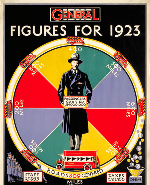
Another old infographic was made for promoting the London Underground. Nowadays, the London Transport Museum displays many of these posters in one of the biggest collections in the world. The infographic below shows that making attractive visuals out of complex data has always been a challenge.
Figures for 1923, by Charles Shepard, 1924
Infographics: From Paper to Pixels
According to the Oxford Dictionary, an infographic is “a visual way of showing information or data, like a chart or diagram”. Nowadays, infographics are not just found in books, posters, or business reports. They’ve moved to the online world. The main change from paper to digital infographics is the ease of sharing. With a click, we can show it to friends, and they can do the same.
The huge growth of social media has made infographics very popular. Everyone online is a possible viewer. Online businesses use many methods to grab attention: banner ads, Google Ads, emails, short videos, guest articles, and share buttons. Share buttons are simple, but they don’t always work. Sharing a website link is good, but many of us bookmark long articles and never read them again.
This is where companies can use infographics. They can combine the best parts of information into a fun and informative visual. These visuals often have bright pictures, arrows, and colors, making information easy and enjoyable to understand. Plus, being the first to share an infographic feels great.
The Multiple Benefits of Infographics
Infographics let creators enhance their brand image, reach new audiences, self-promote, show expertise, increase web traffic, build backlinks, and boost search rankings. It’s easy to see why infographics are so popular online.
Here are some of my favorite infographics that highlight different uses:
Reaching a New Audience
Hotel Club, a hotel-booking company, made an infographic for travelers who are also gamers. These travelers have a high spending ability. The infographic doesn’t directly promote the brand but connects with gamers who love exploring different game worlds.
A Guide to The Gamers Universe

Promoting a Brand
BroadBandChoices, a site comparing broadband services, created an infographic about modems. It’s a clever way of promoting their brand while educating viewers about an essential digital device.
The History of The Modems

Showing Expertise in a Field
News agencies, like the Guardian from the UK, often produce quick and informative infographics. Speed in journalism shows authority. Besides fast articles, they offer visual content for those who prefer visuals over long reads.
Where Does the EU Get its Money From – and How Does It Spend It?

What’s Next for Infographics?
There are countless types of infographics available. Just searching for “infographics” can give you over 8,550,000 results. With so many out there, it’s clear that not all are of high quality or share crucial information. Do we even need infographics when simple stats can convey the message, or if the shared info isn’t important?
Interactive Infographics
With changing technology, marketing approaches adapt. Now, there are interactive infographics that enhance user engagement.
I remember seeing an interactive infographic celebrating Barrack Obama’s 50th birthday. You can control how you view the graphic and choose what info you want to see. It’s an interesting experience.
Obama At 50: Timeline of a President and his Country

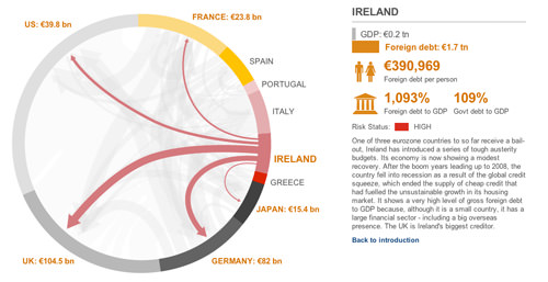
Another one by BBC visualizes the debt connections between Euro countries and major world economies. It showcases which country owes money to whom.
Eurozone Debt: Who Owes What to Whom?
Then there’s a simple one by Thomson Holidays made for music tourists. It encourages dance music fans to explore new places and tunes.
How Music Travels – The Evolution of Western Dance Music

Finally, MahiFX has an interactive infographic, which, even though it’s under construction, provides a unique experience. Instead of a regular landing page, they show how long it would take super trader John Paulson to earn your yearly salary. This creative idea got them lots of web traffic and social shares. Forex trading made engaging!
You vs. John Paulson

Further Reading
Here are more articles we’ve published in the past related to infographics that you might find interesting.