A Look Into Customizable HTML Select Elements
The <select> element is one of the most common form controls on the web, but it has always been one of the hardest to style. That’s because browsers just let the OS decide how it looks, especially for the dropdown list and arrow icon.
While this approach keeps the design consistent with native apps, it also means the appearance can vary a lot across devices and browsers. If you wanted a custom design, you often had to rebuild the whole thing from scratch using JavaScript libraries like React Aria or Shadcn UI. This added more code to maintain, and often could lead to accessibility issues and slower performance.
Now, thanks to a new HTML standard, there are better ways to style the <select> element without the trade-offs. Let’s take a look at how it works.
What’s in the new standard?
This new standard introduces a new <selectedcontent> element which allows you to define custom content for the selected option in a <select> dropdown, including adding some HTML instead of just text.
The standard also specifies a new CSS property value, appearance: base-select;. This base-select value tells the browser to remove all its default operating system styling and use a very minimal base styles instead.
Along with this CSS property, it also introduces a new pseudo-element, ::picker(select) and the ::picker-icon, which allows you to select and style the dropdown list.
Usage
To use these new standards, we can simply add the appearance: base-select; property to your <select> element itself and its ::picker(select) pseudo-element, like below.
.custom-select {
  appearance: base-select;
}
.custom-select::picker(select) {
  appearance: base-select;
}
As we can see below, this CSS would remove the default OS-styles.
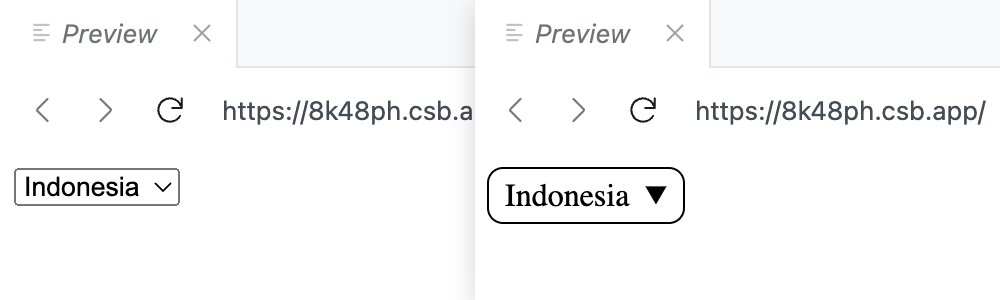
appearance: base-select;On the HTML side, we can now add rich content. For example, we can add an icon with an emoji within each of the options.
<select name="country" id="custom-select">
    <button>
        <selectedcontent></selectedcontent>
    </button>
    <option value="ID">
        <span class="flag">🇮🇩</span>
        <span class="text">Indonesia</span>
    </option>
    <option value="MY">
        <span class="flag">🇲🇾</span>
        <span class="text">Malaysia</span>
    </option>
    <option value="SG">
        <span class="flag">🇸🇬</span>
        <span class="text">Singapore</span>
    </option>
</select>
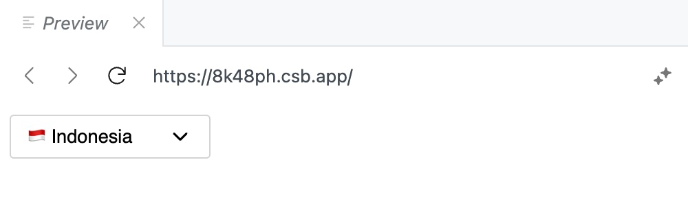
We’ve added it with a span and the class, so we could style it with CSS, and used a button element with the <selectedcontent> element to be able to fully customize the selected option’s appearance, such as adding a custom dropdown icon.
Adding custom dropdown icon
For the dropdown icon, we’ll be using an SVG icon, as follows:
<select name="country" class="custom-select">
    <button>
        <selectedcontent></selectedcontent>
        <svg
            class="dropdown-icon"
            xmlns="http://www.w3.org/2000/svg"
            viewBox="0 0 24 24"
            fill="none"
            stroke="currentColor"
            stroke-width="2"
            stroke-linecap="round"
            stroke-linejoin="round"
            aria-hidden="true"
        >
            <path d="m6 9 6 6 6-6"></path>
        </svg>
    </button>
    ...
</select>
And we’ll hide the default dropdown icon using the ::picker-icon pseudo-element.
.custom-select::picker-icon {
    display: none;
}
After adding a few more styles on the button to align and control the icon size, we can see a nicer result of our custom select element:
Styling the dropdown
Once we’ve customized the selected element and icon, we can style the dropdown list itself.
For example, you could give the dropdown a subtle border, a shadow for depth, and adjust the spacing between options for better readability:
.custom-select::picker(select) {
  border: 1px solid #d4d4d4;
  box-shadow: 0 2px 4px rgba(0, 0, 0, 0.1);
  font-family: sans-serif;
  border-radius: 3px;
  font-size: 0.85rem;
  margin-top: 2px;
}

.custom-select option {
  padding: 4px;
}

.custom-select option .flag {
  margin-right: 2px;
}
Styling the selected element
Next, we can style the selected element itself. For example, we can add a different background color to make it stand out more.
.custom-select option:is(:checked) {
    background: #bedbff;
}
Another thing we could also change is the checkmark icon that appears when an option is selected. We can use the ::checkmark pseudo-element to style it.
For example, here we’ve changed it to use “✔” instead of the default check mark icon, and changed it to a blue color to match the background.
.custom-select option::checkmark {
  content: "✔";
  color: #1c398e;
}
With these styles, we can see a more polished dropdown:
Wrapping up
HTML and CSS have come a long way in making the <select> element more customizable. With the new standards, we can now create dropdowns that look better and are easy to use, while still being accessible.
Keep in mind that, at the time of this writing, these features are still experimental and not widely supported across all browsers. You can check the Can I Use website for the latest support status.
Hopefully, as more browsers implement these features, we can expect to see more beautiful and functional <select> elements on the web.