Understanding CSS3 Regions
Print media, such as magazines and newspapers, has always had a leg up on websites due to its ability to arrange pages and paragraphs in highly flexible layouts. For instance, it can effortlessly distribute content across multiple, even complex, columns.
Replicating these intricate layouts on the web has always been a challenge because of how digital content is structured.
To bridge this gap and bring the flexibility of print layouts to the web, the CSS3 Regions module was introduced. This innovation does away with the need to confine content within multiple elements, instead allowing it to flow through designated areas or ‘regions’ on a web page, creating a more dynamic and versatile layout.
Let’s explore how this module transforms web layouts through an example.
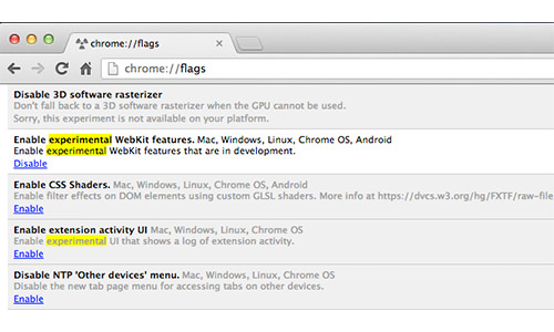
How to Enable Experimental Features
If you’re eager to experiment with CSS3 Regions, keep in mind that it’s still a work in progress and currently enjoys support only in Google Chrome and Internet Explorer, and that too with a prefix. Chrome users need to take an additional step to dive into these features. Simply navigate to chrome://flags/ in your browser and switch the Enable experimental WebKit features option to Enabled.
A Simple Guide to Using CSS3 Regions
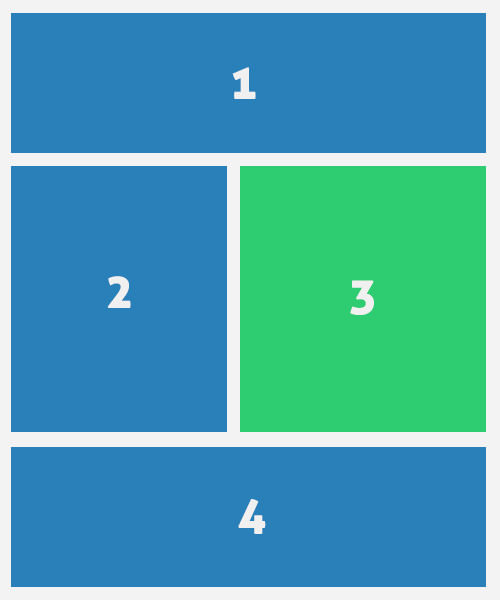
In this tutorial, we’ll explore an example involving two types of content: primary and supplementary. The primary content will be distributed across Region 1, 2, and 4, whereas the supplementary content will find its place in Region 3. The layout below provides a visual guide to how these regions are arranged.
HTML
Let’s kick things off with the HTML structure needed for our example.
One of the great things about the CSS3 Regions module is its flexibility with content arrangement. This means we can place the supplementary content separately from the main body, yet still have it appear amidst the primary content, as we’ve outlined earlier.
<header class="cf">
  <h1><span>Lorem ipsum dolor sit amet,</span> consectetur adipisicing elit, sed do eiusmod tempor incididunt ut.</h1>
  <h2>labore et dolore magna aliqua</h2>
</header>

<article class="cf">
  <p>Lorem ipsum dolor sit amet, consectetur adipisicing elit, sed do eiusmod tempor incididunt ut labore et dolore magna aliqua. Ut enim ad minim veniam, quis nostrud exercitation ullamco laboris nisi ut aliquip ex ea commodo consequat.</p>
</article>

<aside>
  <p><img src="img/stat.jpg" width="500" height="300"></p>
  <p>Lorem ipsum dolor sit amet, consectetur adipisicing elit, sed do eiusmod tempor incididunt ut labore et dolore magna aliqua. Ut enim ad minim veniam, quis nostrud exercitation ullamco laboris nisi ut aliquip ex ea commodo consequat.</p>
</aside>
Then, we need to add the regions markup where the content should flow. It does not matter whether we add the markup above or below the actual content.
<div class="regions cf">
  <div id="region-1" class="region cf"></div>
  <div id="region-2" class="region"></div>
  <div id="region-3" class="region"></div>
  <div id="region-4" class="region cf"></div>
</div>
CSS
Within our CSS file, we’ll define the dimensions for the regions. It’s crucial to set a height for each region because this determines when the content will transition to the next region. Without a defined height, the content won’t properly distribute across the various regions.
.demo-wrapper #region-1,
.demo-wrapper #region-4 {
  width: 100%;
  height: 250px;
}

.demo-wrapper #region-4 {
  height: 400px;
}

.demo-wrapper #region-2,
.demo-wrapper #region-3 {
  width: 50%;
  height: 700px;
  margin-bottom: 25px;
}
To orchestrate the flow of content between these regions, we’ll employ the flow-into and flow-from properties. These properties connect our content with the specified regions, allowing for a seamless transition of text and elements across the layout.
article {
  -webkit-flow-into: article;
  flow-into: article;
}

.demo-wrapper aside {
  -webkit-flow-into: aside;
  flow-into: aside;
}

#region-1,
#region-2,
#region-4 {
  -webkit-flow-from: article;
  flow-from: article;
}

#region-3 {
  -webkit-flow-from: aside;
  flow-from: aside;
}
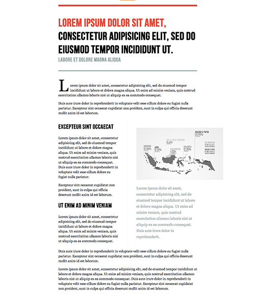
By integrating a few additional styling details, we achieve an appealing visual outcome in the browser, as seen in the image below.
Explore the demo and the source code for a hands-on experience with CSS3 Regions.
Further Resources
- CSS3 Regions Documentation – W3C
- CSS Regions Examples – Adobe
- Content Folding with CSS3 Regions – CSS-Tricks