How to Use CSS3 Page Breaks to Organize Printed Web Pages
While we live in a digital era where most content is easily accessible online, many people still prefer reading long-form text on paper. It’s possible that some of your users will print out your content to read offline.
The ability to style content specifically for print has been around for years. This can be achieved using the @media rule within your stylesheet, like so:
@media print {
  /* Style rules */
}
There are several properties that allow us to format web content for print, and today we’ll focus on one of them: Page Break.
What Does It Do?
If you’ve used word processors like Microsoft Word or Pages, you’re likely familiar with the Page Break feature, which lets you move content to the next page.
The CSS Page Break feature does the same thing – allowing you to control how your web content is split across pages when printed.
Using Page Break
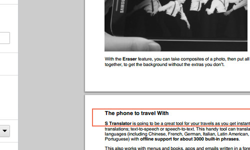
For demonstration, let’s consider a sample page that I intend to print. Initially, there is an awkward break, as shown below.
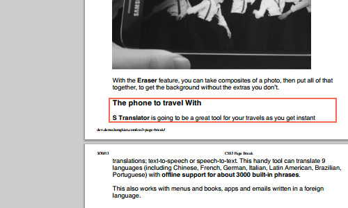
It would be better if the heading and orphan text started on the next page.
To achieve this, you can use the page-break-after property and set its value to always, forcing the next element to “break” onto the following page.
.page-break {
  page-break-after: always;
}
You can then either create a new element with this class between the elements or apply the class to the preceding element, like so:
<p class="page-break">With the <strong>Eraser</strong> feature, you can take composites of a photo, then put them together to get the background without the extras you don't want. </p>

<h3>The phone to travel with</h3>
<p><strong>S Translator</strong> is going to be a great tool for your travels as...</p>
Now, the heading and the orphaned text should appear on the next page.
Widows and Orphans
The method above can be tedious for large amounts of content. Instead of manually forcing page breaks, it’s more efficient to set a minimum threshold for widows and orphans.
In typography, widows and orphans are terms used to describe words or short lines left behind on a different page than the rest of the paragraph.
By using the orphans and widows properties, you can specify a minimum threshold. For example, the following code ensures at least three lines remain at the bottom or top of paragraphs where page breaks occur:
p {
  orphans: 3;
  widows: 3;
}
Further Resources
We’ve covered the basics of controlling page breaks in printed media for your web content. Considering print styles in your website’s design ensures your content looks good both on screen and on paper.
For more detailed information, you can refer to the following resource: