6 Cool Image Captions with CSS3
CSS3 is really powerful. It used to be that we needed images or many lines of JavaScript code to create a simple transition effect. Nowadays, we can achieve the same result using only CSS3.
In this tutorial, we will show you how to create image captions with various transitions simply using CSS3.
Browser Support
These captions heavily depend on `transform` and `transition` properties, which are relatively new features. Therefore, it’s wise to note the browser support required to run the captions smoothly.
The following browsers already support `transform` and `transition`:
- Internet Explorer 10+
- Firefox 6+
- Chrome 13+
- Safari 3.2+
- Opera 11+
Now, let’s start the tutorial.
HTML Structure
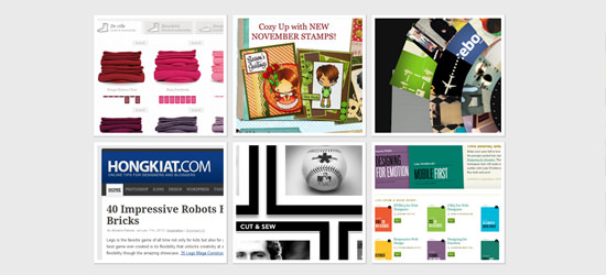
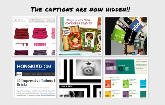
We have 6 images, each with a different caption style.
<div id="mainwrapper">
    <!-- This #mainwrapper section contains all of our images to make them center and look proper in the browser -->

    <!-- Image Caption 1 -->
    <div id="box-1" class="box">
        <img id="image-1" src="css3-image-captions/1.jpg"/>
        <span class="caption simple-caption">
            <p>Simple Caption</p>
        </span>
    </div>

    <!-- Image Caption 2 -->
    <div id="box-2" class="box">
        <img id="image-2" src="css3-image-captions/2.jpg"/>
        <span class="caption full-caption">
            <h4>Full Caption</h4>
            <p>Lorem ipsum dolor sit amet, consectetuer adipiscing elit,sed diam nonummy nibh euismod tincidunt ut laoreet dolore magna aliquam erat volutpat.</p>
        </span>
    </div>

    <!-- Image Caption 3 -->
    <div id="box-3" class="box">
        <img id="image-3" src="css3-image-captions/3.jpg"/>
        <span class="caption fade-caption">
            <h4>Fade Caption</h4>
            <p>Lorem ipsum dolor sit amet, consectetuer adipiscing elit,sed diam nonummy nibh euismod tincidunt ut laoreet dolore magna aliquam erat volutpat.</p>
        </span>
    </div>

    <!-- Image Caption 4 -->
    <div id="box-4" class="box">
        <img id="image-4" src="css3-image-captions/4.jpg"/>
        <span class="caption slide-caption">
            <h4>Slide Caption</h4>
            <p>Lorem ipsum dolor sit amet, consectetuer adipiscing elit,sed diam nonummy nibh euismod tincidunt ut laoreet dolore magna aliquam erat volutpat.</p>
        </span>
    </div>

    <!-- Image Caption 5 -->
    <div id="box-5" class="box">
        <div class="rotate">
            <!-- Rotating div -->
            <img id="image-5" src="css3-image-captions/5.jpg"/>
            <span class="caption rotate-caption">
                <h4>This is rotate caption</h4>
                <p>Lorem ipsum dolor sit amet, consectetuer adipiscing elit, sed diam nonummy nibh euismod tincidunt ut laoreet dolore magna aliquam erat volutpat.</p>
            </span>
        </div>
    </div>

    <!-- Image Caption 6 -->
    <div id="box-6" class="box">
        <img id="image-6" src="css3-image-captions/6.jpg"/>
        <span class="caption scale-caption">
            <h4>Free Style Caption</h4>
            <p>Lorem ipsum dolor sit amet,consectetuer adipiscing elit, sed diam nonummy nibh euismod tincidunt ut laoreet dolore magna aliquam erat volutpat.</p>
        </span>
    </div>
</div> <!-- end of #mainwrapper-->
Basic CSS
Before styling any element, it’s always a good practice to reset all properties using a CSS reset and give them default style values. This ensures all browsers render the results similarly (except perhaps IE6).
The styles will be separated into a `style.css` file, keeping our HTML file neat. However, don’t forget to add a link to the stylesheet inside the `
` tag to apply the styling rules.<link href="style.css" rel="stylesheet" type="text/css" media="screen">
Okay, let’s begin styling the elements, starting with the `html` tag and the `#mainwrapper` ID:
html { background-color: #eaeaea; }

#mainwrapper {
font: 10pt normal Arial, sans-serif;
height: auto;
margin: 80px auto 0 auto;
text-align: center;
width: 660px;
}

Image Box Style
We apply some common styles to the boxes containing the images. The boxes will be displayed side-by-side using `float: left`. Notice that we also added the `overflow: hidden` property; this hides any part of the objects inside that extend beyond the div’s boundaries.
We also declare the `transition` property on every image inside the box, in case we need image transitions later.
#mainwrapper .box {
    border: 5px solid #fff;
    cursor: pointer;
    height: 182px;
    float: left;
    margin: 5px;
    position: relative;
    overflow: hidden;
    width: 200px;
    -webkit-box-shadow: 1px 1px 1px 1px #ccc;
    -moz-box-shadow: 1px 1px 1px 1px #ccc;
    box-shadow: 1px 1px 1px 1px #ccc;
}

#mainwrapper .box img {
    position: absolute;
    left: 0;
    -webkit-transition: all 300ms ease-out;
    -moz-transition: all 300ms ease-out;
    -o-transition: all 300ms ease-out;
    -ms-transition: all 300ms ease-out;
    transition: all 300ms ease-out;
}
Caption Common Style
The captions will have some common styles and also the `transition` property. Instead of using the `opacity` property, we use the RGBA color mode with `0.8` for the alpha channel. This makes the caption slightly transparent without affecting the text inside.
#mainwrapper .box .caption {
    background-color: rgba(0,0,0,0.8);
    position: absolute;
    color: #fff;
    z-index: 100;
    -webkit-transition: all 300ms ease-out;
    -moz-transition: all 300ms ease-out;
    -o-transition: all 300ms ease-out;
    -ms-transition: all 300ms ease-out;
    transition: all 300ms ease-out;
    left: 0;
}
Caption 1
The first caption will have a simple transition effect commonly used for captions. The caption will slide up from the bottom when we hover over the image. To achieve this, the caption has a fixed height of 30px, and we apply `bottom: -30px` to its position to hide it below the image initially.
#mainwrapper .box .simple-caption {
    height: 30px;
    width: 200px;
    display: block;
    bottom: -30px;
    line-height: 25pt;
    text-align: center;
}
Caption 2
The second type has the full width and height of the image/box dimensions (200x200px). The transition creates a sliding door effect, moving from top to bottom.
#mainwrapper .box .full-caption {
    width: 170px;
    height: 170px;
    top: -200px;
    text-align: left;
    padding: 15px;
}
Caption 3
The third caption will have a fading effect. So, we added `opacity: 0` for its initial state.
#mainwrapper .box .fade-caption,
#mainwrapper .box .scale-caption {
    opacity: 0;
    width: 170px;
    height: 170px;
    text-align: left;
    padding: 15px;
}
Caption 4
The fourth caption will slide from left to right. Therefore, we set `left: 200px` as its initial position.
/* Caption 4: Slide */
#mainwrapper .box .slide-caption {
    width: 170px;
    height: 170px;
    text-align: left;
    padding: 15px;
    left: 200px;
}
Caption 5
The fifth caption will have a rotating effect. Not just the caption, but the image will also rotate. It’s more like changing position through rotation.
So, we add the `transform` property with a -180 degree rotation (unless you prefer rotating your monitor to read the caption).
#mainwrapper #box-5.box .rotate-caption {
    width: 170px;
    height: 170px;
    text-align: left;
    padding: 15px;
    top: 200px;
    -moz-transform: rotate(-180deg);
    -o-transform: rotate(-180deg);
    -webkit-transform: rotate(-180deg);
    transform: rotate(-180deg);
}

#mainwrapper .box .rotate {
    width: 200px;
    height: 400px;
    -webkit-transition: all 300ms ease-out;
    -moz-transition: all 300ms ease-out;
    -o-transition: all 300ms ease-out;
    -ms-transition: all 300ms ease-out;
    transition: all 300ms ease-out;
}
Caption 6
The last caption will use a scale transform. However, unlike the previous captions where the text appeared along with the transition, here the text will appear *after* the transition shift is complete. To achieve this, we add a `transition-delay` to the text elements, specifically the <h4> and <p> tags.
#mainwrapper .box .scale-caption h4,
#mainwrapper .box .scale-caption p {
    position: relative;
    left: -200px;
    width: 170px;
    -webkit-transition: all 300ms ease-out;
    -moz-transition: all 300ms ease-out;
    -o-transition: all 300ms ease-out;
    -ms-transition: all 300ms ease-out;
    transition: all 300ms ease-out;
}

#mainwrapper .box .scale-caption h4 {
    -webkit-transition-delay: 300ms;
    -moz-transition-delay: 300ms;
    -o-transition-delay: 300ms;
    -ms-transition-delay: 300ms;
    transition-delay: 300ms;
}

#mainwrapper .box .scale-caption p {
    -webkit-transition-delay: 500ms;
    -moz-transition-delay: 500ms;
    -o-transition-delay: 500ms;
    -ms-transition-delay: 500ms;
    transition-delay: 500ms;
}
Let’s Make Them Move
In the following section, we will define the behavior of the captions when we hover over the images or boxes.
Caption Behavior 1: Show up.
For the first caption, we want it to appear (from the bottom) when hovering over the box. To achieve this movement, we use the `transform` property. The CSS code below tells the caption to move 100% of its height upwards (`translateY(-100%)`).
#mainwrapper .box:hover .simple-caption {
    -moz-transform: translateY(-100%);
    -o-transform: translateY(-100%);
    -webkit-transform: translateY(-100%);
    transform: translateY(-100%);
}
If you don’t understand the negative value for `translateY`, you might want to read this tutorial first for more insight.
Caption Behavior 2: Move it down.
Conversely, the second caption will move down from the top. So, we use a positive value for `translateY`.
#mainwrapper .box:hover .full-caption {
    -moz-transform: translateY(100%);
    -o-transform: translateY(100%);
    -webkit-transform: translateY(100%);
    transform: translateY(100%);
}
Caption Behavior 3: Fade in.
The third caption is the easiest. When the box is hovered over, the caption’s `opacity` changes to `1`, making it visible. Since we’ve already added the `transition` property to the caption class, the transition will run smoothly.
#mainwrapper .box:hover .fade-caption {
    opacity: 1;
}
Caption Behavior 4: Slide it to the left.
As mentioned before, this caption will slide in from the right. However, the image will also slide out to the left simultaneously. So, we have two CSS declarations.
The CSS code below indicates that when hovering over the box, the caption will slide 100% of its width to the left (`translateX(-100%)`). Notice we use `translateX` because we want the slide to move horizontally.
#mainwrapper .box:hover .slide-caption {
    background-color: rgba(0,0,0,1) !important;
    -moz-transform: translateX(-100%);
    -o-transform: translateX(-100%);
    -webkit-transform: translateX(-100%);
    opacity: 1;
    transform: translateX(-100%);
}
When hovering over the box, the image will slide out to the left.
#mainwrapper .box:hover img#image-4 {
    -moz-transform: translateX(-100%);
    -o-transform: translateX(-100%);
    -webkit-transform: translateX(-100%);
    transform: translateX(-100%);
}
Caption Behavior 5: Rotate it.
This caption is different from the rest; it rotates instead of sliding. When the box is hovered over, the `div` containing the image and the caption rotates -180 degrees counter-clockwise, hiding the image and showing the caption.
/** Rotate Caption :hover Behaviour **/
#mainwrapper .box:hover .rotate {
    background-color: rgba(0,0,0,1) !important;
    -moz-transform: rotate(-180deg);
    -o-transform: rotate(-180deg);
    -webkit-transform: rotate(-180deg);
    transform: rotate(-180deg);
}
Caption Behavior 6: Scale it up.
This caption combines several transform effects. When the box is hovered over, the image scales up by 140% (1.4) from its initial dimensions.
#mainwrapper .box:hover #image-6 {
    -moz-transform: scale(1.4);
    -o-transform: scale(1.4);
    -webkit-transform: scale(1.4);
    transform: scale(1.4);
}
And if you saw the CSS under the Caption 6 heading, we initially hid the text 200px to the left. The CSS code below tells the text to move back to its original position. So, the text will slide in from left to right.
#mainwrapper .box:hover .scale-caption h4,
#mainwrapper .box:hover .scale-caption p {
    -moz-transform: translateX(200px);
    -o-transform: translateX(200px);
    -webkit-transform: translateX(200px);
    transform: translateX(200px);
}
Summary
Although these CSS features are cool, they are not yet widely applicable due to the browser support limitations mentioned earlier. However, keep experimenting with these new features, as this is the direction web page shaping will take in the future.
Credits
Image thumbnails used in the tutorial are screenshots taken from the following websites: