UI Design: Glossy Buttons with CSS3 Gradient
We have covered CSS3 gradients a few times, from linear gradient, radial gradient and repeating gradient. This time, we try to utilize these features to create a nice effect, which previously required using a few images for it to work.
In this post, we are going to create the glossy button effect as shown in the above screenshot using CSS3 Gradients and with simple HTML markup.
HTML Structure
As in other tutorials, we will first prepare some essential stuff and, this time, we only need this linen texture for the background. Then create an HTML document, and put the following HTML structure.
<!DOCTYPE html>
<html>
<head>
	<title>Glossy Effect with CSS3 Gradient</title>

	<link rel="stylesheet" href="https://github.com/necolas/normalize.css/2.0.1/normalize.css">
	<link rel="stylesheet" href="css/style.css">
</head>
<body>
	<div class="container">
		<div class="glossy">
			<a>Click Here</a>
		</div>
	</div>
</body>
</html>
Styles
Then, we start working on the stylesheet. We start off by adding background texture in the body, specify the container width and align the text to the center, as follows.
body {
	background: url('../img/ios-linen-white.jpg?new');
}
.container {
	width: 100px;
	margin: 50px auto;
}
.glossy a {
	margin: 6px 0 0 0;
	text-align: center;
	display: block;
	width: 100%;
	height: 100%;
	text-decoration: none;
	color: #000;
}
Next, we add some decorative styles to the div with .glossy class, including the border radius, border color, and the gradient color. There are some handy tools to create CSS3 Gradients, such as from Colorzilla. Regarding this gradient color, we only mix two colors, and adjust the first color stop for 31%.
.glossy {
	width: 100px;
	height: 25px;

	margin: 10px auto;
	position: relative;

	background: #94c4fe;
	background: -webkit-gradient(linear, left top, left bottom, color-stop(31%,#94c4fe), color-stop(100%,#d3f6fe));
	background: -webkit-linear-gradient(top,  #94c4fe 31%,#d3f6fe 100%);
	background: -moz-linear-gradient(top,  #94c4fe 31%, #d3f6fe 100%);
	background: -o-linear-gradient(top,  #94c4fe 31%,#d3f6fe 100%);
	background: -ms-linear-gradient(top,  #94c4fe 31%,#d3f6fe 100%);
	background: linear-gradient(to bottom,  #94c4fe 31%,#d3f6fe 100%);
	filter: progid:DXImageTransform.Microsoft.gradient( startColorstr='#94c4fe', endColorstr='#d3f6fe',GradientType=0 );

	-webkit-border-radius: 25px;
	-moz-border-radius: 25px;
	border-radius: 25px;

	border: 1px solid #4864a9;

	color: #000;
	font-size: 0.750em;
	text-shadow: 1px 1px 0px rgba(255,255,255,.5);

	-webkit-box-shadow:  0px 1px 3px 0px rgba(0, 0, 0, .2);
    box-shadow:  0px 1px 3px 0px rgba(0, 0, 0, .2);

    position: relative;
}
At this stage, here is how it looks like.

Now, we make it more realistic by adding a shining effect on top of it, and we will add it with :before pseudo-element. Similarly, we will also add some decorative styles, like border radius and gradient colors. But, this time, we will use RGBA color format with a low Alpha channel for the background colors, as follows.
.glossy:before {
	content: "";
	width: 90px;
	height: 16px;

	display: block;
	position: absolute;
	left: 5px;

	-webkit-border-radius: 8px;
	-moz-border-radius: 8px;
	border-radius: 8px;

	background: -moz-linear-gradient(top,  rgba(255,255,255,1) 0%, rgba(255,255,255,0.7) 8%, rgba(255,255,255,0) 100%);
	background: -webkit-gradient(linear, left top, left bottom, color-stop(0%,rgba(255,255,255,1)), color-stop(8%,rgba(255,255,255,0.7)), color-stop(100%,rgba(255,255,255,0)));
	background: -webkit-linear-gradient(top,  rgba(255,255,255,1) 0%,rgba(255,255,255,0.7) 8%,rgba(255,255,255,0) 100%);
	background: -o-linear-gradient(top,  rgba(255,255,255,1) 0%,rgba(255,255,255,0.7) 8%,rgba(255,255,255,0) 100%);
	background: -ms-linear-gradient(top,  rgba(255,255,255,1) 0%,rgba(255,255,255,0.7) 8%,rgba(255,255,255,0) 100%);
	background: linear-gradient(to bottom,  rgba(255,255,255,1) 0%,rgba(255,255,255,0.7) 8%,rgba(255,255,255,0) 100%);
	filter: progid:DXImageTransform.Microsoft.gradient( startColorstr='#ffffff', endColorstr='#00ffffff',GradientType=0 );
}
And, at this stage, it looks much nicer.
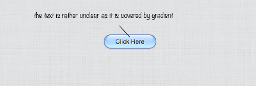
But, as we can see, the text is slightly covered with the gradient from :before pseudo-element. So, we need to shift it higher, by specifying the z-index higher, like so.
.glossy p {
	.glossy a {
	margin: 6px 0 0 0;
	text-align: center;
	display: block;
	width: 100%;
	height: 100%;

	text-decoration: none;
	color: #000;

	position: relative;
	z-index: 1;
}
Now, it looks much better.

You can also try with other colors. In this example, we also add another glossy effect with green. Below is the CSS codes required.
.glossys {
	background: #54bc3e;
	background: -moz-linear-gradient(top,  #54bc3e 0%, #aee850 100%);
	background: -webkit-gradient(linear, left top, left bottom, color-stop(0%,#54bc3e), color-stop(100%,#aee850));
	background: -webkit-linear-gradient(top,  #54bc3e 0%,#aee850 100%);
	background: -o-linear-gradient(top,  #54bc3e 0%,#aee850 100%);
	background: -ms-linear-gradient(top,  #54bc3e 0%,#aee850 100%);
	background: linear-gradient(to bottom,  #54bc3e 0%,#aee850 100%);
	filter: progid:DXImageTransform.Microsoft.gradient( startColorstr='#54bc3e', endColorstr='#aee850',GradientType=0 );
	border: 1px solid #1d6511;
}
Lastly, you can view the demo and download the source below.