How to Integrate Simple CSS Grid Layouts into WordPress
Creating a consistent, solid grid layout in WordPress can be straightforward if you use the right tools. In this tutorial, you’ll learn step-by-step how to quickly set up a lightweight and easy-to-modify grid system in WordPress. We’ll keep the design simple so we can focus on the tools needed to set up your grid, but remember, you can style the grid yourself if needed.
We’ll be using the default Pool theme in WordPress for this tutorial to demonstrate a “start from scratch” approach to getting the grids just right.
Step 1: Determine Your Grid Width
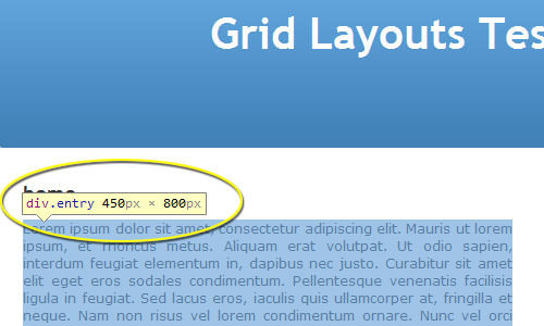
Before starting, you need to determine how wide your grid needs to be. For my WordPress site, I found that the width of my main column is 450px by using Google Chrome’s “Inspect Element” feature, which you can access by right-clicking on an object. This is the fastest way I’ve found to quickly determine the width and height of an object on a web page.
Step 2: Use a Grid Designer
Instead of building a grid by hand, which is possible if you prefer, I recommend using one of the many available grid generator tools. For this tutorial, I’ll be using the grid generator by MindPlay. It’s a very simple and lightweight grid generator.

I want a three-column display, and I need to ensure my grid width is set to 450 pixels. Adjust the settings accordingly, then skip to the “Export” tab. We won’t cover the typography features in this tutorial, but they’re worth exploring on your own.
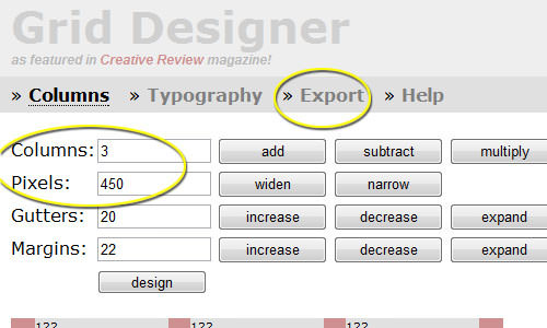
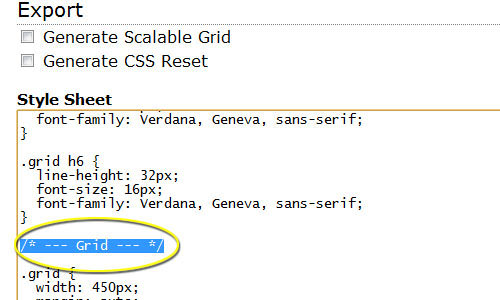
In the Export tab, use the top-most “Style Sheet” frame and scroll down until you see the “Grid” comment. Copy everything from this comment to the bottom of the frame. It should only be about 30 lines of code.
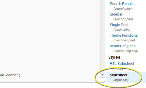
Step 3: Update Your WordPress Stylesheet
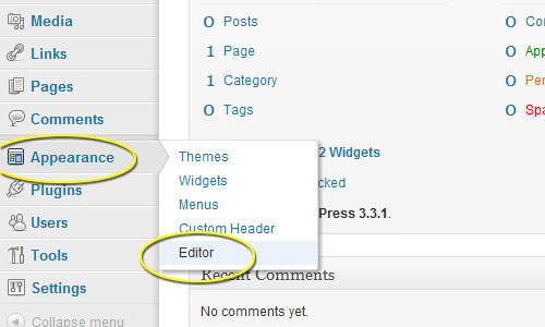
Log in to your WordPress site and navigate to Appearance > Editor.
At the bottom-right of the Editor panel, you’ll see a Styles.css file (or something similar, depending on your theme). Click it to open.
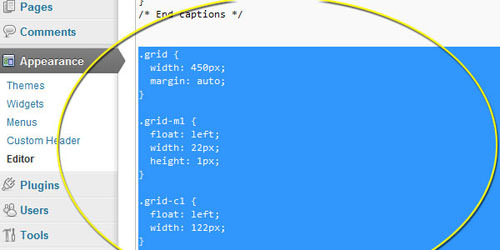
Scroll to the bottom of the stylesheet and paste the code you copied from MindPlay.dk:
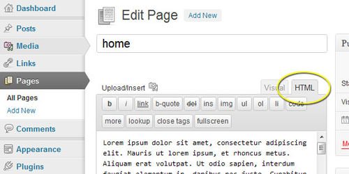
Step 4: Implement the Grid
To use the grid, create a <div> with the class “grid”. Each area of the grid is defined in the CSS. Open up a new page or post in WordPress. Switch to the HTML tab to start building your grid.
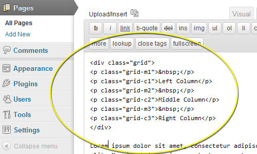
Here is some sample code to get you started:
<div class="grid">
  <p class="grid-m1"> </p>
  <p class="grid-c1">Left Column</p>
  <p class="grid-m2"> </p>
  <p class="grid-c2">Middle Column</p>
  <p class="grid-m3"> </p>
  <p class="grid-c3">Right Column</p>
  <p class="grid-m4"> </p>
</div>
Here’s what it looks like in WordPress:
Save or update the page and check the results. In my case, this is the home page for the site:
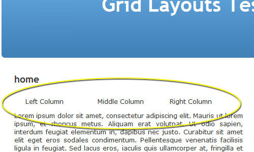
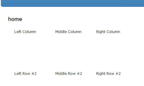
As you can see, we have our three columns, and everything is right where we expect it to be. You can add as many rows as you’d like by starting with the following code:
<div class="grid">

  <!-- Row #1 -->
  <p class="grid-m1"></p>
  <p class="grid-c1">Left Column</p>
  <p class="grid-m2"></p>
  <p class="grid-c2">Middle Column</p>
  <p class="grid-m3"></p>
  <p class="grid-c3">Right Column</p>
  <p class="grid-m4"></p>

  <!-- Row #2 -->
  <p class="grid-m1"></p>
  <p class="grid-c1">Left Row #2</p>
  <p class="grid-m2"></p>
  <p class="grid-c2">Middle Row #2</p>
  <p class="grid-m3"></p>
  <p class="grid-c3">Right Row #2</p>
  <p class="grid-m4"> </p>

</div>
Here’s how it looks so far:
Now you can add images or text and style each row exactly as you’d like.
Tips for Tweaking
You may encounter issues in some browsers when you have more than one row. To address this, you need to set the margin on the far-right element (.grid-m4 in our case) to the height you want each row to be. For example, if you are using images that are 250px by 250px, set the row height in .grid-m4 to 250px:
.grid-m4 {
  float: left;
  width: 20px;
  height: 250px;
}
This ensures your .grid-m1 on the left side of the next row doesn’t float up to the row above it.
If you want to style the background of the entire grid, adjust the height of the .grid class. For instance, if you have four rows, each 250px high, set the height of the .grid class to 1000px so any styling elements cover the entire grid design:
.grid {
  width: 450px;
  height: 1000px;
  margin: auto;
}
Depending on the version of the MindPlay.dk grid generator you use, the site may not generate the “.grid-m4” class. In this case, you can use .grid-m1 after .grid-c3 to ensure your grid extends properly:
<div class="grid">
  <p class="grid-m1"> </p>
  <p class="grid-c1">Left Column</p>
  <p class="grid-m2"> </p>
  <p class="grid-c2">Middle Column</p>
  <p class="grid-m3"> </p>
  <p class="grid-c3">Right Column</p>
  <p class="grid-m1"> </p>
</div>
Final Results
Here are my final results with two rows and some simple graphics:

Have fun designing, and remember that you can style your grid in any way you desire.