CSSMatic – The Ultimate CSS Automation Tool for Web Designers
CSS is a very powerful stylesheet language that lets you take control of the look and feel of a site. It provides efficiency in design and updates. But coding from scratch is always tough. Thankfully, you can find many little helpers which usually cover a few features to make coding CSS easier.
Today, I want to introduce you to CSSMatic, a complete service which can automate the creation of some CSS3 features.
Developed by Alejandro Sánchez Blanes (founder of Freepik) and Joaquín Cuenca (Panoramio) CSSMatic allows you to generate complex and complicated code that are usually written manually. We will look at the four things CSSMatic can help automate for us: Gradients, Border Radius, Noise Texture and Box Shadow.
CSS Could Be The Hardest Language of All (5 Reasons Why)
A website may be built upon several web languages such as HTML, CSS, JavaScript, and PHP. Among these... Read more
1. Gradient Generator
Gradient Generator is the most complex, most complete and probably the most used tool in CSSMatic. It is used to generate multiple color gradients, from several available presets or completely from scratch, speaking of which, you might be interested in the following tutorials on how to:
- Create Linear Gradients With CSS3
- Create Circular And Elliptical Gradients With CSS3
- Create Repeating Gradients With CSS3
Customizing Your Gradient
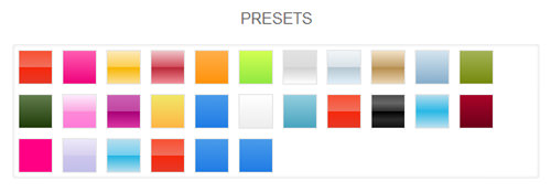
For input option, there are 26 ready-to-use presets for you. When you click any of those presets, it will automatically load in the color slider and preview. Your custom gradient is stored as a new preset once you save.
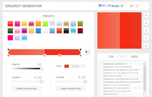
Underneath the presets you can find a color slider with several control stops. Click any of those points to activate a slider to change the opacity. Click on any free top border to create a new stop point. The black stop points, up top, manipulate opacity and gradient location. The bottom points are used to alter gradient color and location.

(Note that there are also static sliders for you to change opacity and location under the slider.)
Clicking at any of the stop points will show a dialog box. Here, you can change the first or secondary color using these points or even add another color or two. To add a color, click on the bottom border and a new stop point will emerge.
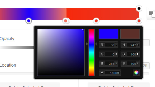
On the color slider, you can see a reverse colors button, which can be used to exchange the first and secondary color of the gradient.

Gradient direction comes in various preferences as well: left to right, top to bottom, diagonally upward, diagonally downward and circular direction.

There are also settings to change hue, saturation or lightness via the slider or inputting the exact value. A reset button allows you to start from scratch. Once you are done customizing the gradient the way you want it, you can save it as a preset.

Gradient Output
With CSSMatic, you can choose how the gradient will be generated in code: either in CSS or SASS. There are several color formats you can change for your generated code, such as: hex, hsl, hsla, rgb and rgba. hsla and rgba make use of the alpha channel.

If you toggle the Comments option, it will add some comments to the code indicating which browser supports the gradient.

To make the gradient work well in IE9, an instruction is available to toggle for IE9 Support option. The instruction will have you add the “gradient” class to all your relevant elements and the following will override your HTML rule.
<!--[if gte IE 9]
	<style type="text/css">
		.gradient {
			filter: none;
		}
	</style>
<![endif]-->
2. Border Radius
The second features is the Border Radius which lets you manipulate the corners of a shape easily. You can use the slider or input a value. The value of 0px denotes a square. The higher the px the more circular your corners get. The corners can be altered all at once (All Corners) or one corner at a time.

If you want to add border, simply define border width or drag the bar. The border comes in various styles including: Solid, Dotted, Dashed, Double, Groove, Ridge, Inset, Outset, Inherit, Hidden or None. Border and background color can also be changed with ease.

3. Noise Texture
Noise Texture helps you create a noise pattern to your web layouts. You can control noise opacity, density as well as background and noise color. Toggling the "Export noise transparent" option will make the noise background transparent.

If you want to download the noise as an image, hit the Download Noise Texture button. You can also specify the image size you desire before downloading it.
4. Box Shadow
The last tool is the Box Shadow. To change the direction of the blur to horizontal or vertical, you can use the sliders on the left sidebar. The density and size of the blur are controlled by Blur and Spread Radius tools. You can choose the color of the box and its shadow.

To change the transparency or alpha channel of the shadow easily, use Color slider. And if you want to make the shadow inset or outline, just toggle the lowermost tool.
10 Creative Techniques Using CSS3 Box Shadow
Learn how to create stunning CSS3 box shadow effects to add depth and dimension to your website design. Read more
For Border Radius, Noise Texture and Box Shadow, once you have created the final result that you want, copy the code out for your use.
Final Thought
CSSMatic is a good time-saver app and it makes your work a bit easier when it comes to coding in CSS. It is also a tool that works well for you, whether you are new to CSS or familiar with it. Thus far, CSSMatic lacks of documentation and instructions, especially the Gradient Generator. The first time you stumble upon it, you may need to play with the tools to figure them out. Let us know if you like it.