How to Create a Stacked-paper Effect Login Form
Login forms are an essential part of any dynamic website. They provide a mechanism for users to access restricted content.
In this tutorial, we will explore various CSS3 features such as text-shadow, box-shadow, linear gradients, and transitions to create a simple and elegant login form with a stacked-paper look.
The image above shows a preview of the login form we will be building. Ready to dive in? Let’s get started!
How to Create a Beautiful CSS3 Search Box
CSS3 is the new age of styling for web pages. It brings forward fresh and innovative tools like... Read more
1. Basic HTML Markup
The HTML markup we will be using is very simple. After the HTML5 Doctype declaration, we have the <head> and <title> tags. Within the <body> tag, we have a <section> tag with a class of ‘stacked’. This <section> tag defines the width of the content box and aligns it to the center of the page. We’ll also use this tag’s class name to target it using CSS.
A <form> tag follows the <section> tag. The form tag does not have a valid value for the ‘action’ attribute since it is only used for demonstration purposes. Inside the form field are the declarations for the email and password labels and input fields, followed by a submit button.
An important point to note is that we have used an input field with a type of ’email’. This is provided by the HTML5 declaration and gracefully degrades to a regular text input field in older browsers.
Here’s the entire HTML markup:
<html>
    <head>
        <meta http-equiv="Content-type" content="text/html; charset=utf-8">
        <title>Simple Login Form</title>
        <link rel="stylesheet" href="master.css">
        <link href="http://fonts.googleapis.com/css?family=Open+Sans:400,700,600" rel="stylesheet" type="text/css">
    </head>
    <body>
        <div class="wrap">
            <div class="stacked">
                <h2>Login</h2>
                <form action="" method="post" id="login">
                    <div class="field">
                        <label for="email">Email</label>
                        <input type="email" name="email" id="email" class="text-input" placeholder="john@doe.com" />
                    </div>
                    <div class="field">
                        <label for="password">Password</label>
                        <input type="password" name="password" id="password" class="text-input" placeholder="Secret Password" />
                    </div>
                    <div class="action clearfix">
                        <input type="submit" />
                    </div>
                </form>
            </div>
        </div>
    </body>
</html>
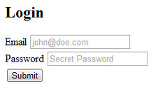
And here’s a preview of what we have created so far:
2. Adding Basic Styles
Create a new CSS file called master.css and add a link to this file in your main HTML file. We will start our CSS file with a quick reset to ensure uniformity across different browsers.
Let’s also add a nice background image to our page. The image I have used is from SubtlePatterns. Feel free to browse the site to find a background image that suits your taste. We can add the background image with the following declaration.
Note that I am using the Open Sans font from Google Web Fonts for the body text.
/* --------Base Styles--------- */
body, html {
    margin: 0;
    padding: 0;
}

body {
    background: url("https://assets.hongkiat.com/uploads/stack-paper-login-form/bg.png") left top repeat;
    font: 16px/1.5 "Open Sans", Helvetica, Arial, sans-serif;
}

div.wrap {
    width: 400px;
    margin: 80px auto;
}
3. Stacked-Paper Effect
Now that we have the basic layout ready, let’s start designing the form. To create the stacked-paper effect, we will use the :after and :before pseudo-elements. These pseudo-elements are commonly used for adding visual effects to any selector.
The :before pseudo-element adds content before the selector’s content, while the :after pseudo-element adds content after it.
We will begin by giving the section with a class of ‘stacked’ a width of 400px and a height of 300px. We’ll also give this box a background color of #f6f6f6 and a 1-pixel-thick border with the color #bbb.
The key elements to note here are the border-radius and box-shadow declarations. We’ve used “-moz-” and “-webkit-” browser prefixes to ensure compatibility with gecko and webkit-based browsers.
The border-radius declaration is straightforward and creates rounded corners, with 3px representing the curvature. While the box-shadow declaration might look complex, let’s break it down into smaller parts to understand it better.
/*--------Border Radius and Box Shadow--------- */
-webkit-border-radius: 3px;
-moz-border-radius: 3px;
border-radius: 3px;

-webkit-box-shadow: 0 0 3px rgba(0,0,0,.2);
-moz-box-shadow: 0 0 3px rgba(0,0,0,.2);
box-shadow: 0 0 3px rgba(0,0,0,.2);
The first two zeros indicate the x-offset and y-offset, and the 3px indicates the blur. Next is the color declaration. I have used rgba values here; rgba stands for red, green, blue, and alpha (opacity). Thus, the four values inside the parentheses indicate the amount of red, green, blue, and opacity.
.stacked {
    background: #f6f6f6;
    border: 1px solid #bbb;
    height: 300px;
    margin: 50px auto;
    position: relative;
    width: 400px;
    -webkit-box-shadow: 0 0 3px rgba(0,0,0,.2);
    -moz-box-shadow: 0 0 3px rgba(0,0,0,.2);
    box-shadow: 0 0 3px rgba(0,0,0,.2);
    -webkit-border-radius: 3px;
    -moz-border-radius: 3px;
    border-radius: 3px;
}
Now that we have created the basic bounding box for the form, let’s implement the :after and :before pseudo-elements.
.stacked:after,
.stacked:before {
    background: #f6f6f6;
    border: 1px solid #aaa;
    bottom: -8px;
    content: '';
    height: 250px;
    left: 2px;
    position: absolute;
    width: 394px;
    z-index: -10;
    -webkit-box-shadow: 0 0 3px rgba(0,0,0,.2);
    -moz-box-shadow: 0 0 3px rgba(0,0,0,.2);
    box-shadow: 0 0 3px rgba(0,0,0,.2);
    -webkit-border-radius: 3px;
    -moz-border-radius: 3px;
    border-radius: 3px;
}

.stacked:before {
    bottom: -14px;
    left: 5px;
    width: 388px;
    -webkit-border-radius: 3px;
    -moz-border-radius: 3px;
    border-radius: 3px;
    -webkit-box-shadow: 0 0 15px rgba(0,0,0,0.5);
    -moz-box-shadow: 0 0 15px rgba(0,0,0,0.5);
    box-shadow: 0 0 15px rgba(0,0,0,0.5);
}
The code for :after and :before pseudo-elements is almost identical to that of the bounding box discussed above. The key point to note is that these pseudo-elements are positioned absolutely relative to the bounding box.
Each pseudo-element is progressively lowered by a few pixels to create the stacked-paper effect.
4. Input Fields
In the HTML markup, we added a class of ‘text-input’ to both the email and password fields to easily target these elements with our CSS declarations. Here’s the CSS declaration applied to both input fields.
form input.text-input {
    outline: 0;
    display: block;
    width: 330px;
    padding: 8px 15px;
    border: 1px solid gray;
    font-size: 16px;
    font-weight: 400;
    -webkit-border-radius: 25px;
    -moz-border-radius: 25px;
    border-radius: 25px;
    box-shadow: inset 0 2px 8px rgba(0,0,0,0.3);
}
Again, we have used the border-radius and box-shadow declarations. For text fields, the border-radius is given a higher value to create more curvature.
In the box-shadow declaration, we use the keyword ‘inset’ to specify that the shadow will be inside the text field. Here, the vertical offset for the shadow is 2px with an 8px blur, and the color is declared using the rgba format.
To add interactivity to the input fields, we will modify the box-shadow property on the ‘hover’ state. The new box-shadow declaration has zero x and y offsets but has a 5px blur, with the color declared in rgba format.
5. Submit Button
The final element we need to complete is the submit button. Similar to the input field, we’ll give the submit button a radius of 25px using the border-radius property. A box-shadow property with a 1px y-offset has also been added to create an “inner-shadow” effect.
form input[type="submit"] {
    float: right;
    padding: 10px 20px;
    display: block;
    cursor: pointer;
    font-size: 16px;
    font-weight: 700;
    color: #fff;
    text-shadow: 0 1px 0 #000;
    background-color: #0074CC;
    border: 1px solid #05C;
    -webkit-border-radius: 25px;
    -moz-border-radius: 25px;
    border-radius: 25px;
    background-image: -moz-linear-gradient(top, #08C, #05C);
    background-image: -ms-linear-gradient(top, #08C, #05C);
    background-image: -webkit-linear-gradient(top, #08C, #05C);
    background-image: linear-gradient(top, #08C, #05C);
    -webkit-box-shadow: inset 0 1px 0px rgba(255, 255, 255, 0.5);
    -moz-box-shadow: inset 0 1px 0px rgba(255, 255, 255, 0.5);
    box-shadow: inset 0 1px 0px rgba(255, 255, 255, 0.5);
}
The crucial aspect here is the gradient declaration for the button. CSS3 gradients is a broad topic, and we’ll only cover the basics.
For this submit button, we’re adding a linear gradient transitioning from #08C to #05C. As with other CSS3 properties we’ve used, we’ll add “-moz”, “-webkit”, and “-ms” vendor prefixes to ensure the gradient works across different browsers.
6. Demo and Download
Our login form is now complete. Check out the demo to see the final result. If you got lost at any point or couldn’t follow the tutorial, don’t worry – you can download the files to your desktop and experiment with the CSS code to understand how it works.
I hope you enjoyed this tutorial. Feel free to experiment with these features and share your thoughts in the comments.