50 Useful Responsive Web Design Tools for Web Designers
In previous, we’ve explored some top-notch WordPress and Joomla responsive themes for your website. Now, it’s time to arm you with the tools you need for responsive web development. This collection includes frameworks, services, and downloadable scripts that are key to efficient and effective responsive design.
To help you easily navigate through this comprehensive list, we’ve organized the tools into the following categories:
- Grid & Frameworks
- Sketch Sheets & Wireframes
- JavaScript & jQuery Plugins
- Testing & Preview Tools
- Sliders for Responsive Design
- Other Essential Tools
Grid & Frameworks
Responsive Wireframes
Curious about how your website’s layout will adjust to different screen sizes? Responsive Wireframes offers a set of pre-designed wireframes for various popular layouts, helping you envision and plan your site’s responsive design. This tool allows you to concentrate on design elements that engage your audience across all devices, streamlining the wireframing process.

Skeleton
Skeleton is appreciated for its simplicity and effectiveness, standing out as a straightforward CSS framework. It’s a favorite among developers and designers for its focus on pure CSS, eliminating the need for complex Javascript, complemented by clear documentation.

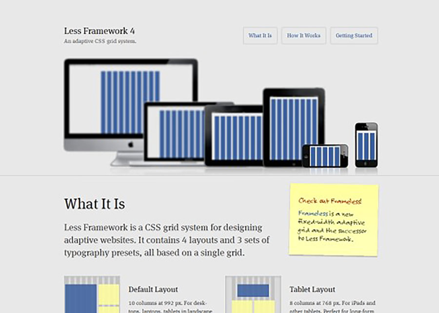
LessFramework 4
Less Framework is an adaptive CSS grid system, using inline CSS media queries to ease the development of responsive websites. This framework simplifies creating responsive layouts, living up to its name by offering more with less.
320 and Up
‘320 and Up’ is a unique CSS media queries boilerplate that kickstarts your responsive design. It employs a reverse approach compared to other available boilerplates, offering a fresh perspective in responsive design templates.

Inuit.css
Inuit.css is a user-friendly CSS framework suitable even for beginners. Its minimalist nature means you only work with what’s essential, yet it’s flexible enough to be expanded with various plugins as needed.

Gridless
Gridless is an optimal starting point for developing responsive, cross-browser websites with an emphasis on beautiful typography. It advocates for progressive development, ensuring your project grows seamlessly from the ground up.

1140 CSS Grid
The 1140 CSS Grid, designed by Andy Taylor, is tailored for large monitors with a width of 1140 pixels. It offers a fluid layout that adapts effortlessly to smaller resolutions, simplifying the responsive design process.

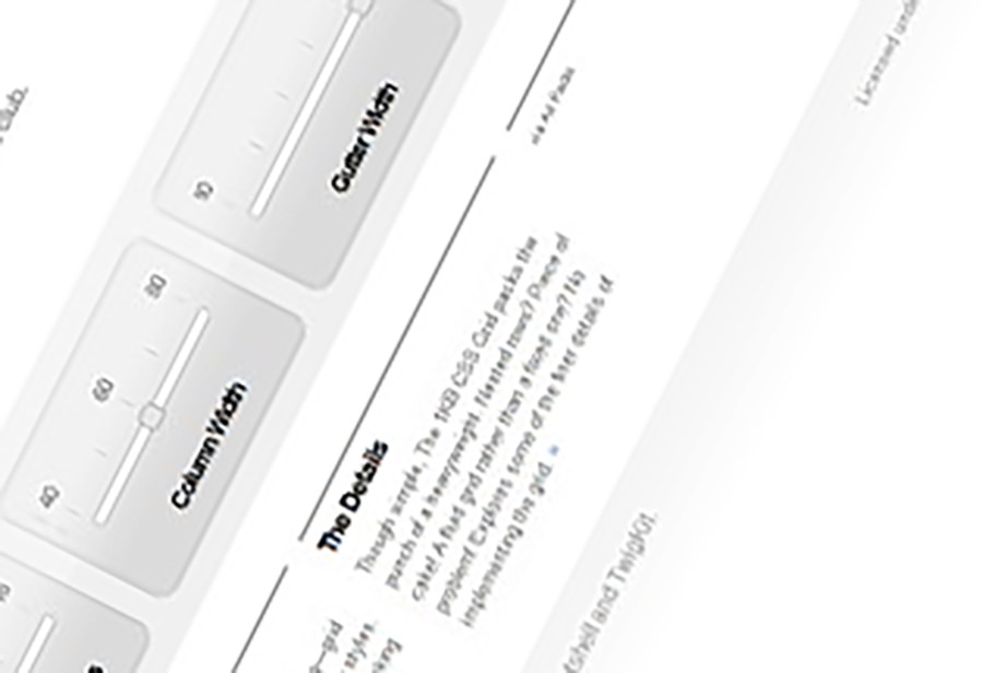
1KB CSS Grid
Created by Tyler Tate, the 1KB CSS Grid is a straightforward, lightweight grid generator. It allows customization of columns, column widths, and gutters, with the ability to download a tailored CSS grid for your website.
Bootstrap
Bootstrap, crafted by Mark Otto and Jacob Thornton at Twitter (now X), offers a comprehensive suite of user interface elements, layouts, and JavaScript tools. This excellent resource is freely available for enhancing your web design projects.

Fluid Grid Calculator
The Fluid Grid Calculator is a handy tool for quickly obtaining the CSS for your fluid grid website design, streamlining the development process.

Gridset
Developed by Mark Boulton, Gridset is an advanced tool for creating various types of grids, including columnar, asymmetrical, and responsive. Although still in beta, Gridset is shaping up to be a highly versatile tool for grid design.

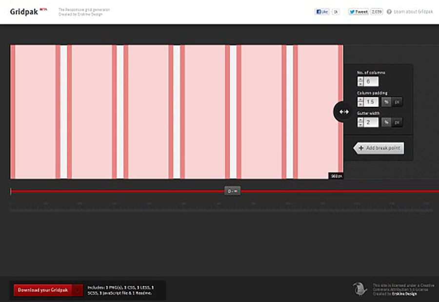
Gridpak
Gridpak is a responsive grid generator allowing customization of columns, padding, and gutters, with options for custom breakpoints. The tool generates ready-to-download CSS and provides PNG grid templates for design in Photoshop.
SimpleGrid
SimpleGrid, created by Michael Kuhn, is a straightforward CSS framework designed for infinite grid-based layouts. It’s pre-configured for four screen size ranges, facilitating responsive design.

Susy
Susy by Oddbird offers a grid solution akin to the Semantic Grid System, with no extra markup or special classes required. It’s particularly suited for users of Sass and its extension Compass.

Tiny Fluid Grid
Tiny Fluid Grid is a versatile web app that allows interactive determination of a website’s grid system. Set your layout’s columns, gutter percentage, minimum and maximum width, and download the generated CSS.

Sketch Sheets & Wireframes
Justinmind
Justinmind is an indispensable tool for those looking to create detailed and interactive wireframes. This desktop application boasts over 500 UI elements and a range of interaction features, enabling the creation of limitless prototypes. Its user-friendly drag-and-drop functionality makes it accessible to both beginners and professionals. Justinmind comes in both free and paid versions, with the latter offering advanced features for a more comprehensive design experience.

Multi-Device Layout Patterns
Finding the perfect layout for a website, especially for multiple devices, can be a daunting task. Multi-Device Layout Patterns comes to the rescue by showcasing a variety of responsive design layouts. This tool helps you visualize and choose the best layout for your website’s content, ensuring a consistent and smooth user experience across different devices.

Responsive Web Design Sketch Sheets
This tool is instrumental in planning the placement of various elements in your website layout for different devices. It aids in conceptualizing where to position essential website components across a range of screen sizes and resolutions, streamlining the design process.

JavaScript & jQuery Plugins
FlowType.JS
FlowType.JS, a dynamic jQuery plugin, elegantly adjusts font sizes for optimal readability on various devices. It aims for the perfect character count per line in your text layout, offering customizable ratios for elements and font sizes, making it a versatile choice for responsive typography.

Adapt.js
Adapt.js, created by Nathan Smith of the 960 Grid System, is a JavaScript alternative to CSS media queries. Recognizing that @media doesn’t work in all browsers, Adapt.js presents a lightweight solution for enabling responsive design in environments where traditional methods fall short.

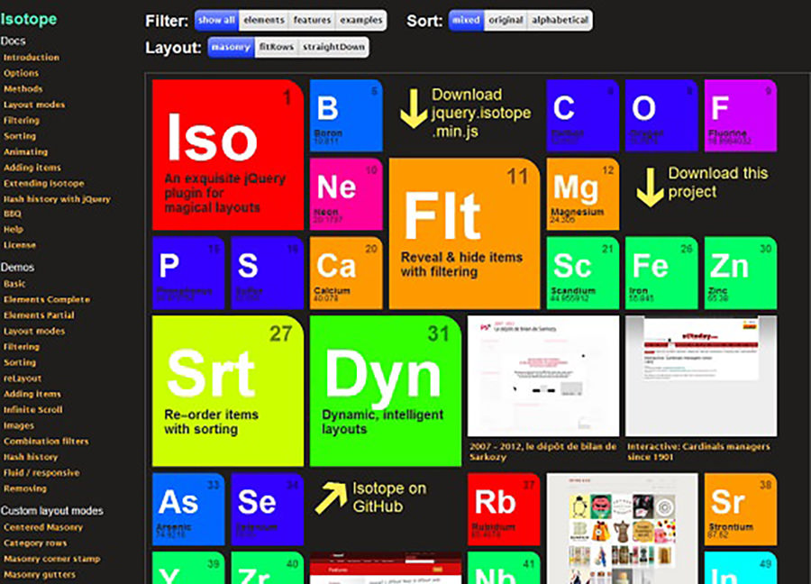
Isotope
Isotope is a versatile jQuery plugin for responsive design, facilitating not just the rearrangement of page elements during window resizing or on smaller screens, but also offering filtering capabilities to manage these elements efficiently.
Masonry
Masonry is a dynamic jQuery plugin for creating adaptive layouts. It adeptly rearranges elements in responsive designs, ensuring they fit seamlessly into the grid’s open spots, enhancing the overall layout.

Respond.js
Respond.js is a compact and fast script, designed to enable responsive web designs in browsers that don’t support CSS3 Media Queries, such as older IE versions. It’s remarkably efficient, being only 3 Kb minified and 1 Kb gzipped.

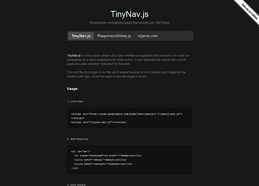
TinyNav.js
TinyNav.js is a compact jQuery plugin, just 362 bytes, transforming extensive navigation lists into concise dropdown menus for smaller screens, simplifying navigation in responsive designs.
Wookmark jQuery Plugin
The Wookmark jQuery plugin intelligently organizes page elements into columns based on browser window size. It also features a live preview, enabling you to see the layout adjustments in real-time.

Elastislide
Elastislide is a jQuery plugin that’s perfect for those needing a carousel that adapts automatically to screen size. Whether you resize your browser window or access your site on a smaller screen, Elastislide adjusts smoothly and efficiently.

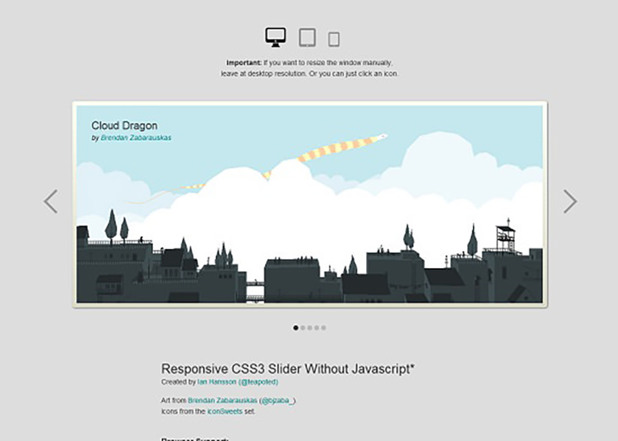
Responsive CSS3 Slider
This pure CSS3 slider excels in responsively adapting to any screen size and resolution. A unique feature is how the arrows are integrated within the box for smaller device screens, all without the need for JavaScript.
ResponsiveSlides.Js
ResponsiveSlides.Js is an exceptionally simple and ultra-lightweight (just 1Kb) jQuery plugin that creates responsive sliders from unordered lists. It’s compatible with a wide range of browsers, including IE6 and newer versions.

FitText.Js
FitText.js is a compact JavaScript tool designed for the automatic resizing of text and headlines when the browser window changes size. It ensures your text size always matches the design of your responsive site.

FitVid.Js
FitVid.Js is your go-to jQuery plugin for making embedded videos respond to browser resizing and different device resolutions. It’s lightweight, straightforward, and ensures your videos maintain fluid width for an optimal viewing experience.

Testing & Preview
ResponsivePx
ResponsivePx stands out for its pixel-by-pixel resizing feature, making it an exceptional tool for testing responsive websites. This functionality is crucial for identifying breakpoints and ensuring CSS media queries perform as intended.

Responsive Web Design Testing Tool
This impressive tool allows you to view your responsive website in various screen sizes all at once. It’s especially useful for debugging, as it displays all resolutions side-by-side for a comprehensive overview of your site’s responsiveness.

ReView.Js
ReView is a dynamic viewport system crafted in pure JavaScript, providing an exceptional viewing experience for responsive web designs. It enhances the adaptability and user experience of your site across different devices.

Screenfly
Screenfly by QuirkTools is a versatile tool for viewing responsive websites across various devices including Desktop, Tablet, Mobile, and TV. It offers features like scroll enable/disable and display rotation for a more thorough testing experience.

The Responsinator
The Responsinator is an essential tool for testing sites on a variety of devices, from iPhones and iPads to Kindles and Androids. It presents your site in both portrait and landscape modes, with device outlines adding clarity to the testing process.

Sliders
Elastislide
If you’re looking for a carousel that seamlessly adjusts to screen size changes, whether it’s due to resizing the browser window or using a smaller screen, Elastislide is an ideal jQuery plugin for your project.
Responsive CSS3 Slider
Experience the flexibility of a pure responsive CSS3 slider that effortlessly adapts to any screen size and resolution. An interesting feature of this slider is how the arrows smartly reposition inside the box on smaller screens, ensuring a smooth experience without the need for JavaScript.
ResponsiveSlides.Js
ResponsiveSlides.Js stands out for being an incredibly simple and ultra-lightweight (just 1Kb) jQuery plugin for creating responsive sliders. It’s compatible with a broad range of browsers, including older versions like IE6 and up, making it a versatile choice for diverse web projects.
Others
Adaptive Images
Adaptive Images is a cutting-edge online tool tailored for responsive web design. It smartly detects your visitor’s screen size, then creates, caches, and delivers images that are perfectly scaled for that specific screen and resolution.

Simbla
Simbla is an ideal choice for those who want to launch a website swiftly without getting bogged down in design details. It offers over 100 responsive website templates, enabling you to select a design that aligns with your vision and ensures a responsive, user-friendly website with ease.

Retina Images
Retina Images provides an impressive javascript solution that automatically serves high-resolution images, twice the size, for retina displays. Just upload a high-resolution version for each image, and it takes care of the rest, enhancing the visual experience on retina screens.

Seamless Responsive Photo Grid
The Seamless Responsive Photo Grid showcases images in a stunning edge-to-edge display on the browser, with no gaps between them. Images are neatly tiled and flow in columns across the page, adjusting the number of columns in response to browser window resizing.

Categorizr
Categorizr, a compact PHP script, offers your visitors a more tailored web experience by delivering device-specific designs, whether they’re using a Tablet, TV, Mobile, or Desktop.

Media Query Bookmarklet
The Media Query Bookmarklet is a handy tool that displays the size of the current viewport and indicates which media query is being applied. This is especially useful for designers and developers in fine-tuning responsive designs.

The Responsive Calculator
The Responsive Calculator is a straightforward online tool aiding in the conversion of pixels to percentages during responsive website design, simplifying the design process considerably.
