6 Practices That Make Your Blog Look Less Professional
Note: This post was first published on the 1st of Sept, 2011.
In the heat of managing a blog, which includes everything from writing great content to working with advertisers to moderating comments to promoting the site, one can overlook certain aspects of the site – from little things like broken links, to big ones like intrusive advertising and an overly crowded design.
Over time, as your site grows, you keep adding things – a banner here and there, a link section, some social media buttons, some graphics, etc., which ultimately clog your site up and make it harder for your readers to figure out what’s what. Since you’re spending hours a day glaring at the site, you could probably navigate it blindfolded.
But that’s an entirely different story with your readers, especially the first-timers coming to your site. What you see as simple, they might see the opposite. That’s why it’s important to take a step back once in a while and look at your blog objectively, from a distance, to catch out those pit holes which make your blog looks amateurish, and below are seven practices that doom your blog’s professionalism, check them out!
1. Too many ads
Monetization is one of the cornerstones of any site, blog, and web business and is usually done in the form of advertising banners and links. While you have every right to profit from your hard work, there is a fine line between earning income and squeezing every pixel on the page for ad revenue.

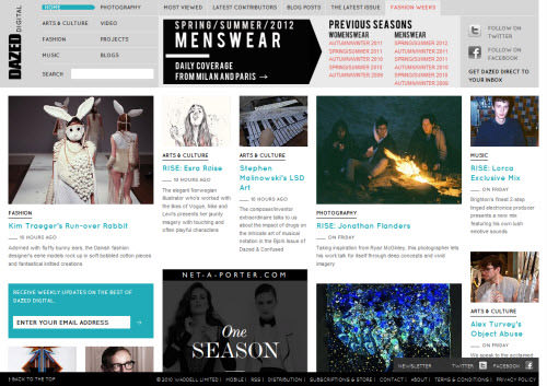
Image Source: CNET
Not only is the practice of adding too many ads confusing, annoying, and disrespectful to your reader, but it’s also detrimental to the ads you serve: most of the time, your users will only click one ad, so if you have 10 ads, it means 9 of them are ignored. The more ads you have, the less impactful they have.
Tip(s): Experiment with different ad providers and ad positions, then select a few effective ads and place them well. This will usually result in better earnings and a more desired look than stuffing ads all over your site. Also, don’t use text ads that insert links into your content. At best, users have already learned how to avoid those; at worst, it’s frustrating, especially the ads that expand once you hover over them.
2. Intrusive ads
Intrusive ads are, among others, those banners that expand once your mouse passes over them or those that flash like a Christmas tree. It is the ads that auto-play music and videos, and worst of all, the biggest no-no: pop-ups and pop-unders. Pop-ups and pop-unders have gotten such a bad reputation, and rightfully so, that any site that features them is immediately looked down upon by the user.

Image Source: Wikipedia
Always remember that content is the reason the visitor got there in the first place, so you need to hang on to them. Annoy them too much, and they won’t come back, no matter how great your content is.
Tip(s): Don’t be annoying. Check what kind of companies advertise on your site, how their banners appear and choose the displaying method that’s less annoying to the readers. And regarding pop-ups/ pop-unders: don’t do it. No matter how much you get paid per pop-up window, it’s annoying, and most people close it before the ad even loads; it’s just harmful in the long term.
3. Too many social media buttons
Sharing your content and letting others be aware of it should be a part of your routine. But there’s a limit on how many Twitter buttons you can cram on your site before it becomes annoying and distracting to readers. Always remember that everything is right to do until it makes reading content annoying.

Image Source: NavigationArts
Tip(s): Gather your social media/share buttons in one place on your site. On the sidebar, or above/under the posts. It’s a lot better than having a retweet button in one place, a Facebook share button on the other side of the page, etc.
Keep it simple. Disregard the fancy, glossy, grungy, large buttons. They won’t get you more Twitter followers than a regular, simple Twitter button. Also, position them right. Readers are much more likely to retweet your articles if the retweet button appears at the top of the page, rather than at the bottom.
4. Bad design/ Crowded design
When designing your site, you have a lot to consider, and the most important thing to strike is a good balance between site graphics, content, ads, etc. And the worst thing you can do is to make your site crowded with too many elements.
As soon as the users arrive to your site, the first thing they’ll be looking for is the content, and it’s your responsibility to ensure that the content is easily found, that the users’ eyes don’t have to scan through fancy graphics, social media buttons, banner ads, etc. before they arrive at the destination. In short, don’t make it ugly for design and usability.
Tip(s): Understand that you won’t be able to fit everything on your site, especially if you want it “above the fold” (at the top part of the site, before any scrolling is done). Make sure that your main objective is to display your content in a readable way, then build the design around that notion.
It’s counterproductive to have a fancy, colorful header that distracts users, and/or pushes the content far down the page. No one ever bookmarked a website because it had a fancy header. Focus on content, and build everything around that.
5. Splash pages
When someone comes to your site, they usually came because they searched for something or someone posted a link that they thought was worthy of clicking. This is the most precious part of getting them to come to your site, and when they’re finally there, the worst thing you can do is to block them from the content as soon as they arrive.

Image Source: Hugs For Monsters
A splash page asking readers to subscribe to your RSS or to follow you on Twitter or give out their email address is not only a major turn-off , it has a “scammy” feeling over it. A splash page blocking readers from accessing to your content because of their browser is even worse, most of them are innocent as they didn’t even know about the browser, and even they know, blocking access is a very bad move on gaining the visitor.
Tip(s): Don’t use splash pages, no matter how creative they are. It’s as simple as that. Not even a “Welcome” page for new readers. And don’t dare to ask for their email address, no matter how much you think they’ll enjoy your free eBook or whatever you might be offering.
6. Aggregating content from others
We’ve all been guilty of doing it at one point or another: when we don’t have any ideas or posts lined up, we “cheat” and aggregate content from others, a “daily news roundup” or something similar, unless your site is fully a content aggregator like Reddit.

There’s nothing wrong in doing this once or twice a week, sharing content that you appreciate, but these kinds of posts must never overshadow your own content. Remember that the content is king, and by content it means unique content.
Your readers are the ones who come because of your unique content, not the content you link from other sites. If readers start coming to your site because of the links you share, you’re in trouble because those readers are easily lost to the next guy who can do a better “daily roundup”.
Tip(s): Limit “roundup” posts, like twice a week or once a week, and make sure the articles and links you include are the best you can find.
More
Looking further to clean up your site for best readability? Here are the guides that probably meet your needs: