HTML5 Tutorial: Login Page with HTML5 Forms
HTML5 brings many features and improvements to web forms, there are new attributes and input types that were introduced mainly to make the lives of web developers easier and provide better experience to web users.
So, in this post we are going to create a login page using HTML5 forms to see how the new added features work.
HTML5 Input
Let’s take a look at the following markup.
<section class="loginform cf">
<form name="login" action="index_submit" method="get" accept-charset="utf-8">
<ul>
<li>
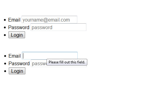
<label for="usermail">Email</label>
<input type="email" name="usermail" placeholder="yourname@email.com" required>
</li>
<li>
<label for="password">Password</label>
<input type="password" name="password" placeholder="password" required>
</li>
<li>
<input type="submit" value="Login">
</li>
</ul>
</form>
</section>
If you have been working with HTML forms before, this will look familiar. But, you’ll also notice differences there. The inputs have placeholder and required attributes, which are new attributes in HTML5.
Placeholder
The placeholder attribute allows us to give initial text in the input that will disappear when it is in a focus state or being filled in. Previously, we used to do it with JavaScript, but now it becomes a lot easier with this new attribute.
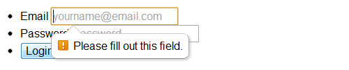
Required Attribute
The required attribute will set the field to be mandatory and thus should not be left blank before the form is submitted, so when the user hasn’t filled in the field, the following error will appear.
New selector is also introduced in CSS3, :required to target fields with required attribute. Here is an example;
 input:required {
 border: 1px solid red;
 }
Email Input Type
The first input type is email which is actually a new field type added in HTML5 as well. The email type will give basic email address validation in the field. When the user doesn’t fill the field with an email address, the browser will show the following notification;
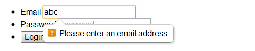
Using email input types can also give better experience for mobile users, like iPhone and Android users, where it will show the email-optimized on-screen keyboard with a dedicated “@” button to help type email address faster.
The Downsides
The new form features offered in HTML5 are powerful and easy to implement, but they are still lack in some areas. For instance;
The placeholder attribute, is only supported in modern browsers – Firefox 3.7+, Safari 4+, Chrome 4+ and Opera 11+. So, should you need it to work in unsupported browsers, you can use this polyfills in conjunction with Modernizr.
The same thing goes with the required attribute. The error notification cannot be personalized, the error will remain “Please fill out this field” rather than “Please fill out your First Name”, this attribute support is also limited to the latest browsers.
So, using JavaScript to validate the required field is (so far) a better option.
function validateForm() {
  var x = document.forms["login"]["username"].value;
  if (x == null || x == "") {
    alert("Please fill out the username");
    return false;
  }
}
Styling the Forms
Alright, now let’s decorate our login form with CSS. First we will give the background a wood pattern in the html tag.
html {
  background: url('wood_pattern.png');
  font-size: 10pt;
}
Then, we need to remove the default padding and margin in ul tag that wraps the entire inputs and floats the li to the left, so the inputs will be displayed horizontally, side by side.
.loginform ul {
  padding: 0;
  margin: 0;
}

.loginform li {
  display: inline;
  float: left;
}
Since we float the li, the parents will collapse, so we need to clear things around the parent with the clearfix hack.
label {
  display: block;
  color: #999;
}

.cf:before,
.cf:after {
  content: "";
  display: table;
}

.cf:after {
  clear: both;
}

.cf {
  *zoom: 1;
}

:focus {
  outline: 0;
}
In CSS3 we have the negation selector. So, we will use it to target inputs other than the submit type, which in this case will target the email and password input;
.loginform input:not([type=submit]) {
  padding: 5px;
  margin-right: 10px;
  border: 1px solid rgba(0, 0, 0, 0.3);
  border-radius: 3px;
  box-shadow: inset 0px 1px 3px 0px rgba(0, 0, 0, 0.1), 0px 1px 0px 0px rgba(250, 250, 250, 0.5);
}
Lastly, we will give a little style decoration for the Submit button, as follows.
.loginform input[type=submit] {
  border: 1px solid rgba(0, 0, 0, 0.3);
  background: #64c8ef;
  /* Old browsers */
  background: -moz-linear-gradient(top, #64c8ef 0%, #00a2e2 100%);
  /* FF3.6+ */
  background: -webkit-gradient(linear, left top, left bottom, color-stop(0%, #64c8ef), color-stop(100%, #00a2e2));
  /* Chrome,Safari4+ */
  background: -webkit-linear-gradient(top, #64c8ef 0%, #00a2e2 100%);
  /* Chrome10+,Safari5.1+ */
  background: -o-linear-gradient(top, #64c8ef 0%, #00a2e2 100%);
  /* Opera 11.10+ */
  background: -ms-linear-gradient(top, #64c8ef 0%, #00a2e2 100%);
  /* IE10+ */
  background: linear-gradient(to bottom, #64c8ef 0%, #00a2e2 100%);
  /* W3C */
  filter: progid:DXImageTransform.Microsoft.gradient(startColorstr='#64c8ef', endColorstr='#00a2e2', GradientType=0);
  /* IE6-9 */
  color: #fff;
  padding: 5px 15px;
  margin-right: 0;
  margin-top: 15px;
  border-radius: 3px;
  text-shadow: 1px 1px 0px rgba(0, 0, 0, 0.3);
}
That’s it, now you can try the login form from the following links.
Final Words
In this tutorial we looked into a few new features in HTML5 forms:placeholder, required and email input types to create a simple login page. We have also come through the downsides of the attributes, so we can decide a better approach to be applied.
In the next post we will look into another new HTML5 form features, so stay tuned.