Flexbox Patterns: The Ultimate CSS Flexbox Code Library
The newest CSS flexbox property has radically changed the way developers create interfaces. No more floats and CSS hacks to get layouts aligned perfectly. No more worrying about custom responsive techniques for handling multi-columned layouts.
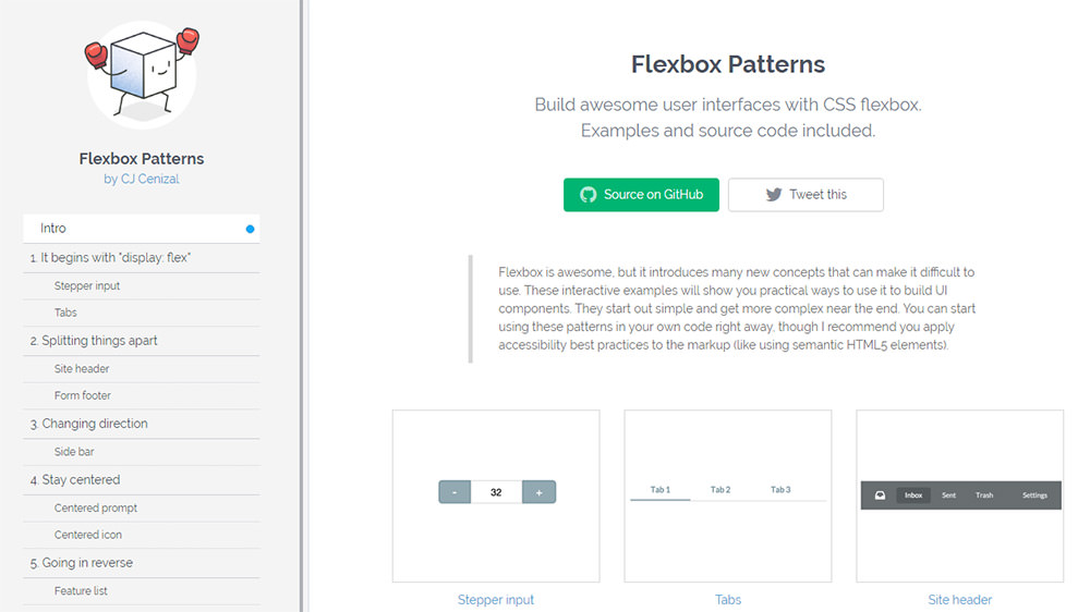
But even though flexbox solves many problems it’s also complicated to learn. To help you get started there’s a new online library called Flexbox Patterns that catalogs many different flexbox elements into one central location.
Read Also: Understanding Flexbox: A Modern Approach to UI Design
This library is completely free to use and it’s open sourced on GitHub. All the examples can be downloaded locally through NPM or through GitHub. But you can also browse the examples through the website to copy and paste codes as needed.
Each pattern has its own page with a brief description and code samples. You can quite literally copy and paste the codes into your existing web project, although it’s recommended that you first learn a little about what the code does and why you’re using it.
Take for example the site header bar demo using flexbox to align all the elements in a top navbar side-by-side.

Typically this would require floats and a clearfix class to get everything aligned properly.
With flexbox you can hold everything in one container using the display: flex property. This way you can define how the elements should interact with each other and how the flexbox should operate on smaller screens.
The patterns are consistently being updated and the current library focuses on the most common elements like tabs, sidebars, and vertical/horizontal centering.
If you’re brand new to flexbox then definitely check out Flexbox Patterns. The site won’t teach you all the basics of flexbox but it will offer real-world examples you can tinker with for your own web projects.