Creating Sleek On/Off Button with CSS3
Using a button is, so far, the preferred way to interact with electronic devices, such as radios, TVs, music players, and even a smartphone that has a voice command feature still needs at least one or two physical buttons.
Furthermore, in this digital age, the button has evolved in its digital form as well, making it more interactive, dynamic, and easy to create compared to the physical button.
So, this time, we are going to create a slick and interactive button based on this excellent design over at Dribbble using only CSS.
Well, let’s get started.
HTML
We will start by placing the following markup in our HTML document. It’s quite simple: the button is based on an anchor tag, with a span next to it to create the indicator light. They are wrapped together within an HTML5 section tag.
<section>
<a href="#button" id="button"></a>
<span></span>
</section>
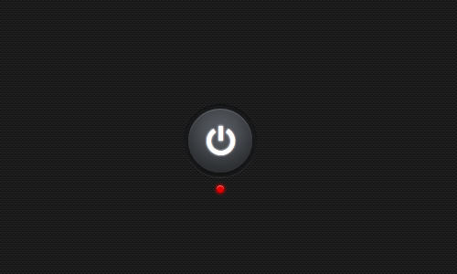
Here is how our button initially looks.

Basic Styling
In this section, we will start working on the Styles.
First, we apply this dark background from Subtle Pattern to the body’s document and center the section. Then, we will also remove the dotted outline upon the :focus and :active link states.
body {
    background: url('images/micro_carbon.png');
}

section {
    margin: 150px auto 0;
    width: 75px;
    height: 95px;
    position: relative;
    text-align: center;
}

:active, :focus {
    outline: 0;
}
Using Custom Font
For the button’s icon, we will use a custom font from Font Awesome rather than an image. This way, the icon will be easily style-able and scalable through the stylesheet.
Download the font, store the font files (eot, woff, ttf, and svg) in the fonts folder, and then place the following code in your stylesheet to define a new font family.
@font-face {
    font-family: "FontAwesome";
    src: url("fonts/fontawesome-webfont.eot");
    src: url("fonts/fontawesome-webfont.eot?#iefix") format('eot'),
         url("fonts/fontawesome-webfont.woff") format('woff'),
         url("fonts/fontawesome-webfont.ttf") format('truetype'),
         url("fonts/fontawesome-webfont.svg#FontAwesome") format('svg');
    font-weight: normal;
    font-style: normal;
}
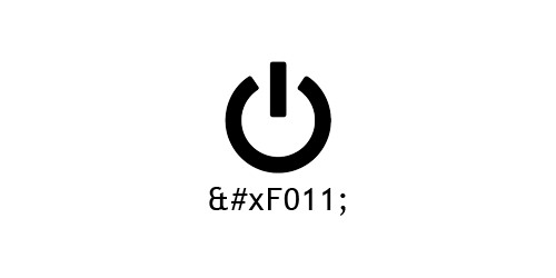
The power icon we need for this button is represented by the Unicode number F011. If you look closely at the HTML markup above, we have put this numeric character reference within the anchor tag, but since we haven’t defined the custom font-family in the button style yet, the icon is not rendered correctly.
Further reading: Unicode and HTML: Document Characters
Styling the Button
First, we need to define the custom font-family for the button.
Our button will be a circle. We can achieve this effect using the border-radius property and setting the value to at least half of the button’s width.
Since we are using a font for the icon, we can easily set the color and add text-shadow for the icon in the stylesheet as well.
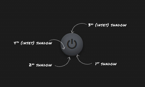
Next, we will create a beveled effect for the button. This effect is quite tricky. First, we apply background-color: rgb(83,87,93); for the button’s base color, then we add up to four layers of box-shadows.
a {
font-family: "FontAwesome";
color: rgb(37,37,37);
text-shadow: 0px 1px 1px rgba(250,250,250,0.1);
font-size: 32pt;
display: block;
position: relative;
text-decoration: none;
background-color: rgb(83,87,93);
box-shadow: 0px 3px 0px 0px rgb(34,34,34), /* 1st Shadow */
0px 7px 10px 0px rgb(17,17,17), /* 1nd Shadow */
inset 0px 1px 1px 0px rgba(250, 250, 250, .2), /* 3rd Shadow */
inset 0px -12px 35px 0px rgba(0, 0, 0, .5); /* 4th Shadow */
width: 70px;
height: 70px;
border: 0;
border-radius: 35px;
text-align: center;
line-height: 79px;
}
There is also a larger circle outside the button, and we will use the :before pseudo-element for it rather than adding extra markup.
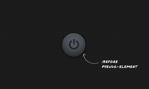
a:before {
    content: "";
    width: 80px;
    height: 80px;
    display: block;
    z-index: -2;
    position: absolute;
    background-color: rgb(26,27,29);
    left: -5px;
    top: -2px;
    border-radius: 40px;
    box-shadow: 0px 1px 0px 0px rgba(250,250,250,0.1),
                inset 0px 1px 2px rgba(0, 0, 0, 0.5);
}
Further reading: CSS :before and :after pseudo-elements (Hongkiat.com)
Indicator Light
Under the button, there is a tiny light to designate the Power On and Off status. Below, we apply red for the light’s color because the power is initially OFF. We also add box-shadow to imitate the gleam effect of the light.
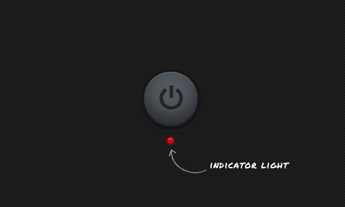
a + span {
    display: block;
    width: 8px;
    height: 8px;
    background-color: rgb(226,0,0);
    box-shadow: inset 0px 1px 0px 0px rgba(250,250,250,0.5),
                0px 0px 3px 2px rgba(226,0,0,0.5);
    border-radius: 4px;
    clear: both;
    position: absolute;
    bottom: 0;
    left: 42%;
}
The Effect
At this point, our button starts looking good, and we only need to add some effects. For instance, when the button is ‘being’ clicked, we want it to look like it’s being pressed and held down.
To achieve this effect, the first box-shadow on the button will be zeroed out, and its position will be lowered slightly. We also need to adjust the intensities of the other three shadows a little to match the button’s new position.

a:active {
    box-shadow: 0px 0px 0px 0px rgb(34,34,34), /* 1st Shadow */
                0px 3px 7px 0px rgb(17,17,17), /* 2nd Shadow */
                inset 0px 1px 1px 0px rgba(250, 250, 250, .2), /* 3rd Shadow */
                inset 0px -10px 35px 5px rgba(0, 0, 0, .5); /* 4th Shadow */
    background-color: rgb(83,87,93);
    top: 3px;
}
Furthermore, once the button has been clicked, it should remain pressed down, and the icon should ‘shine’ to indicate that the power is ON.
To achieve such an effect, we will target the button using the :target pseudo-class, then change the icon’s color to white and add a white text-shadow as well.
a:target {
    box-shadow: 0px 0px 0px 0px rgb(34,34,34),
                0px 3px 7px 0px rgb(17,17,17),
                inset 0px 1px 1px 0px rgba(250, 250, 250, .2),
                inset 0px -10px 35px 5px rgba(0, 0, 0, .5);
    background-color: rgb(83,87,93);
    top: 3px;
    color: #fff;
    text-shadow: 0px 0px 3px rgb(250,250,250);
}
Further reading: Using :target pseudo-class
We also need to adjust the box-shadow in the circle outside the button, as follows.
a:active:before, a:target:before {
    top: -5px;
    background-color: rgb(26,27,29);
    box-shadow: 0px 1px 0px 0px rgba(250,250,250,0.1),
                inset 0px 1px 2px rgba(0, 0, 0, 0.5);
}
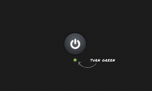
The light indicator will turn from the default red to green to emphasize that the power is already ON.
a:target + span {
    box-shadow: inset 0px 1px 0px 0px rgba(250,250,250,0.5),
                0px 0px 3px 2px rgba(135,187,83,0.5);
    background-color: rgb(135,187,83);
}
Transition Effect
Lastly, to make the button’s effect run smoothly, we will also apply the following transition effect.
This snippet below will specifically add the transition to the color and text-shadow properties for 350ms in the anchor element.
a {
    transition: color 350ms, text-shadow 350ms;
    -o-transition: color 350ms, text-shadow 350ms;
    -moz-transition: color 350ms, text-shadow 350ms;
    -webkit-transition: color 350ms, text-shadow 350ms;
}
This second snippet below will add the transition for the background-color and box-shadow properties in the light indicator.
a:target + span {
    transition: background-color 350ms, box-shadow 700ms;
    -o-transition: background-color 350ms, box-shadow 700ms;
    -moz-transition: background-color 350ms, box-shadow 700ms;
    -webkit-transition: background-color 350ms, box-shadow 700ms;
}
Final Result
We have covered all the styles needed. Now you can see the final result live and download the source file from the links below.
Bonus: How to turn it off
Here comes the bonus. If you have tried the button from the demo above, you’ve noticed that it can only be clicked once (to turn it on). So how do we turn it off?
Unfortunately, we have to use jQuery for this, but it’s really simple. Below is all the jQuery code needed.
$(document).ready(function() {
    $('#button').click(function() {
        $(this).toggleClass('on');
    });
});
The snippet above will add the class ON to the anchor tag using jQuery’s toggleClass function. When the #button is clicked, jQuery checks if the ON class has been added. If not, it adds the class; if it has, jQuery removes the class.
Note: Don’t forget to include the jQuery library.
Now we have to change the Style slightly. Simply replace all instances of the :target pseudo-class with the .on class selector, as follows:
a.on {
    box-shadow: 0px 0px 0px 0px rgb(34,34,34),
                0px 3px 7px 0px rgb(17,17,17),
                inset 0px 1px 1px 0px rgba(250, 250, 250, .2),
                inset 0px -10px 35px 5px rgba(0, 0, 0, .5);
    background-color: rgb(83,87,93);
    top: 3px;
    color: #fff;
    text-shadow: 0px 0px 3px rgb(250,250,250);
}

a:active:before, a.on:before {
    top: -5px;
    background-color: rgb(26,27,29);
    box-shadow: 0px 1px 0px 0px rgba(250,250,250,0.1),
                inset 0px 1px 2px rgba(0, 0, 0, 0.5);
}

a.on + span {
    box-shadow: inset 0px 1px 0px 0px rgba(250,250,250,0.5),
                0px 0px 3px 2px rgba(135,187,83,0.5);
    background-color: rgb(135,187,83);
}
Finally, let’s try it in the browser.