Create Multiple Columns Layout (Magazine-alike) With CSS3
In general, people lose track when reading extremely long content. That is why, in print media like magazines and newspapers, the content is divided into multiple columns for easy reading.
Creating columns on the Web is a totally different story. It used to be quite difficult. In fact, not too long ago, you might have needed to divide the content manually into several div elements, float them to the right or left, and then specify the width, padding, margin, borders, etc.
But things are now much simplified with the CSS3 Multi Column Module. As the name clearly implies, this module allows us to divide content into the columned layout we often see in newspapers or magazines.
Browser Support
Multiple columns are currently supported in all major browsers – Firefox 2+, Chrome 4+, Safari 3.1+, and Opera 11.1+ – except Internet Explorer, although IE10 started providing support for this module.
For the other browsers, Firefox still requires the -moz- prefix for it to work, while Chrome and Safari need the -webkit- prefix. Opera doesn’t require any prefixes, so we can just use the official properties.
Source: When can I use CSS3 Multiple column layout?
Create Multiple Columns
Before we create the columns, we have prepared some text paragraphs for the demonstration, wrapped inside the HTML5 <article> tag, as follows:
<article>
  Lorem ipsum dolor sit amet, consectetur adipiscing elit. Nunc libero magna, venenatis quis aliquet et,
  rutrum in augue. Donec vel tempor dolor. Donec volutpat fringilla porta. Suspendisse non nulla tortor.
  Quisque commodo ornare mi, sit amet aliquet justo bibendum non. Integer bibendum convallis sapien, sit
  amet tincidunt orci placerat in. Integer vitae consequat augue.

  //and so on
</article>
…and specified a width of 600px in the stylesheet.
Now, let’s start creating the columns.
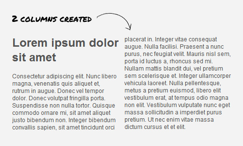
In the example below, we will divide the content into two columns using the column-count property. This property tells the browser to render the content into the specified number of columns, letting the browser decide the appropriate width for each column.
article {
  -webkit-column-count: 2;
  -moz-column-count: 2;
  column-count: 2;
}
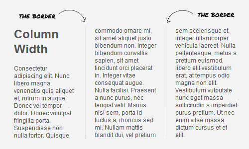
Apart from being defined by the count, columns can be created by specifying the width using the column-width property, letting the browser decide how many columns should be generated in place.
In this example, we specify a column width of 150px, which results in the content being divided into three columns.

article {
  -moz-column-width: 150px;
  -webkit-column-width: 150px;
  column-width: 150px;
}
As stated in the specification, the actual width of the column may be wider or narrower than the specified column width, depending on the available space. Also, if the width value is not explicitly specified, “auto” will be taken as the default, which could also mean “no columns”.
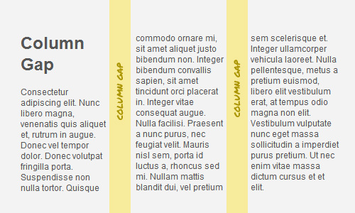
Column Gap
Column Gap defines the space that separates each column. The gap value can be stated in em or px, but as stated in the specification, the value cannot be negative. In the example below, we specify a gap of 30px, so the spaces between the columns look a little wider.
article {
  -webkit-column-gap: 30px;
  -moz-column-gap: 30px;
  column-gap: 30px;
}
Column Rule
Should you want to add borders between the columns, you can use the column-rule property, which works very similarly to the border property. So, let’s say, if we want to put a dotted border between the columns, we can write:
article {
  -moz-column-rule: 1px dotted #ccc;
  -webkit-column-rule: 1px dotted #ccc;
  column-rule: 1px dotted #ccc;
}
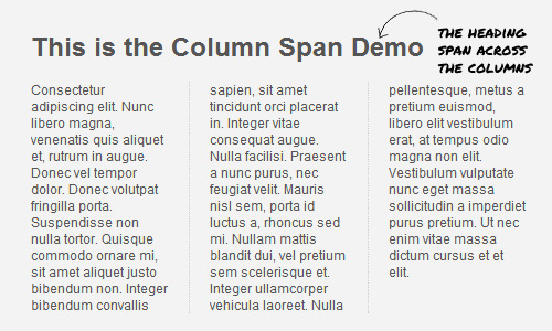
Column Span
This property works quite similarly to the colspan attribute in the table tag. The common implementation of this property is to span the content headline across all columns. Here is an example:
article h1 {
  -webkit-column-span: all;
  column-span: all;
}
In the example above, we defined the h1 to span across all columns. If the column span is not specified, 1 will be taken as the default. Unfortunately, at the time of this writing, this property only works in Opera and Chrome.
Final Words
That’s all for now; we have covered the essential techniques for creating multiple columns with CSS3. As we mentioned at the beginning, this module works very well in modern browsers but doesn’t work in older versions of Internet Explorer.