Elevate Your Photos with the CSS3 Border-Image Property
HTML and CSS have always allowed us to frame our content with borders, offering styles like solid, dotted, and dashed lines.
However, the introduction of the CSS3 border-image property has taken border design to a whole new level. This feature enables the use of images as borders, opening up possibilities for more visually appealing designs. Let’s dive into how this property can be utilized to enhance your web elements.
Syntax and Browser Compatibility
To define a border image in CSS3, use this shorthand syntax:
border-image: [image source] [slice] [width] [outset] [repeat];
This syntax, as specified by the W3C, works in Chrome. Other browsers like Opera, Firefox, and Safari still need their respective prefixes (-o-, -moz-, -webkit-). Internet Explorer, as expected, does not support this property.
Moreover, the [width] and [outset] values in the border-image property are not supported by any browser yet, but you can use the border-width property as a workaround for the width.
In essence, currently, we’re limited to using the [image source], [slice], and [repeat] values.
border-image: [image source] [slice] [repeat];
Understanding Image Slicing
Before we dive into how to use this property, it’s essential to grasp the concept of “image slice”. Image slicing allows us to specify how an image is divided for border usage. It defines cuts from the top, right, bottom, and left edges of the image, effectively splitting the image into nine parts, as shown in the example below.
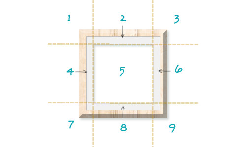
In the illustrated image, notice how sections 1, 3, 7, and 9 form the corners of the border. Sections 2, 4, 6, and 8 serve as the sides of the border. These sections are designed to be repeatable or stretchable, ensuring a seamless edge.
Slice values can be set using either pixels or percentages, providing flexibility in measurement.
More References:
Creating a Photo Frame with CSS3 Border-Image
Let’s explore a practical example of the border-image property by crafting a photo frame. We’ll use the following image as our border source, having precisely measured it to ensure it slices, repeats, and stretches effectively across any content size.
For the photo inside our frame, we’ll feature an enchanting Cinemagraph from From Me to You.

The Markup
Starting with our HTML, it’s straightforward:
 <div class="wrapper">
 <img src="path/photo.jpg">
 </div>
Remember to change path/photo.jpg to the actual path of your photo.
The Styles
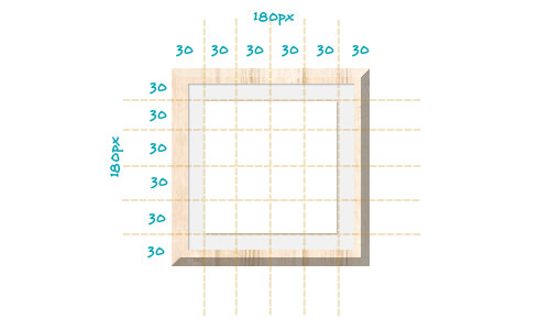
Next, let’s frame our image. Based on the earlier image, our border measures a total of 180px in width. Dividing this into 6 gives us segments of 30px each, which will be our slice measurement.
When specifying slice values in pixels, omit the px unit – it’s understood as pixels. If using percentages, include the (%) symbol.
We’ll stick with the default repeat for image repetition, but stretch is also an option without sacrificing the border’s appearance.
img {
  border-image: url("images/frame.png") 30 repeat;
  -o-border-image: url("images/frame.png") 30 repeat;
  -moz-border-image: url("images/frame.png") 30 repeat;
  -webkit-border-image: url("images/frame.png") 30 repeat;
  border-width: 30px;
}
Furthermore, to enhance our design, we’ll center the image in the browser and apply a subtle background texture to the document.
html {
  background: url('images/lightpaperfibers.png');
}

.wrapper {
  margin: 20px auto;
  height: 476px;
  width: 675px;
  text-align: center;
}
Final Thoughts
The introduction of the border-image property is a significant enhancement in the CSS3 toolkit, liberating us from the confines of basic borders.
Throughout this guide, we’ve illustrated how to craft a photo frame that adapts seamlessly to the dimensions of any photo, thanks to the flexibility provided by stretchable or repeatable border sources.
If you’re still finding the border-image concept a bit challenging, don’t worry – there